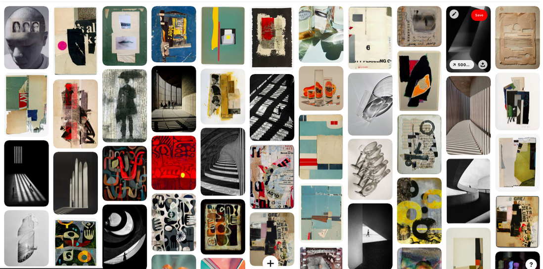
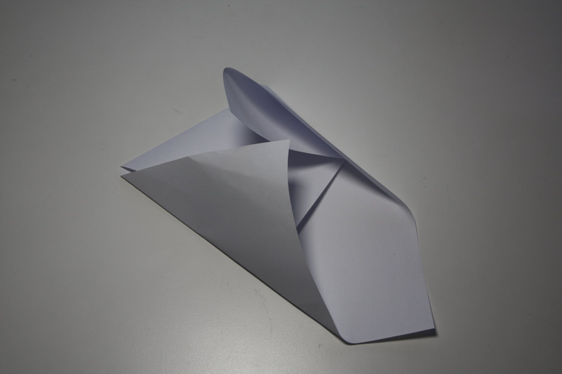
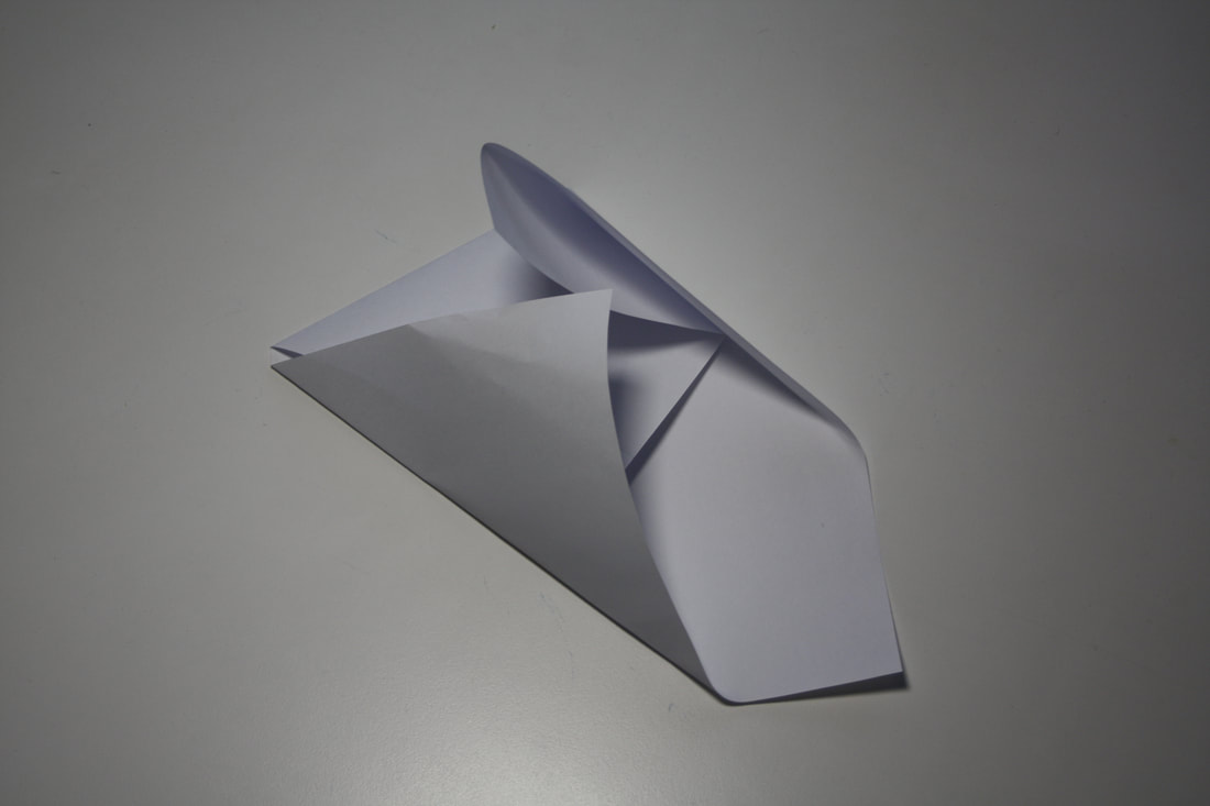
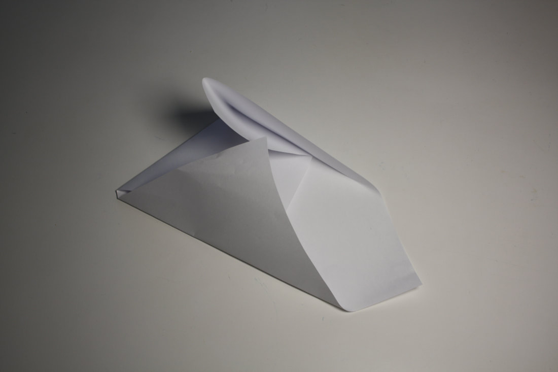
White paper test
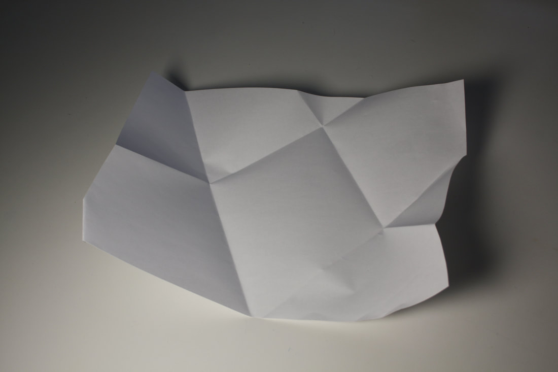
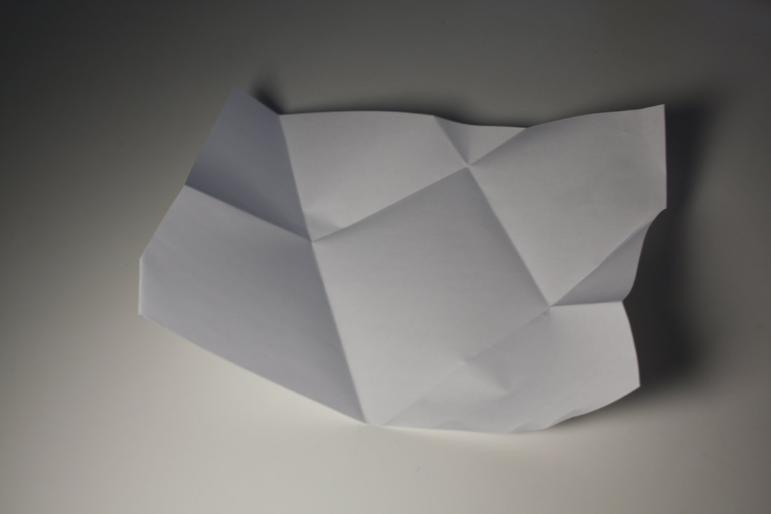
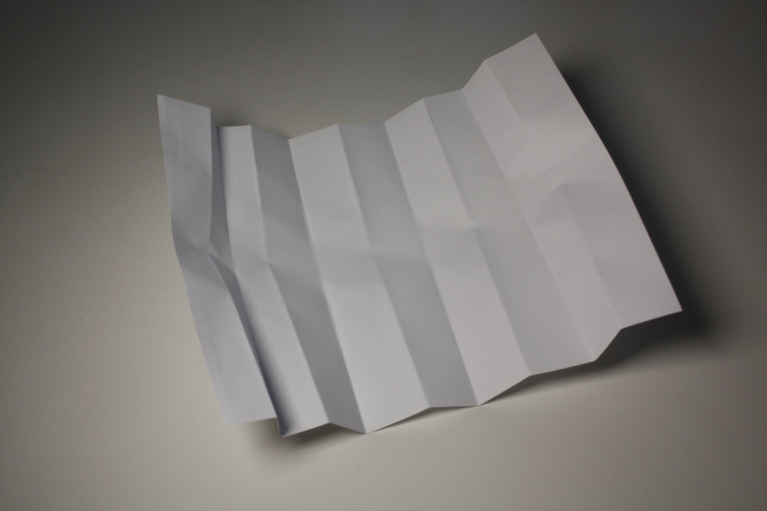
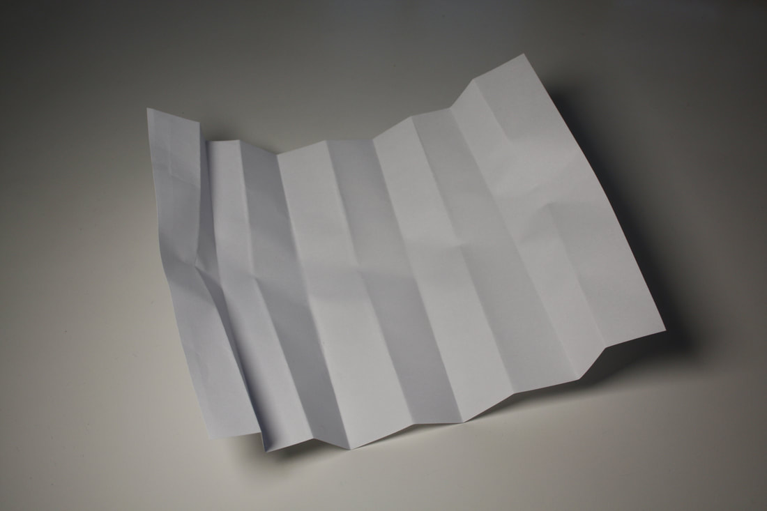
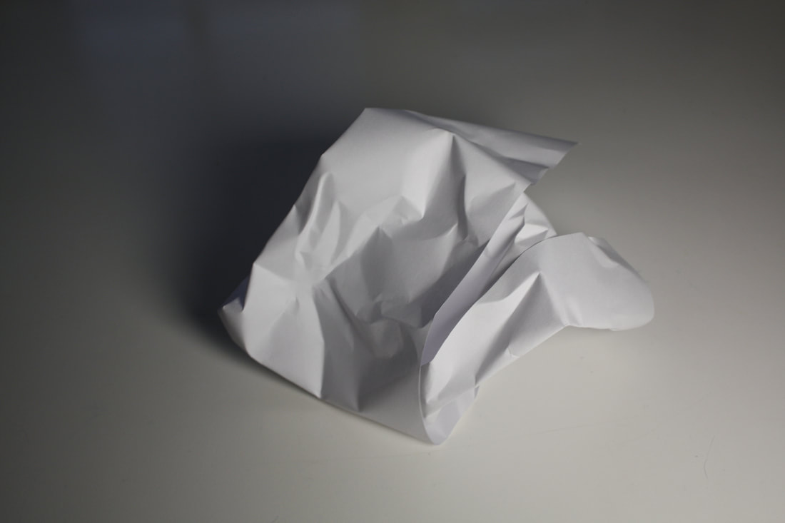
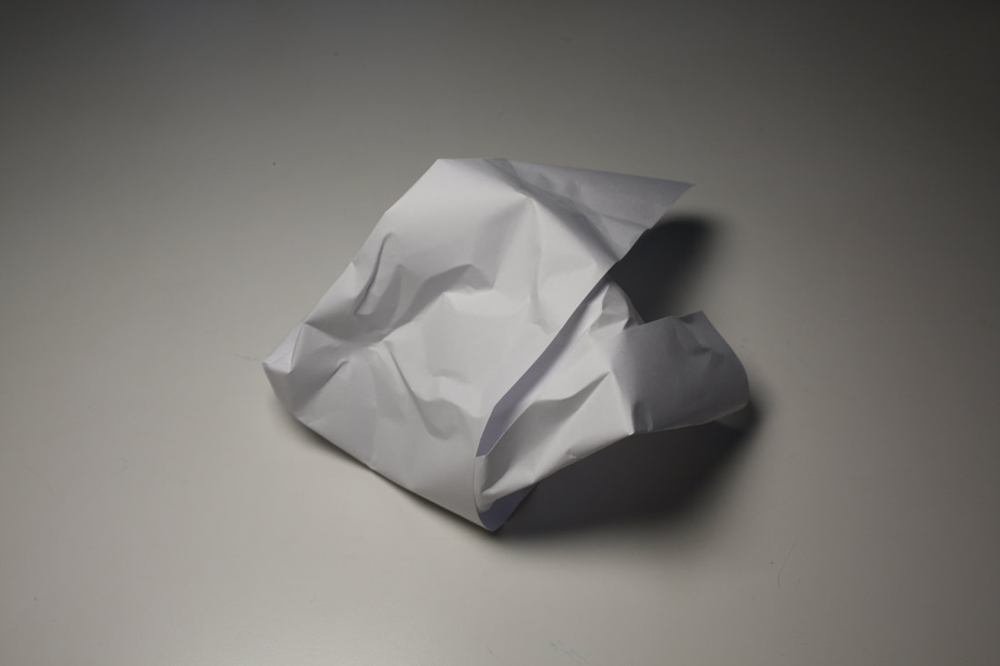
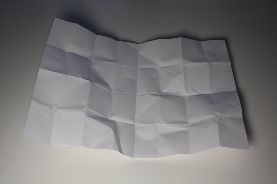
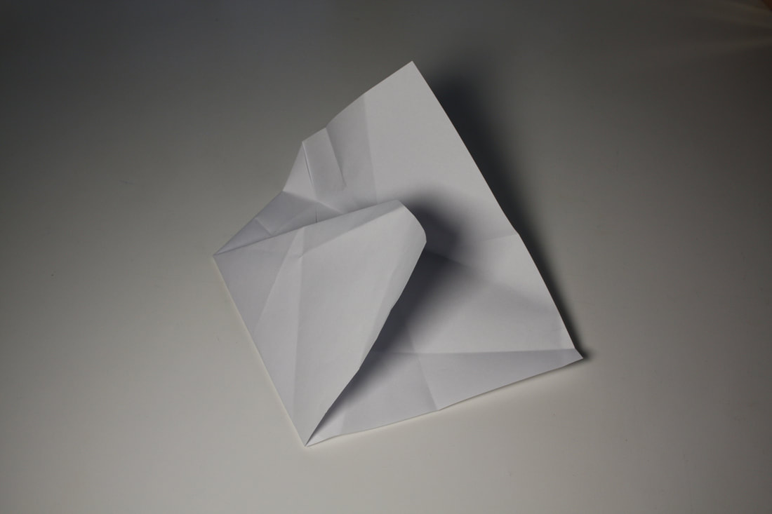
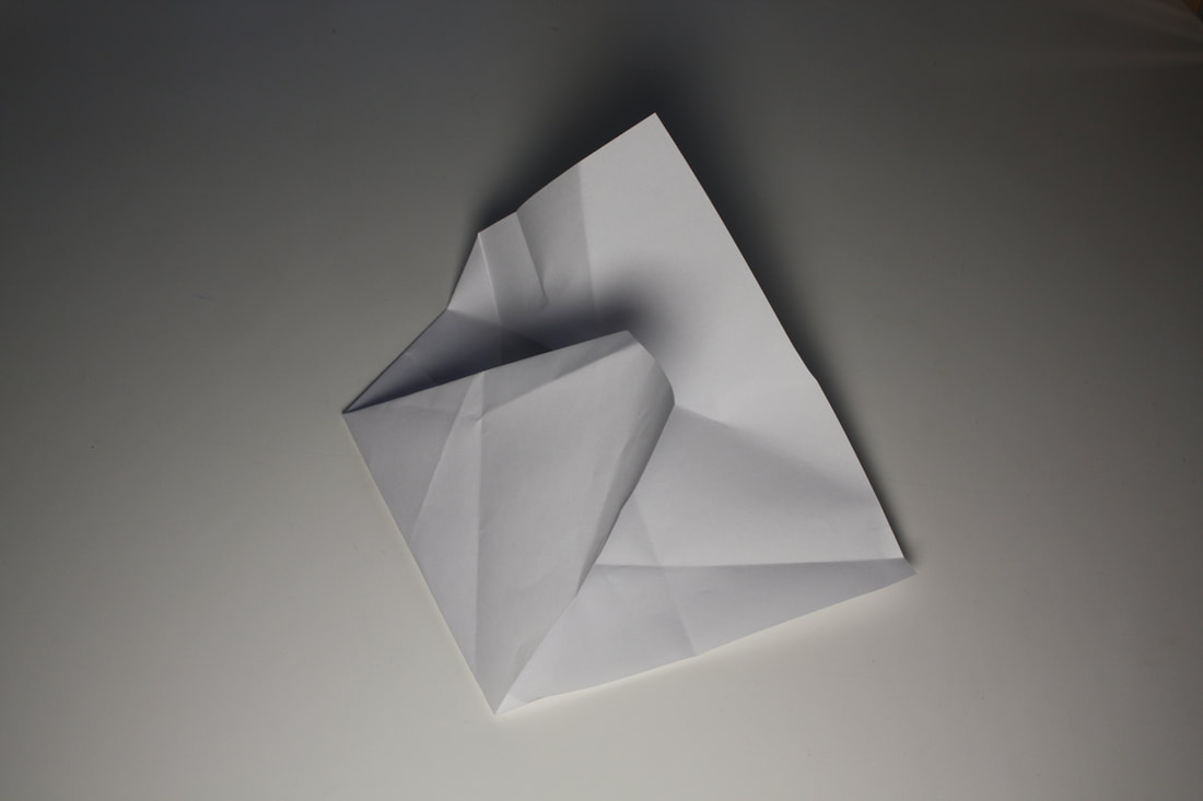
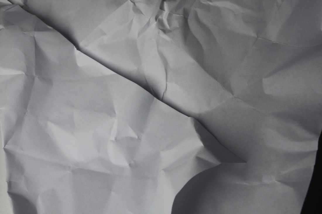
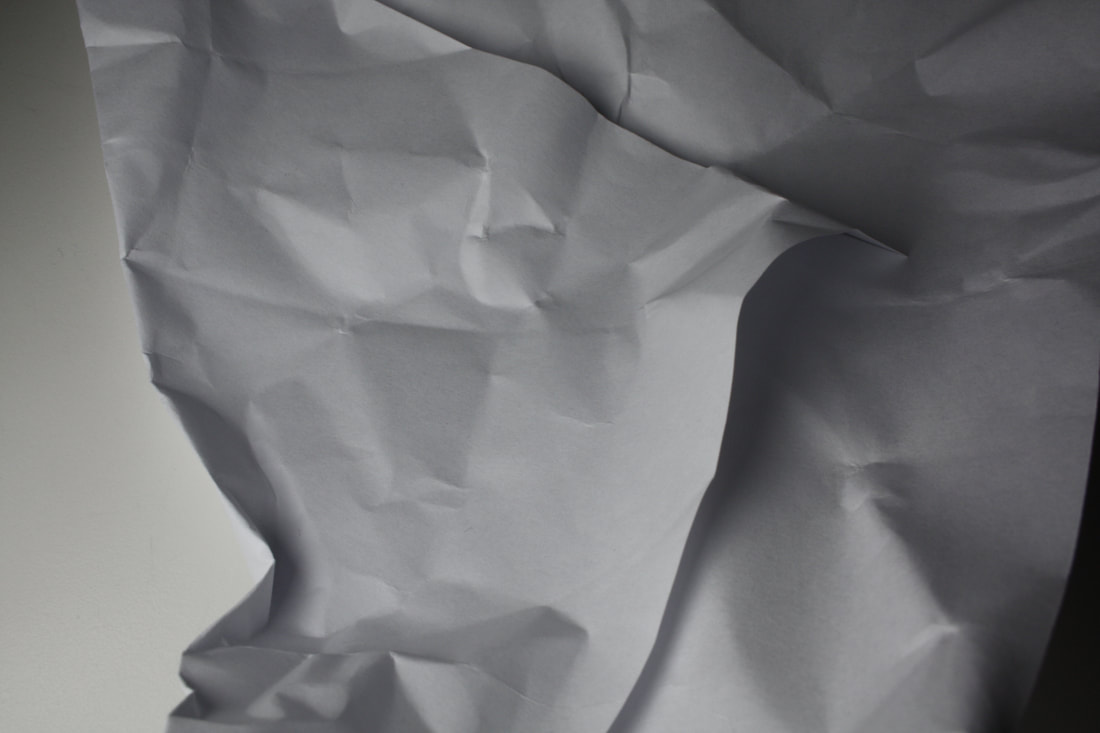
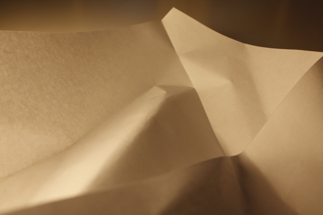
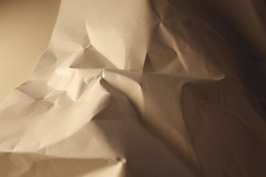
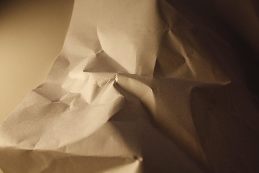
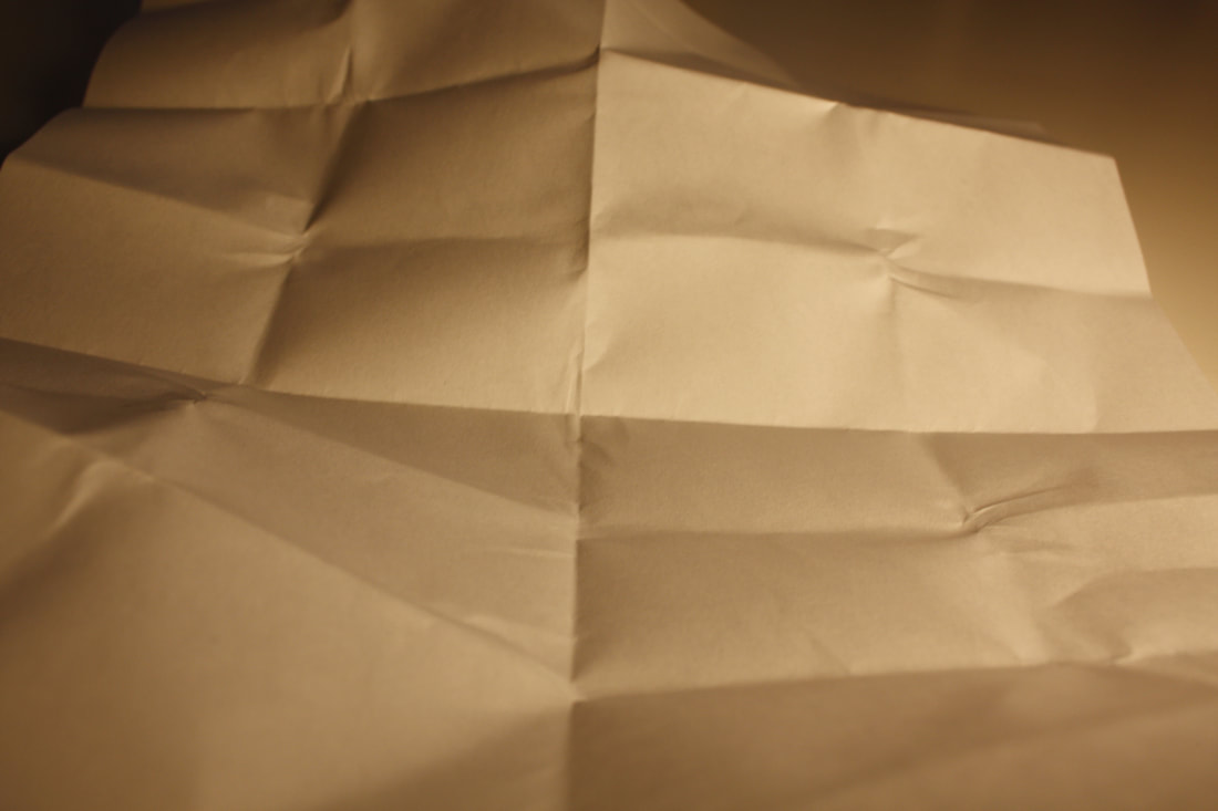
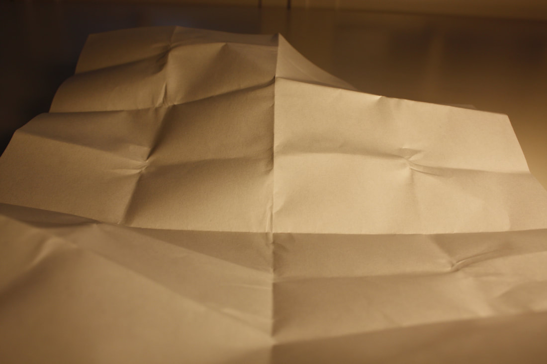
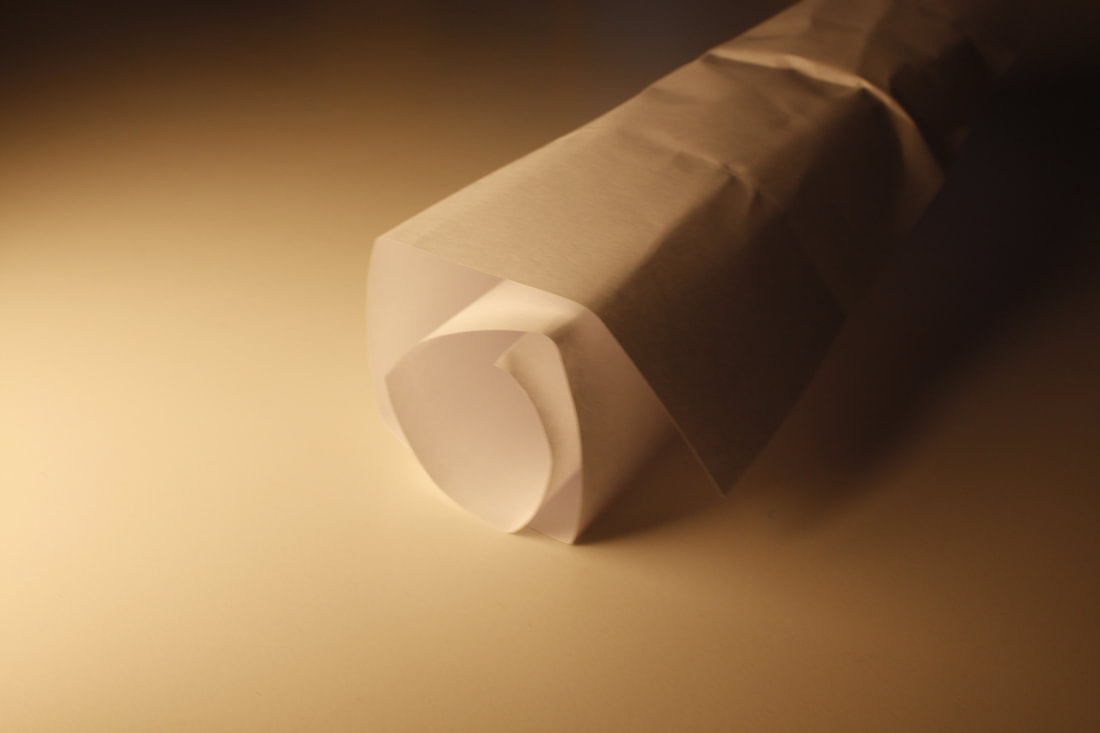
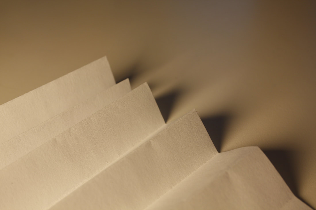
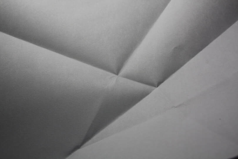
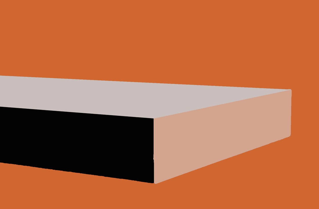
In this first task, i we took many different photos of just a piece of white paper. This meant that we could fold it , crumple it, roll it and use different light sources to take the photos. I used two different lights, with different colours and lots of techniques to get the photos. The best photos are the ones which are close up so that it becomes hard to identify what the photo is. I don't like the images which are taken far away because they look too ordinary and unimaginative. My favourite photo from this shoot is definately the picture at the bottom. this is because of the dark lines created from folds as well as the composition which looks like some of the paper is close up while the folded piece is the background.
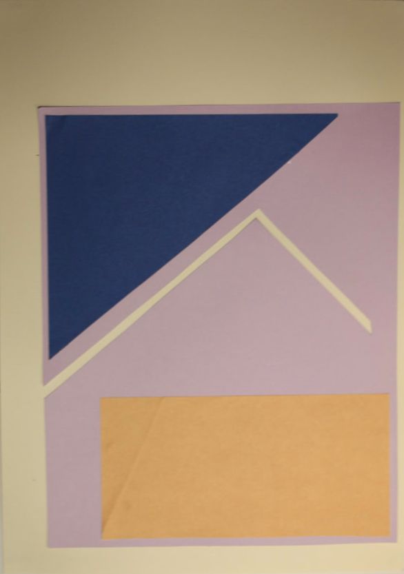
Tamara Lorenz
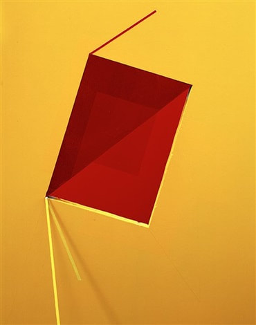
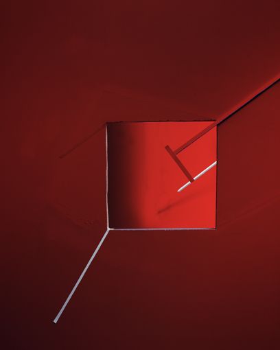
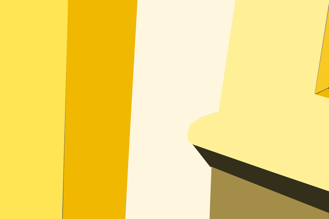
Tamara Lorenz is a German photographer who uses colours and shapes to create abstract images. She does this by making various constructions using paper and other materials, which she then photographs to frame their properties. She uses strong block colours with contrasting colours in her photos, as well as strong geometric shapes thin lines. She also sometimes uses shadow and techniques like fading colours to create a reflection effect, as if they are mirrors reflecting other shapes. My favourite picture from Tamara Lorenz is the red image on the right. This is because I like the deep red and white along with the way the two reds are blending gradually.
|
|
|
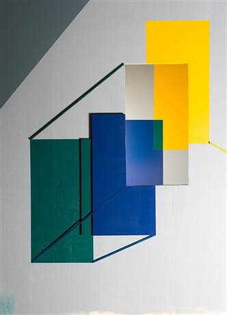
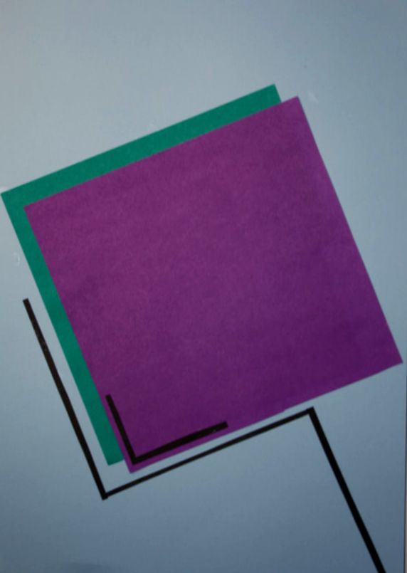
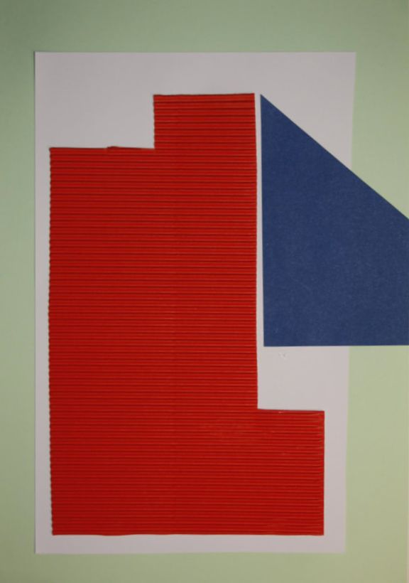
This is my response to Tamara Lorenz' absract style photography. I tried to imitate it by using the different aspects in her photos. For example, i used thin lines as well as solid geometric shapes. i also placed my shapes in positions that i think resembled Lorenz', like how some are tilted or how the shapes fit together. The most important thing i had to keep in mind were the colours i was using, making sure they contrasted eachother and each piece had a different colour range. I have edited the photos to make the colours more vibrant since Tamara Lorenz' images are very bright and colourful.
|
|
|
Brendan Austin
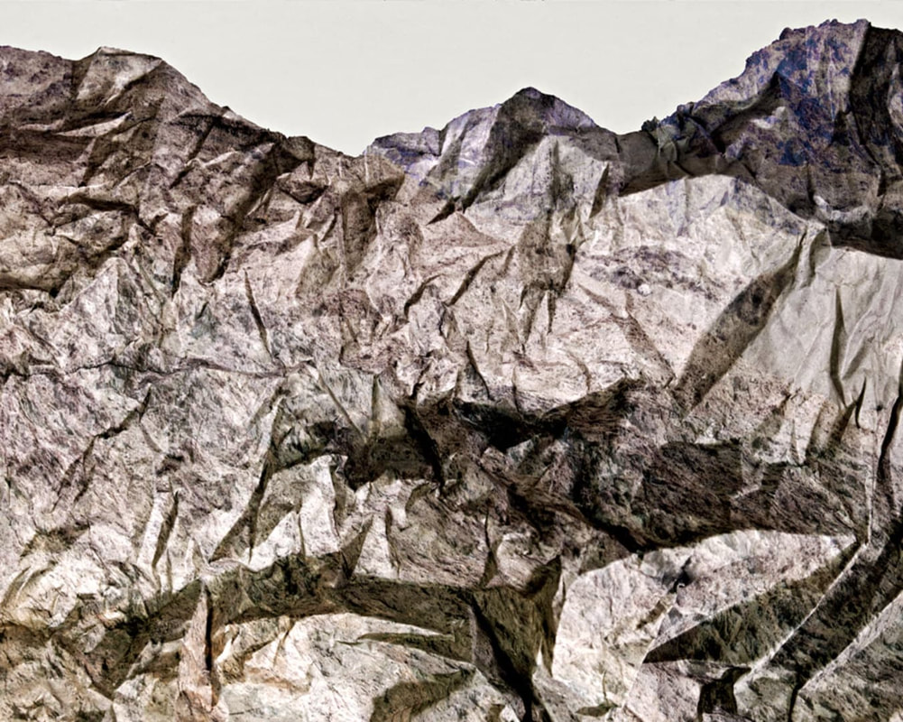
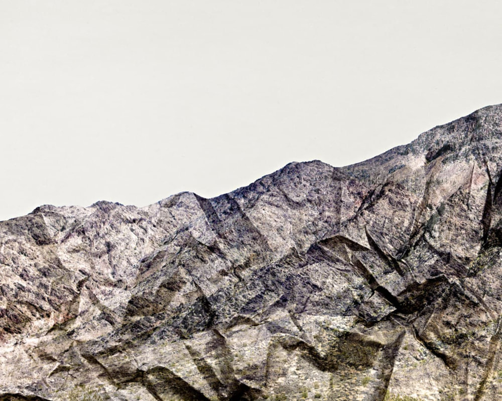
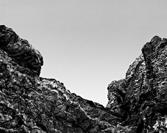
Brendan Austin is a British architectural and landscape photographer who also has a series called 'Paper mountains'. In this series, he takes photos of wrinkled paper which resemble mountains or cliffs. As you can see, the photos are very similar to mountains partly because of the textured colouring of the paper, but also because of the compositions and precise placing of the paper. As he is a landscape photographer, he must be able to recreate them from his experience. My favourite photo from this series is the photo on the right as it is somehow much more detailed and realistic. This might be because of how the paper has much more wrinkles which look like lots of crevices and rocks, and also because of how the camera is angled up at the paper, making it look as large as a mountain.
|
|
|
Ordinary to Extraordinary
Edward Weston
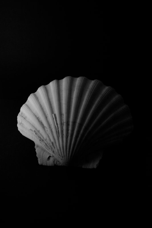
Edward Weston was a very famous and influential photographer, born in 1886, Illinois. He started photography when he was 16 after recieving a camera form his father. By the time he was 40, he had become known for his nude, close-up and landscape photography. In the 1920s, there was a group of photographers called the 'F64 group' who used high aperture to place emphasis on pure photography and sharp images. Western was a part og this group because, as you can see in his images, he used a very high aperture in order to get a very detailed and sharp photo. He was a landscape photographer, but he was most famous for his nude photography and photographs of peppers. Western has over 30 different images of peppers which were all taken with an aperture over 200, making the exposure time around 2-4 hours, and making the lens the size of a pin hole. For these images he used natural light which made the image look luminous as the light source changed over the long exposure time. If there was any movement in that time, then the image would be ruined and he would scrap it.
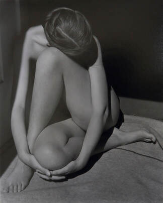
Nude, 1936
|
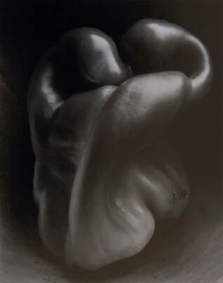
Pepper, 1930
|
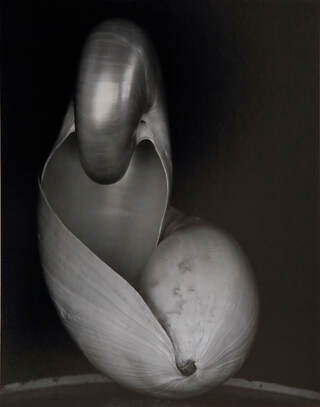
Shell, 1927
|
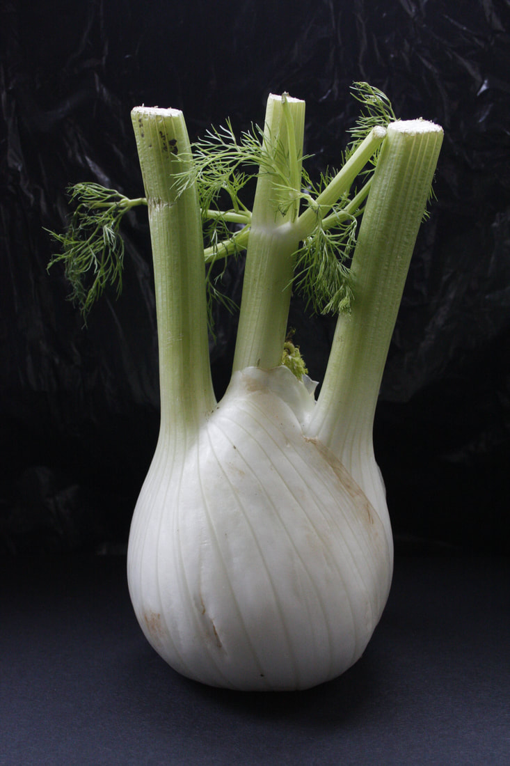
Natural Light
|
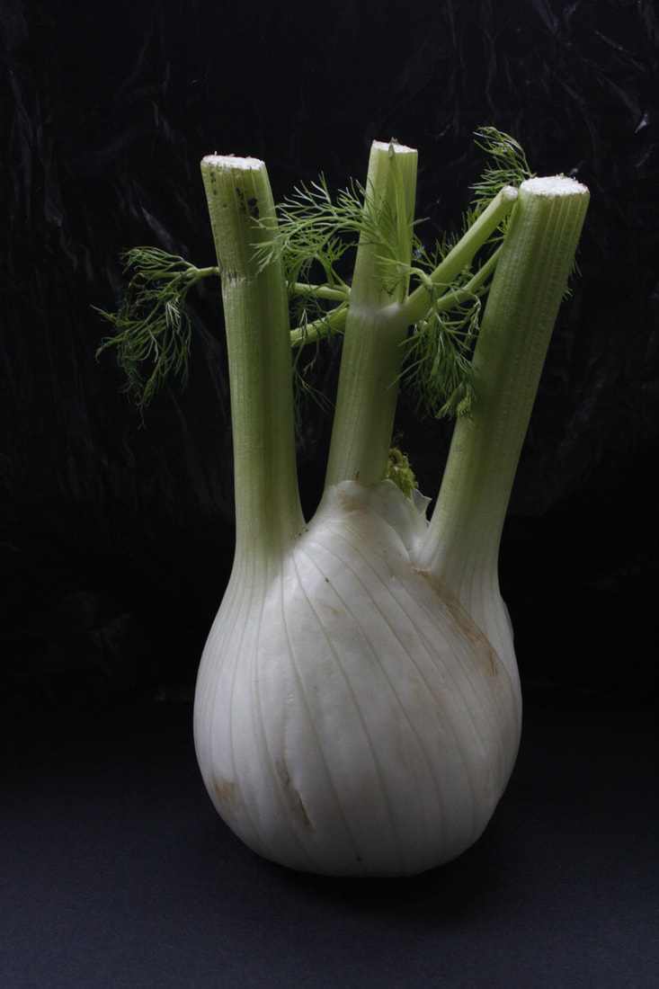
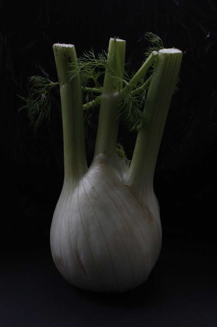
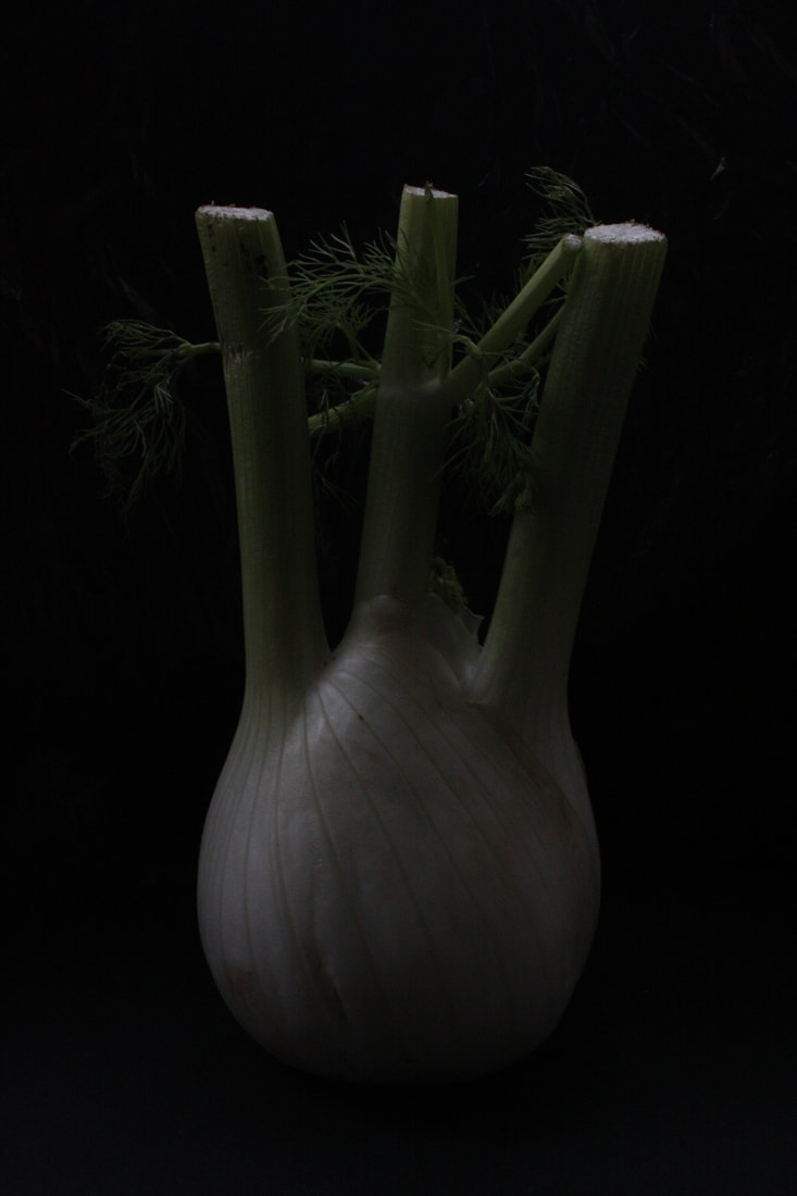
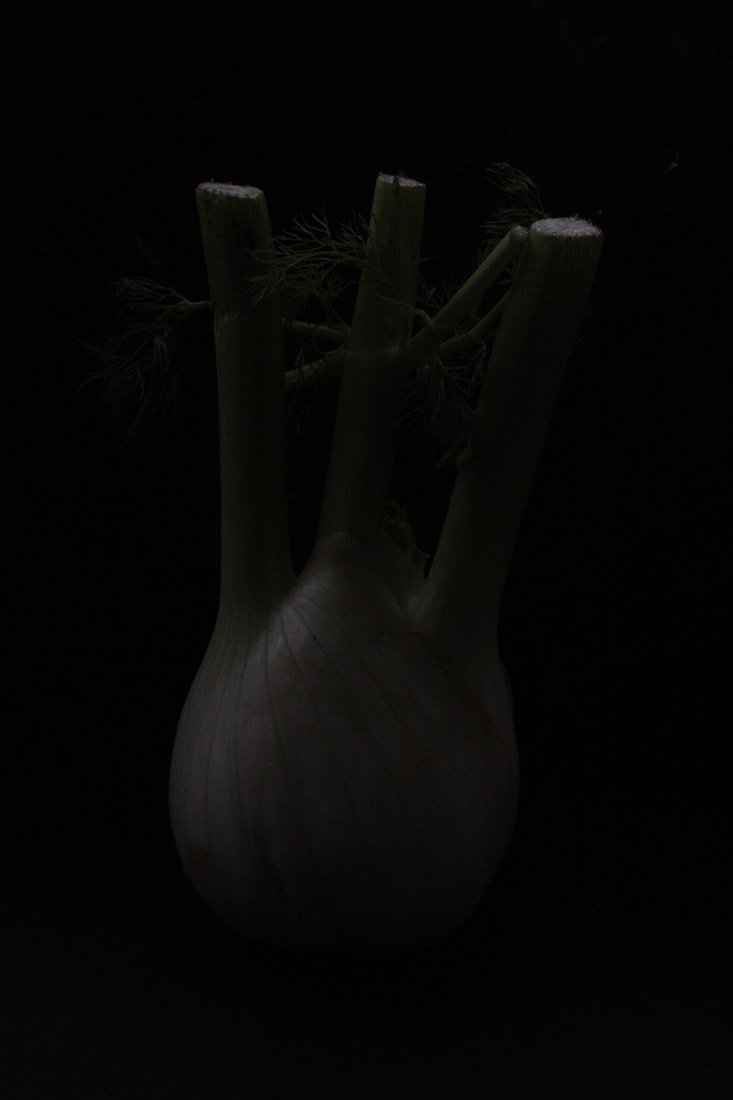
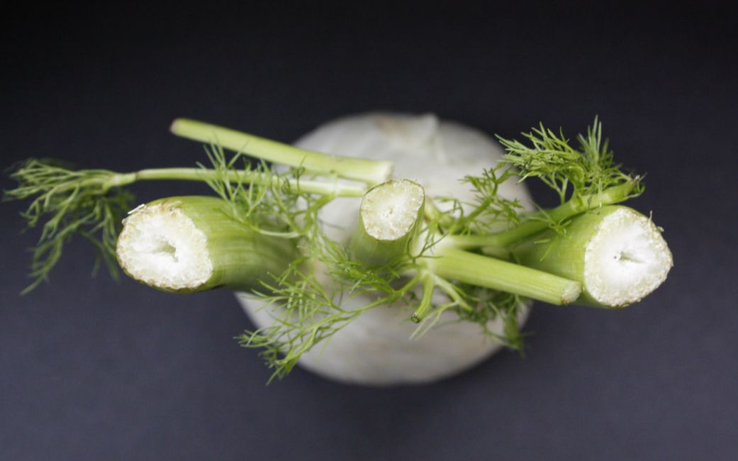
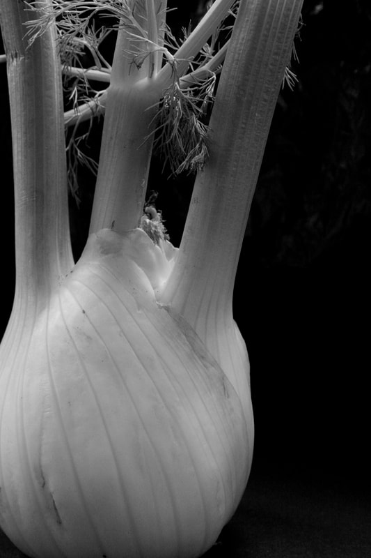
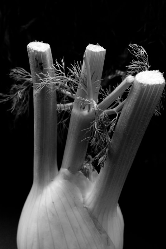
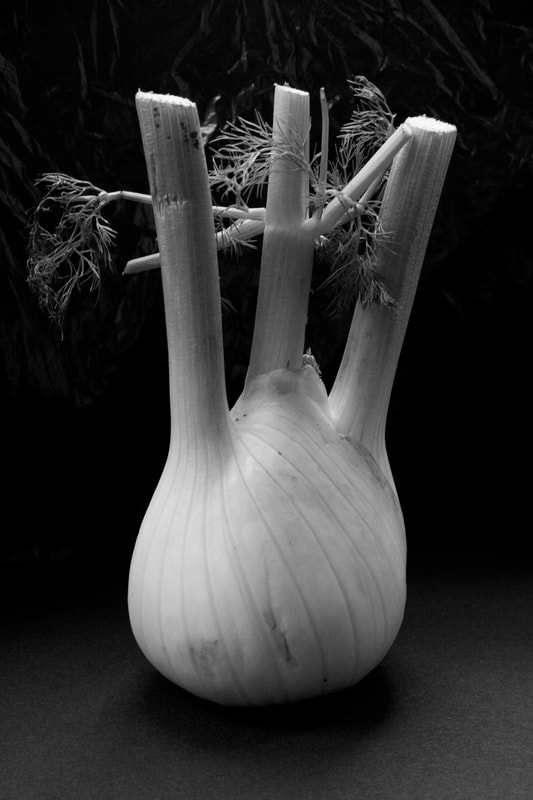
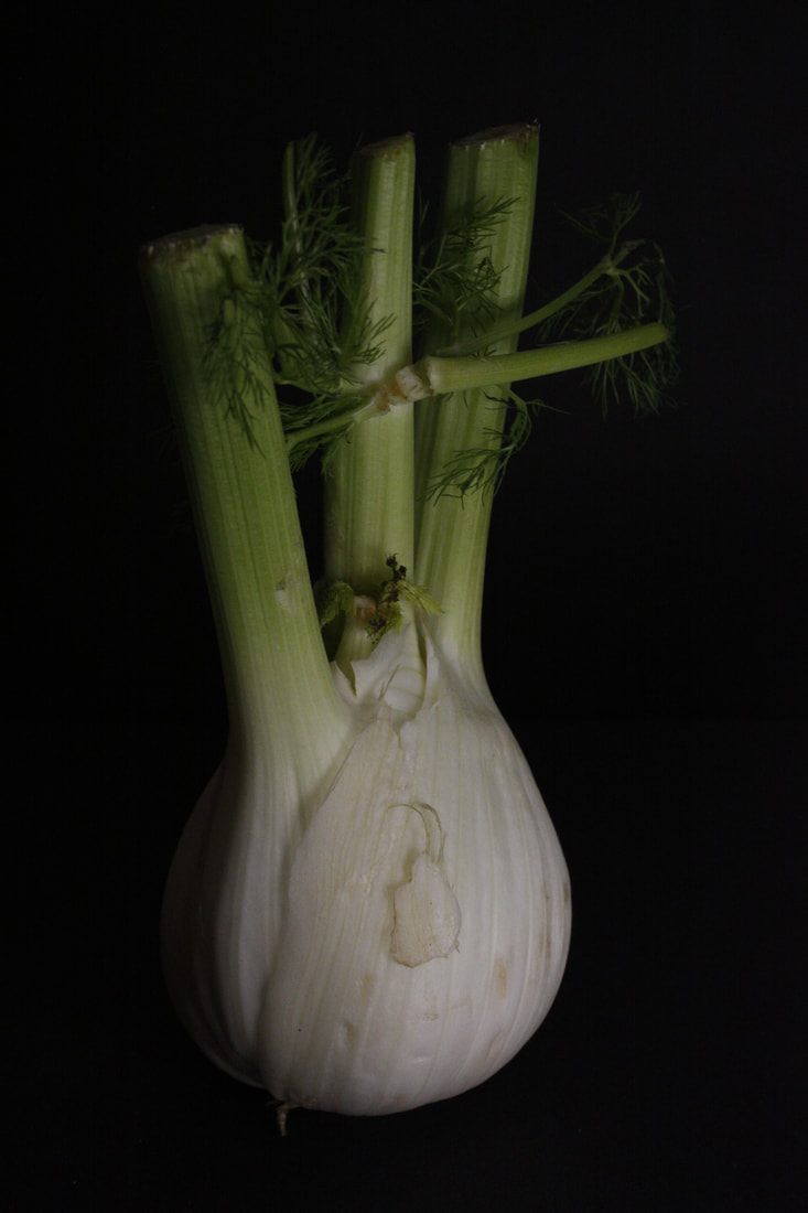
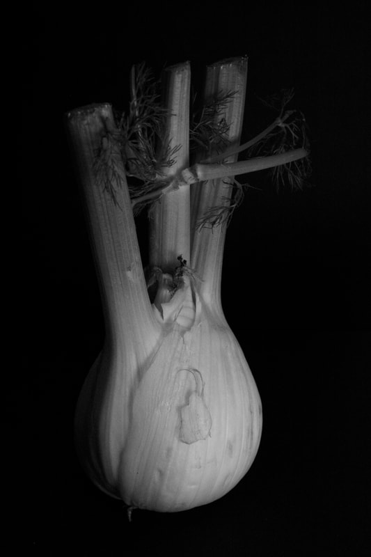
his is my response to Edward Weston's photography style. This task required me to take photos of interesting shaped fruit or objects similar to Weston's. It had to be done using natural light only. This meant that i had to take my photos close to the window and have no control over where the light source came from. I took photos of some fennel, which isn't the most interesting object but i think i managed to photograph it well, and similar to Edward Weston's. The photos in the slideshow are most of the pictures i took for this task, and below is the bracketing part of this task. This meant that i kept my shutter speed the same, at 1/50, and my ISO the same, at 1600. I then took 5 different images with the same composition, changing the aperture every time. My favourite is the first photo, but the second one could also be good. I have edited my three favourite images from this shoot and made them black and white. This increased the contrast like Weston's images and made the backgrond darker.
|
|
1/50 F7.1
|
1/50 F9
|
1/50 F13
|
1/50 F18
|
1/50 F29
|
|
|
|
|
|
|
|
Artificial Light
|
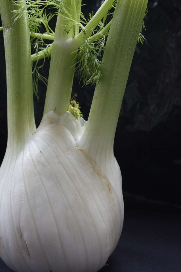
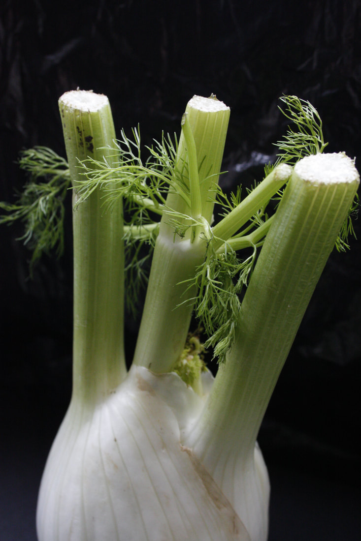
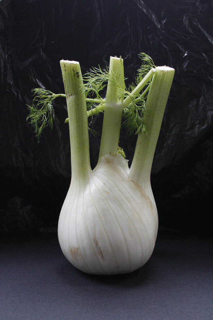
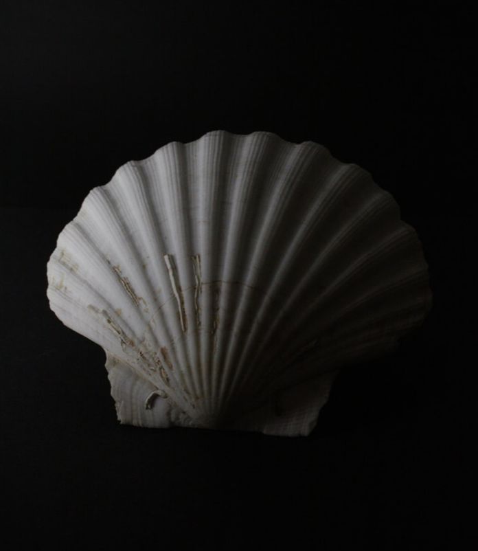
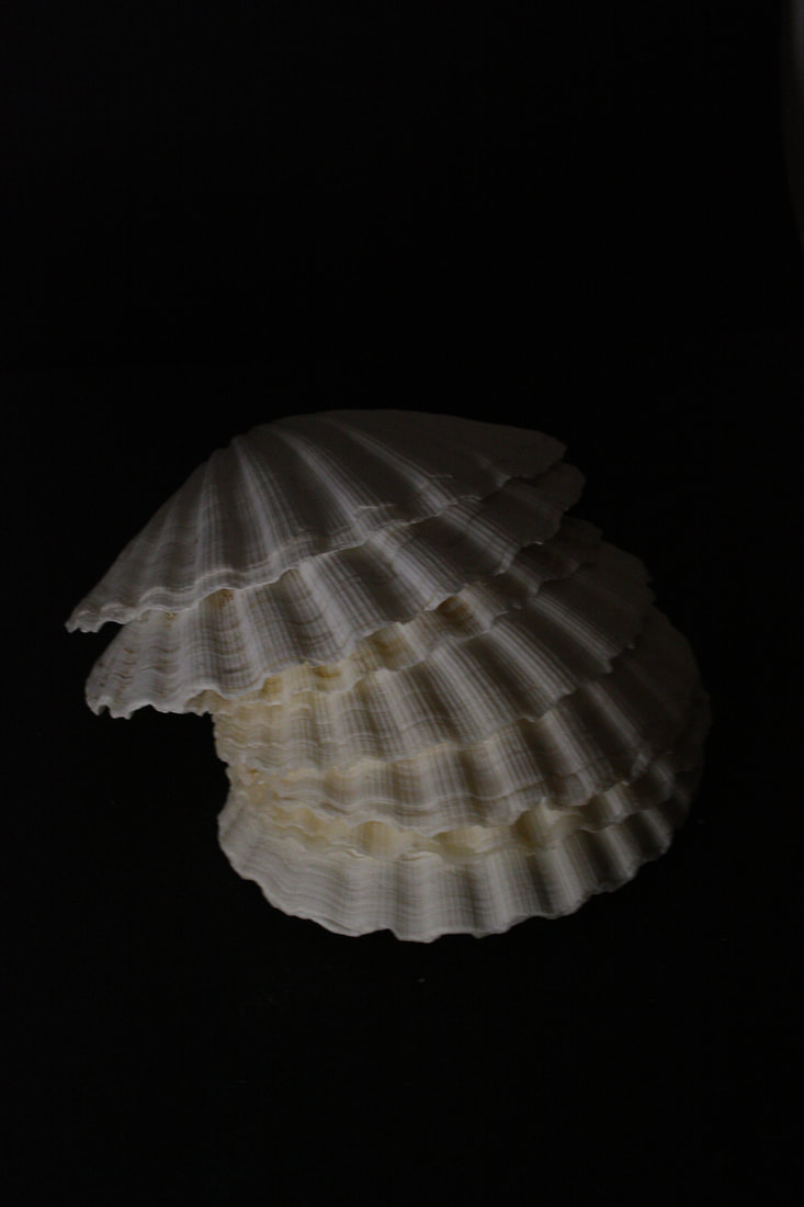
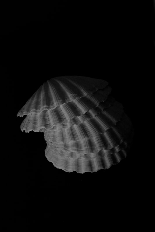
This is my response to the second task of Edward Weston. This time we were using artificial light which meant that i had more control over what the outcome of the photos would be, and i could play around with it more. I took photos of large shells as well as the same piece of fennel i used for the last task. The shells are good objects for this because of the ridges they have on the front, so that when i angled the light in a certain way, there were shadows inbetween all of them, defining the shape of the shell. Most of my photos are underexposed and lit from one side, which means that the object is very light on one side, and almost black on the other, which i liked. Also, you cannot see the black paper at all, making it look like they are floating.
|
|
|
|
|
|
|
|
Abstraction of the Body and Nature
Alicja Brodowicz and Agnieszka Lepka
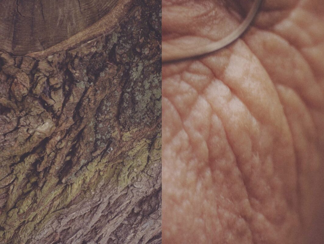
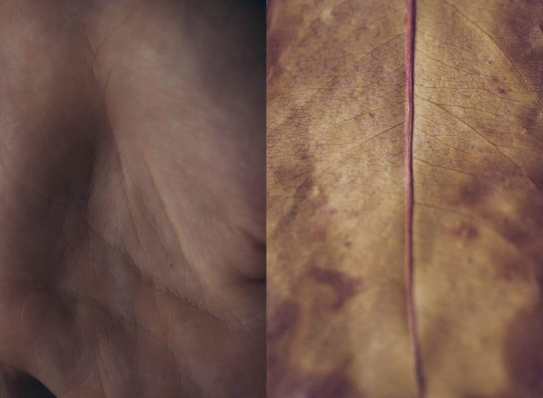
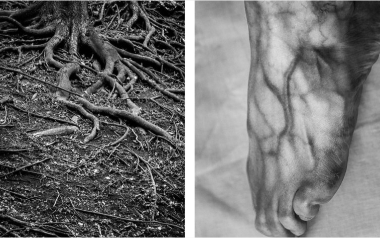
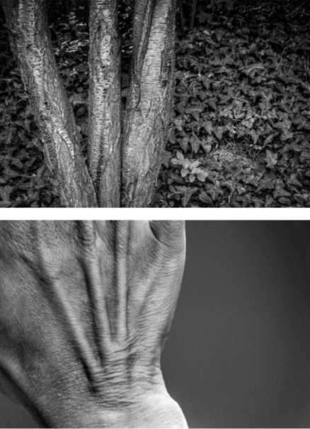
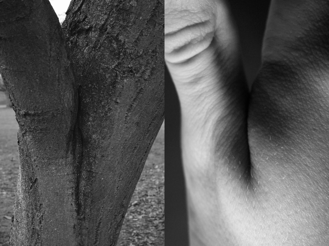
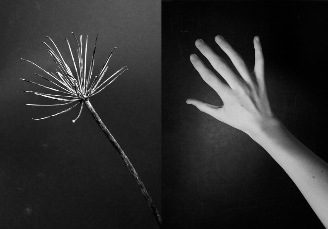
Alicja Brodowicz and Agnieszka Lepka are both photographers who have created similar work. Lepka's series is called 'Human vs Nature' and Brodowicz's series is called 'Visual Exercises', they both revolve around showing the similarities between the human body and parts of nature. For example, the veins on someone's foot might resemble roots in the ground and these photographers have tried to prove that. Both of the artists take two photos and edit them together side by side, this really shows you the resemblance because you can easily compare the similarities when they are next to eachother. Lepka's work mostly covers the more detailed and smaller parts of the body, like wrinkles and even fingerprints. Brodowicz's photography shows more of the larger body parts like hands and feet, but still is very close-up. She also photographs in black and white while, lepka's is mostly in colour.
Agnieszka Lepka
|
Agnieszka Lepka
|
Alicja Brodowicz
|
Alicja Brodowicz
|
|
This is my response to Agnieszka Lepka and Alicja Brodowcz's work. I had to recreate their photography style by taking photos of pieces of nature and comparing it to human body parts. This is to show unity between the human body and nature. I had a hard time thinking of similarities between things i saw in nature and a human, but i managed to make two that i think show similarities. My first photo, with the tree and my thumb resembles Lepka's photography because i chose a part of my body which is small and insignificant. This is like her work because she also takes photos of small creases and imperfections. The second photo of my whole hand is more like Brodowicz's work as i used a larger part of the body. Brodowicz has photos of a whole hand as well, and also likes to keep the backgrounds black like in that photo. I think both of my photos are good and show a resemblance, but it would be better if they had backgrounds which matched.
|
|
Abstract Portraits
Bill Jacobson
Context-Bill Jacobson is an American photographer widely known for his out of focus, blurred photographs. He shot out of focus from 1989 until 2002 in reflection to the AIDs epidemic going aroud in the early 1990s.
Intentions-These early works, titled 'Interim Portraits', feature shadowy, pale figures that evoke the loss experienced by many during the height of the AIDS epidemic. The blurred subjects underline the futility of capturing a true human likeness in both portraiture and memory.
Inspiration- His blurred photography was inspired by the blurred or obscured, old images taken by early photographers. he was interested in the 'layers of time' that the photos revealed and how old images can transport the viewer back to the precise moment they were captured.
Technique- Since 2002 he has been photographing in focus ,however his blurred photos remain his most famous.
|
|
|
My response
|
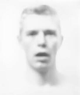
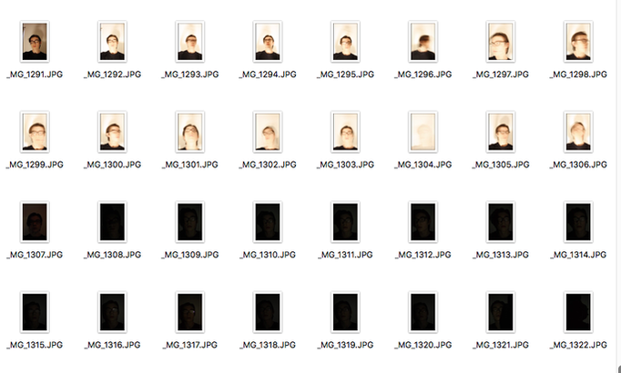
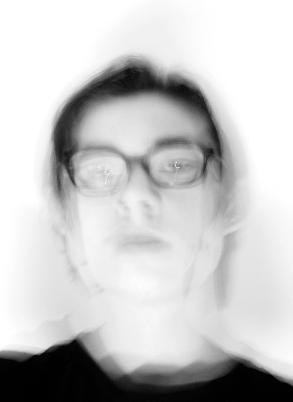
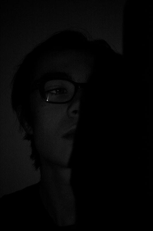
This is my first shoot i did in response to Bill Jacobson's abstract portraits. I didn't know what i would do at first, so i just played around with different techniques like over exposing the photo, like Bill Jacobson, or using coloured light. However, i didn't like how the coloured light looked and i decided to use these two photos which are quite different. One of them is overexposed with lots of blur, and the other is underexposed and dark. In the dark photo i also covered part of the light to create a shadow that covers half my face, which i think looks great and fits with the dark image. In the light photo, i moved my head a lot when the shutter was open to create the blur, and i like how, amongst all of it, you can still see my eyes looking at the camera.
|
|
|
|
Second response
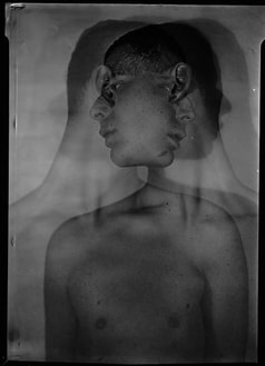
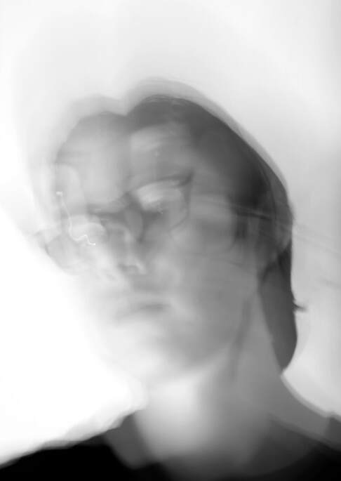
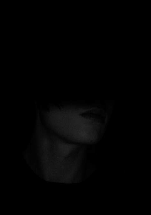
This is the second shoot for the abstract portrait task, in which i tried to develop on the first photos i took. I did this on the first photo by using a double exposure and adding to the blurred, overexposed effect that i had made in the first shoot. However, i think i still prefer the original photo. I developed on the second photo by using a dark background which makes the photo look like it is less exposed and i like how you cannot see anything other than me. I also changed the shadow to cover the top part of my face which makes it look more mysterious. The only problem is the quality of the photo since it was so dark.
|
|
Johnny Kerr
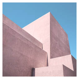
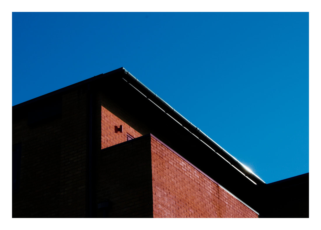
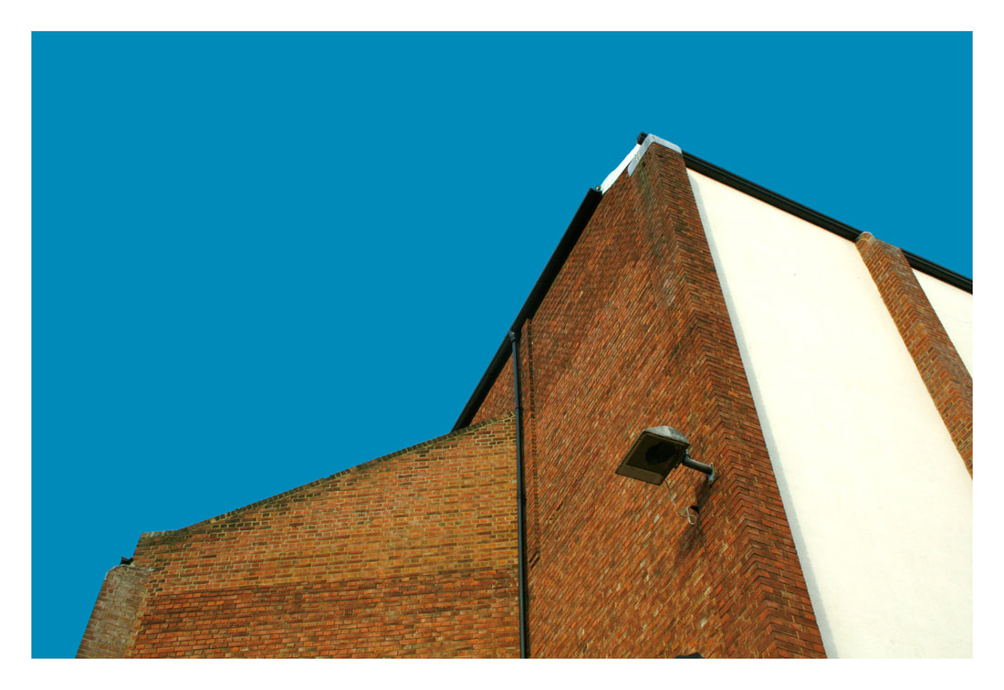
Johnny Kerr is an American Photographer who mostly photographs architecture. he is experienced in graphic design, and his photography reflects that. This is because of the minimalist style that he creates, as well as the use of lines and geometric shapes. He is based in Pheonix, Arizona which means that he is able to use the blue sky in most of his photos.
|
|
|
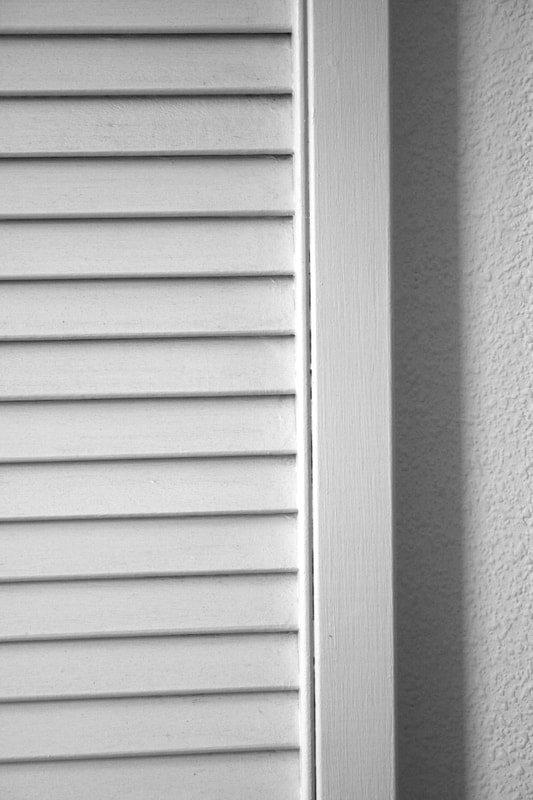
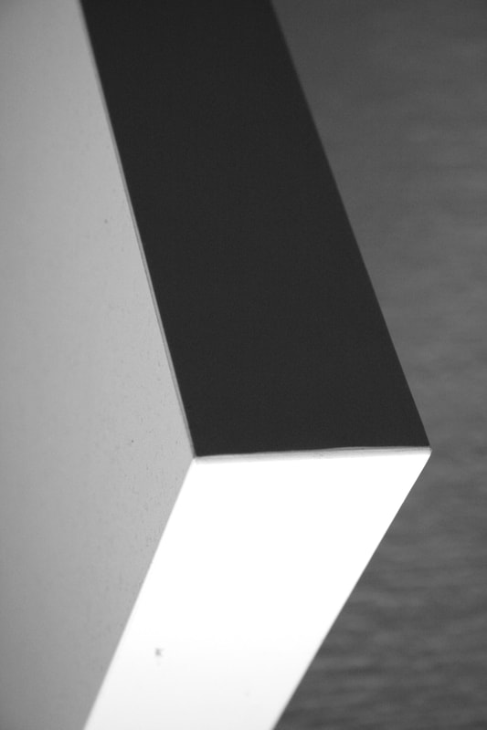
These are my photos in response to Johnny Kerr's abstract, minimalistic photography. His work has sharp, straight lines with lots of contrast to define every line. My photos are all taken in my house and inhave tried to replicate the straight lines and contrast in my photos. I also tried to keep them as minimal as possible, just using smaller, cropped parts of the things in my house. My favourite photo is the one on the right of a shelf because it resembles his work the most as it is minimal and has high contrast. Also, because you cannot see what it is in the photo since i rotated the photo. Below are the edited photos which have been coloured with block colours, and kept the outline. This was to make the photos more similar to Johnny Kerr's photos as they have vibrant colour and have sharper lines. For each photo, i kept the colours the same to show different shades.
|
|
|
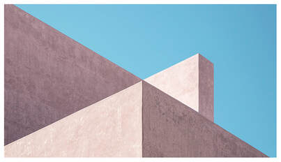
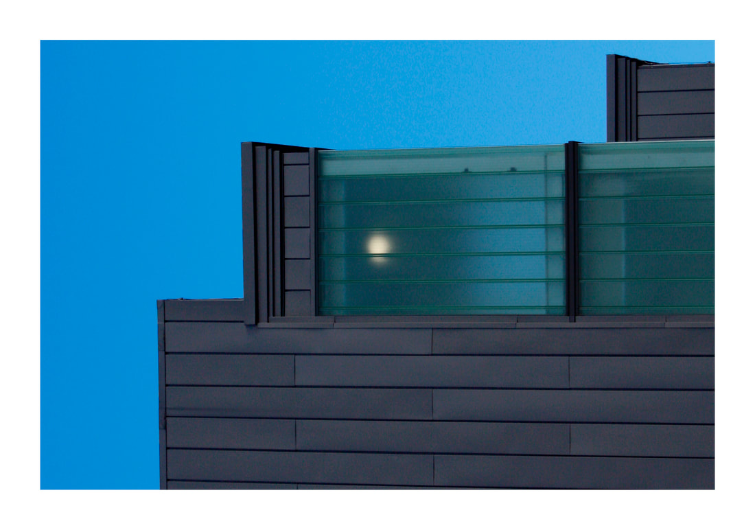
Matthieu Venot
Matthieu Venot is a photographer who is quite similar to Jhonny Kerr. They both shoot quite minimalist photos of buildings with bright blue skies, creating geometric shapes and unique compositions. They also both over expose their photos, making them less contrasted and more bright. They are slightly different because Venot focuses on colour while Kerr uses more grey buildings. The photos at the bottom are my edits of the original photos, which have been changed to block colours. This is so that the shapes are more defined and geometric. The colours in each photo are the same but with different shades.

|
|
|
|

|

|
|
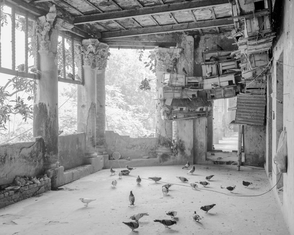
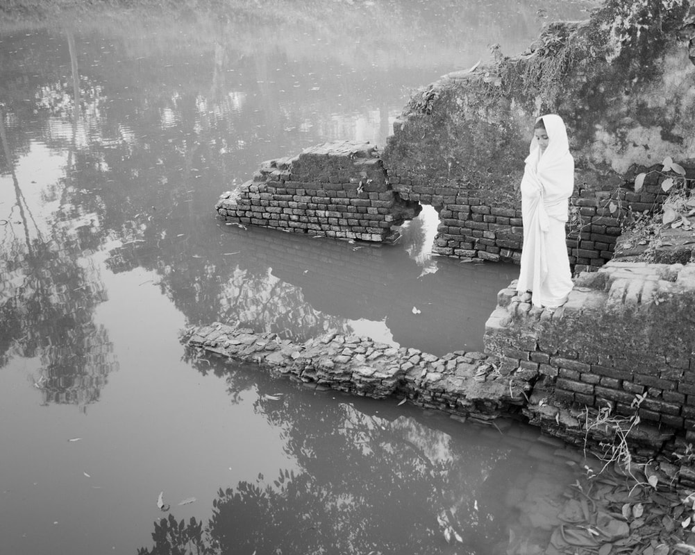
Sarker Protick
Sarker Protick is a Bangladeshi photographer who's work focuses on subjects of temporality, materiality of time and the metaphysical prospects of Light and Space. He creates videos displaying his photos with audio and text.
|
|
|
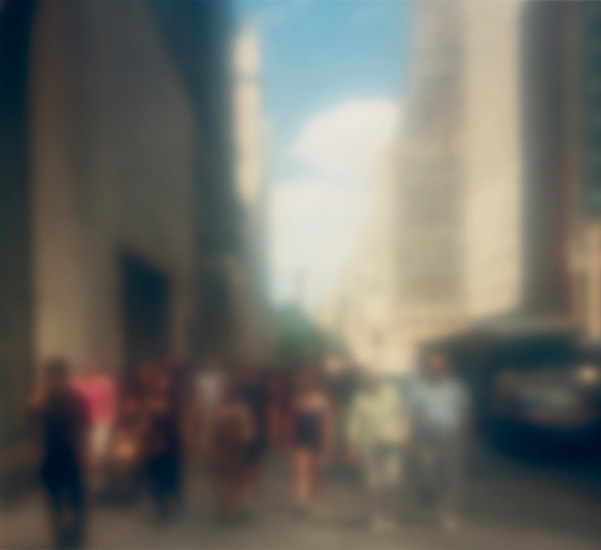
For this task, i was required to create a video including photos from the daily environment in lockdown and on walks. These photos were supposed to show the things you see every day, but never notice as something substantial. We also were told to take the photos in different, more abstract ways than usual, like blurred or out of focus photos. I edited these photos, giving them high contrast or even no mid tones at all. This is suggesting the tedious life in lockdown. In my video, the photos on screen begin to change into more colourful and less lifeless than the images at the start. This contrast is showing that we can see beautiful things when going on walks or exercising. I also gave the video a quiet rubbish truck audio, because i thought it fit both contexts as you hear it inside and outside.
|
|
|
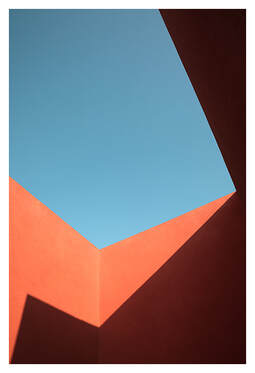
Three Strands
Johnny Kerr development
|
This is the first strand out of three, and it is a development on Johnny Kerr's minimalist style photography. the first time we did this task, the photos were taken indoors on smaller parts. This time i took the photos outside of buildings like Johnny kerr. Also, the first time, we edited them with block colours, creating a different photo entirely but this time, have just edited the sections and increased the vibrance of the colours. From the original photos on the slideshow, the colours have been enhanced a lot, especially the blue sky. The photos are all taken of buildings with straight and geometric shapes, and i focused on achieving an interesting negative space. My favourite photo is the photo on the right. In this photo, i did change the sky into a block colour since there were clouds, but i think it looks good and works with the colour of the building. This photo looks more like a drawing than the others which is why i like it.
|
|
|
|
|
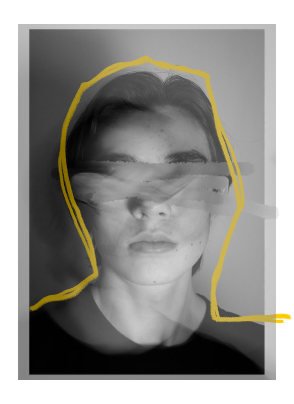
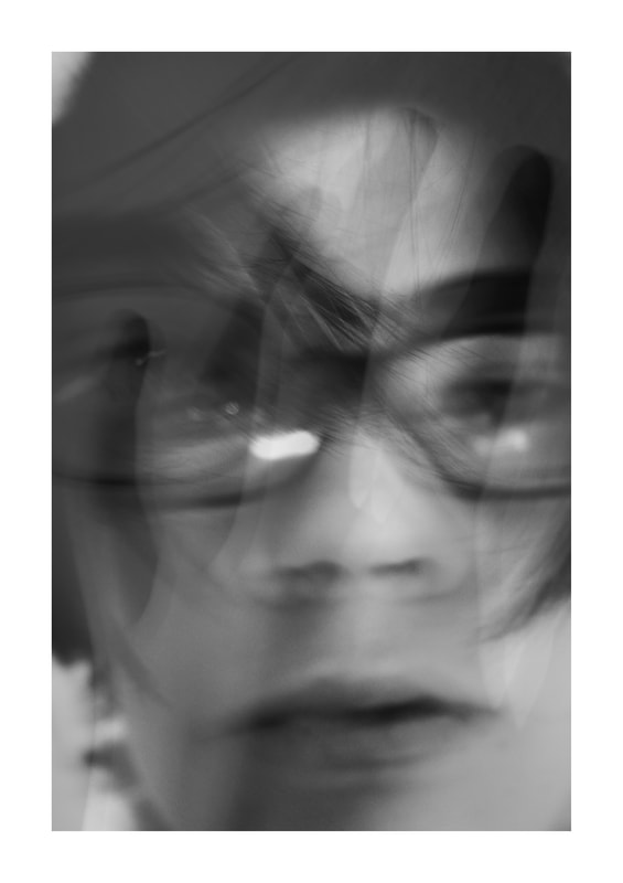
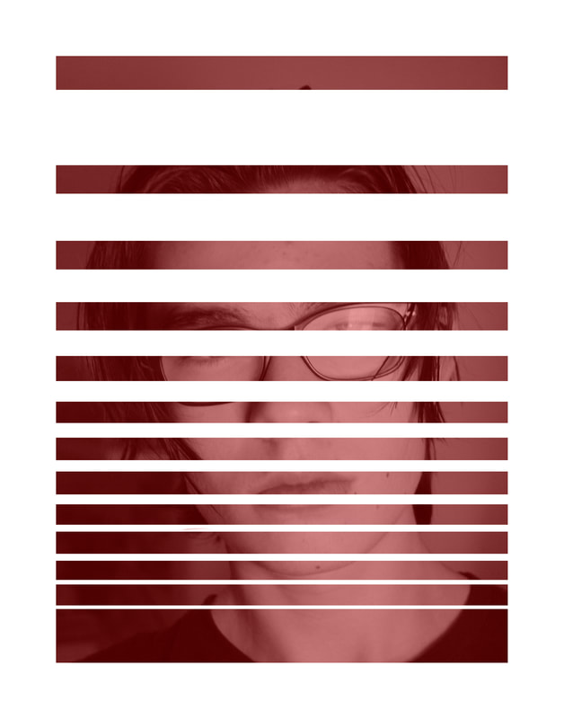
Bill Jacobson development
|
This second strand is a development of Bill Jacobson's abstract photography, however i have created abstraction through editing in photoshop. I prefer to do it this way because there is more freedom, and unlimited ways in which i could distort my face, such as double exposure. The first photo is similar to Ben Watt's style of collaging and drawing onto the photo. I had no plan of what i would do. First, i made a double exposure of the original photo of my face and a blurred photo. I also blurred my eyes out to distort the photo and drew a rough yellow outline. The middle photo is my favourite because it is quite different to the others and doesn't have an ordinary composition for a portrait. It has multiple different blurred photos on top of each other, creating a disorientating effect and also, looks like i am behind glass. The last photo is a photo tinted red wit white lines obstructing my face. I liked the idea of using the border in the photo, and it looks like the photo is split up into sections which get smaller.
|
|
|
|
|
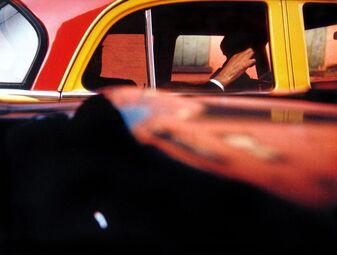
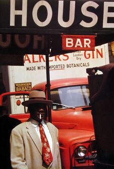
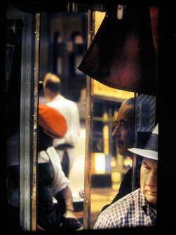
Saul Leiter
|
|
|
|
|
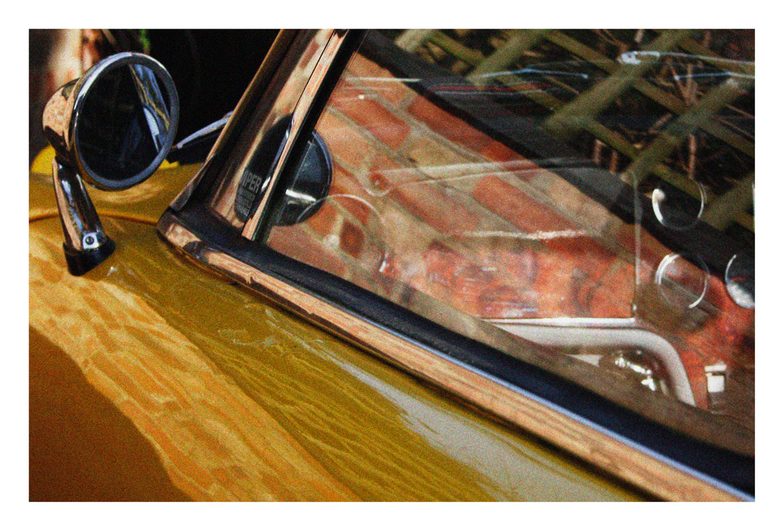
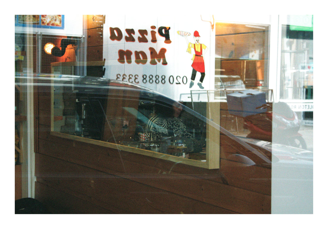
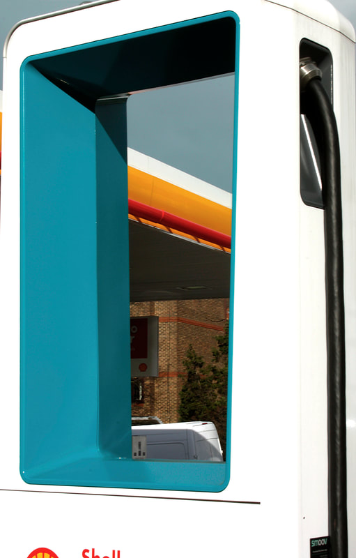
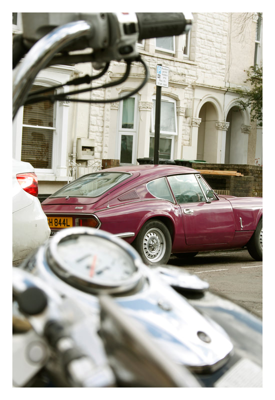
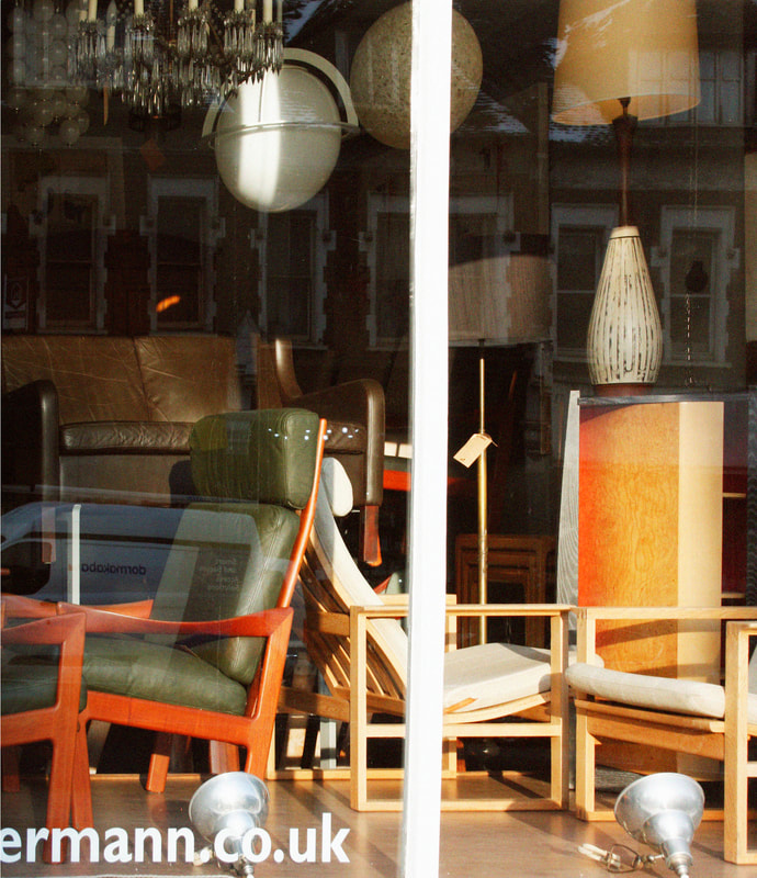
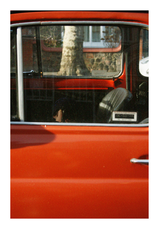
This is my 3rd strand in response to Saul Leiter's photogrpahy. I haven't done a task on him this year, but i did do one in a previous year, therefore this is a development on that. Leiter uses reflection a lot in all of his photographs, and tries to create different layers of reflection. His photos will often have parts of the image with no reflection and use lots of contrasting colours. These are things i have tried to add in this shoot. I think all four of my photos show similarities to Saul Leiter's since i have included reflection and interesting colour, however my favourite photo is the one on the bottom right even though it has less reflections show. This is because i think the composition is similar to one of his photographs, as the car window frames the shot. I also think the orange, old looking car has a good effect on the photo. I also like the bottom left photo because it has lots of reflection of the trees against the sky, as well as yellow, green and red parts. I edited all the photos in photoshop to make them look more like Saul Leiter's analogue photos, altering the colours and adding grain.
|
|
|
|
|

|
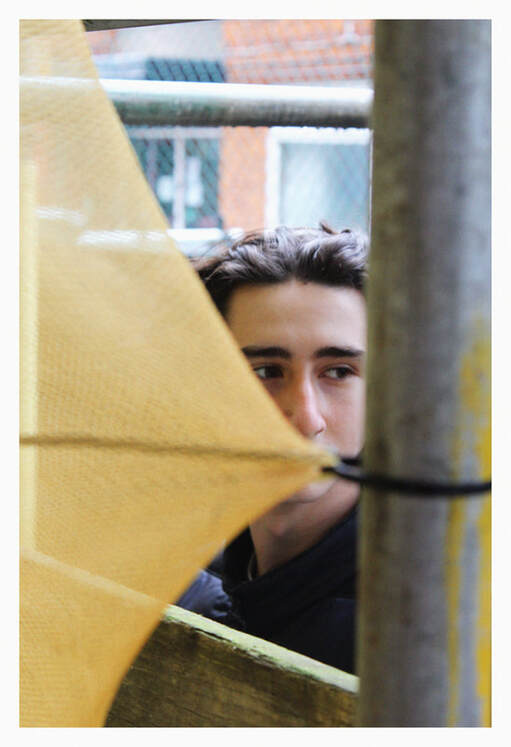
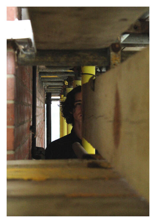
Saul Leiter development- Using model
This is a development on Saul Leiter's photography. he often uses things in his environment to frame his photos, such as car windows. he also likes to have people in his photos, often with only part of them in the frame, so for this development I used a model and took photos through existing frames made by things around me. In these, I only focused on the framing aspect and not reflection but I think the photos look good, and the frames make the photos much better and add a lot to the portraits.I like the photo on the left more as it is a more unique frame and isn't the same shape as a normal image.
|
|
Framing development
|
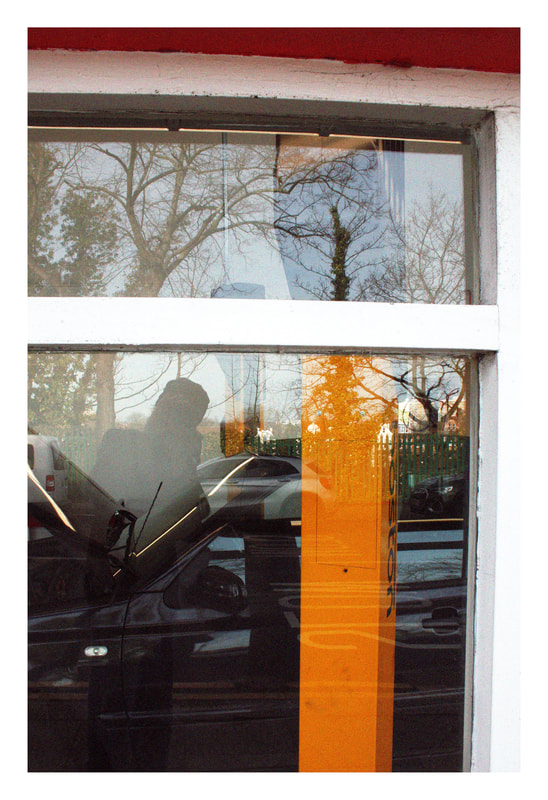
This development is still focused on framing, however I haven't used a model in this. They are mostly focused on colour and contrast. I like th photo on the left the most because of the contrast in blue, orange and red. Also, what I framed through makes the photo feel more futuristic changes the photo entirely. In the next development I want to use more unique frames and make the photos more abstract, using blur and focal length.
|
|
|
|
|
Develop
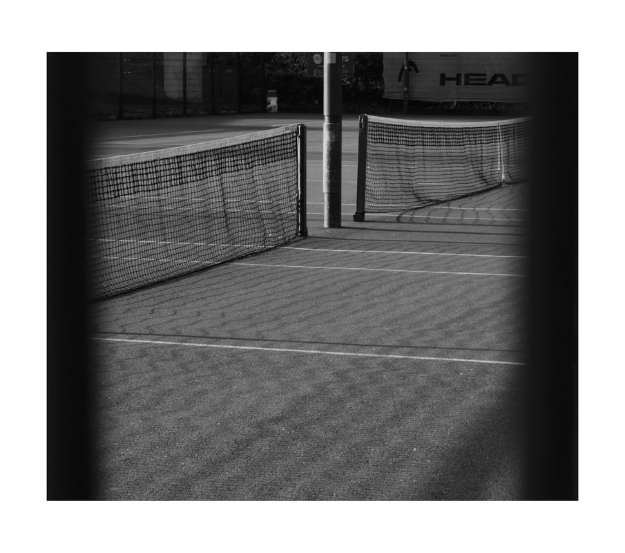
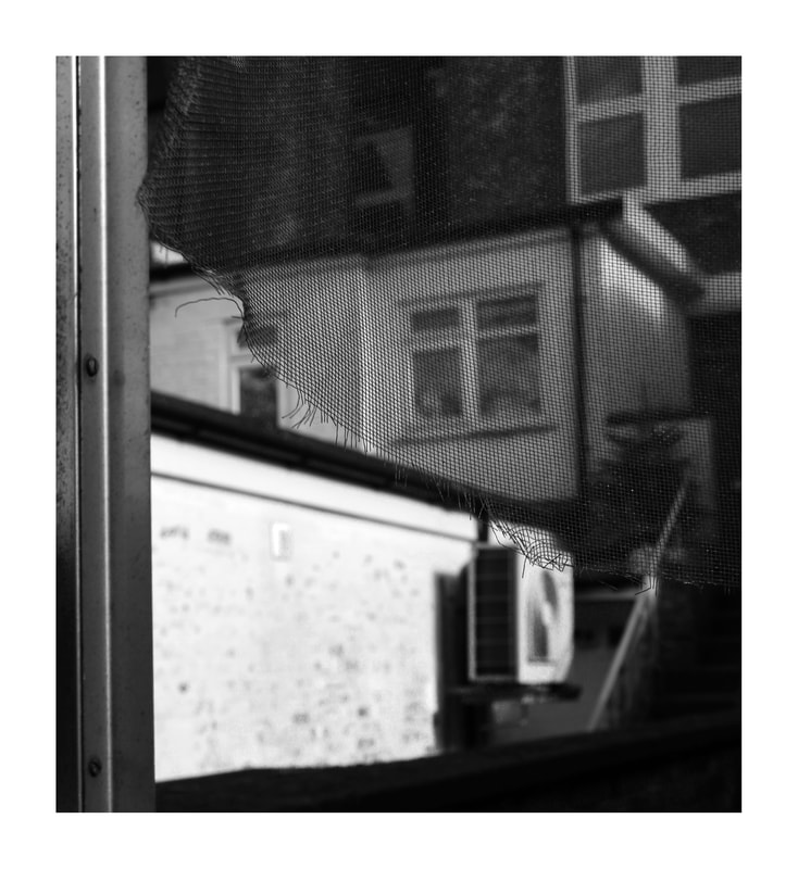
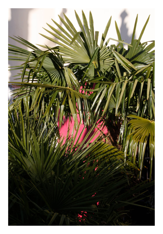
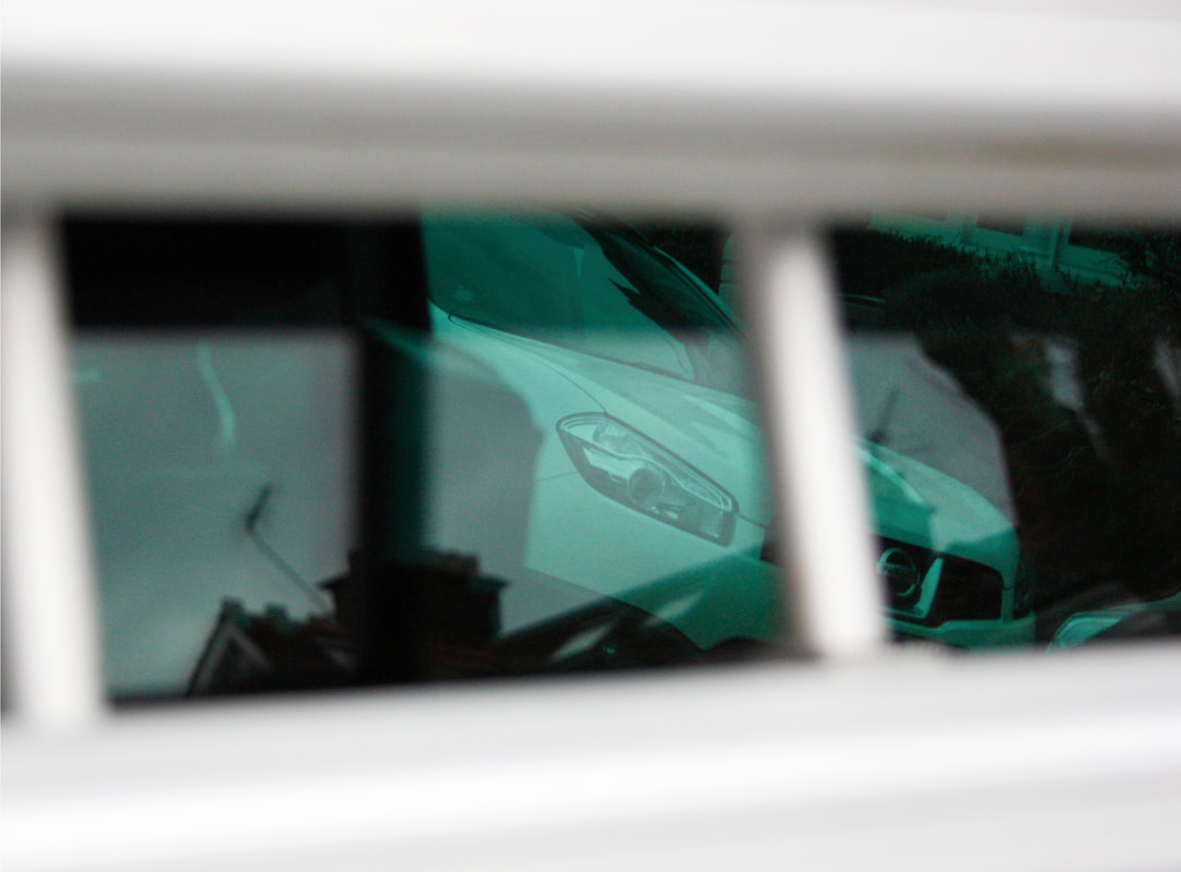
In this development, I wanted to take photos which were slightly more abstract and had more unique framing than in my previous developments. . For example, one of the photos has a netting that frames the photo, splitting it into two textures. I think this is an interesting use of framing. I also wanted to stray a bit farther from Saul Leiter in this shoot, and put use my own ideas. I made two of the photos black and white because I wanted them to be more focused on the idea of framing and shape than the colours. This is quite different to Leiter's work, as he uses colour a lot in his photos. One of the photos is in colour because I thought that it was essential since the colours complement each other and the green is framing the pink. Overall, I think this development has changed from the previous one because ei was focused on different ways of framing and they are more abstract.
|
|
|
|
Best Photos
|
|
|
|
|
