Exhibition visits
Whitechapel Art Gallery
|
|
|
|
|
|
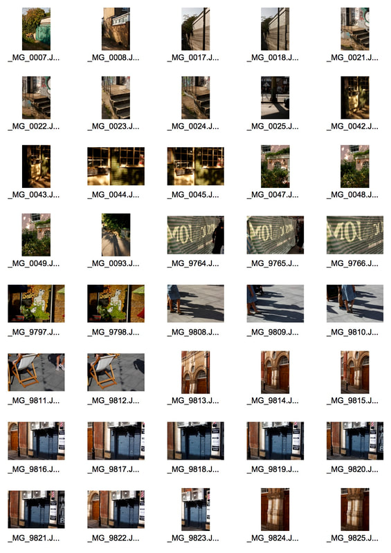
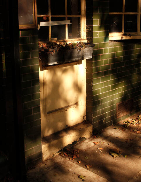
Light and Shadow
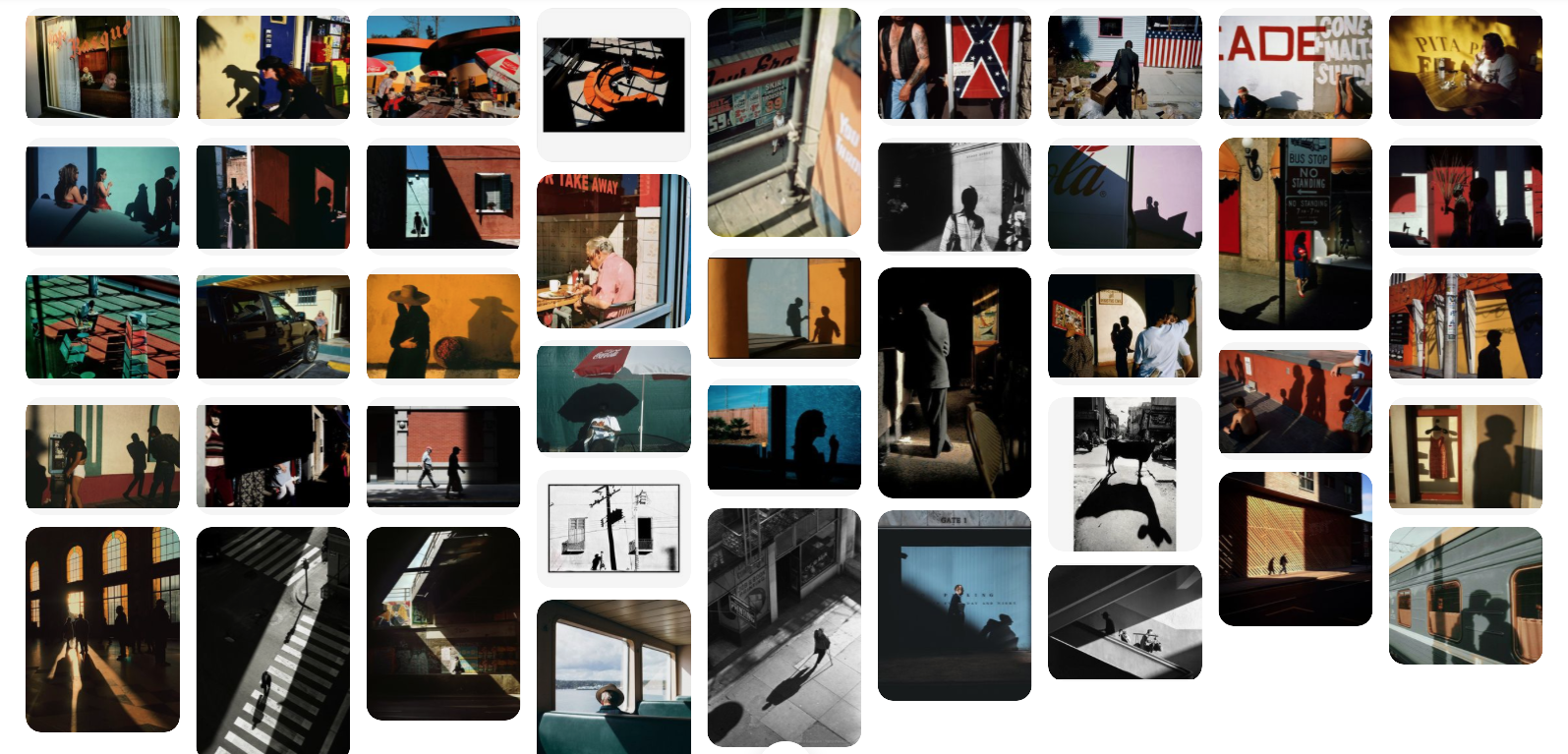
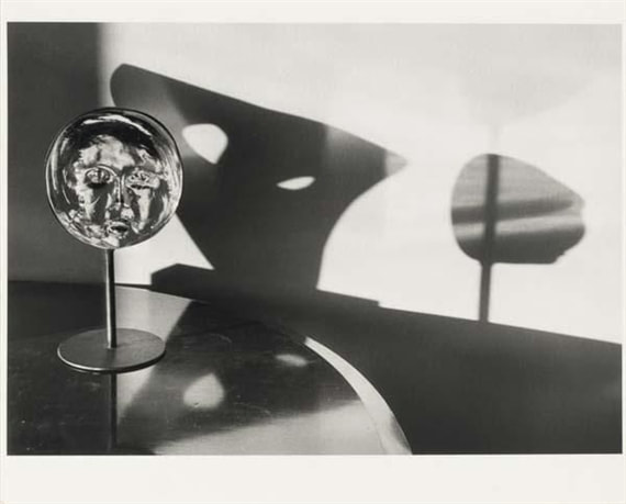
Harry Gruyaert
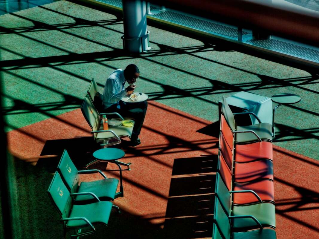
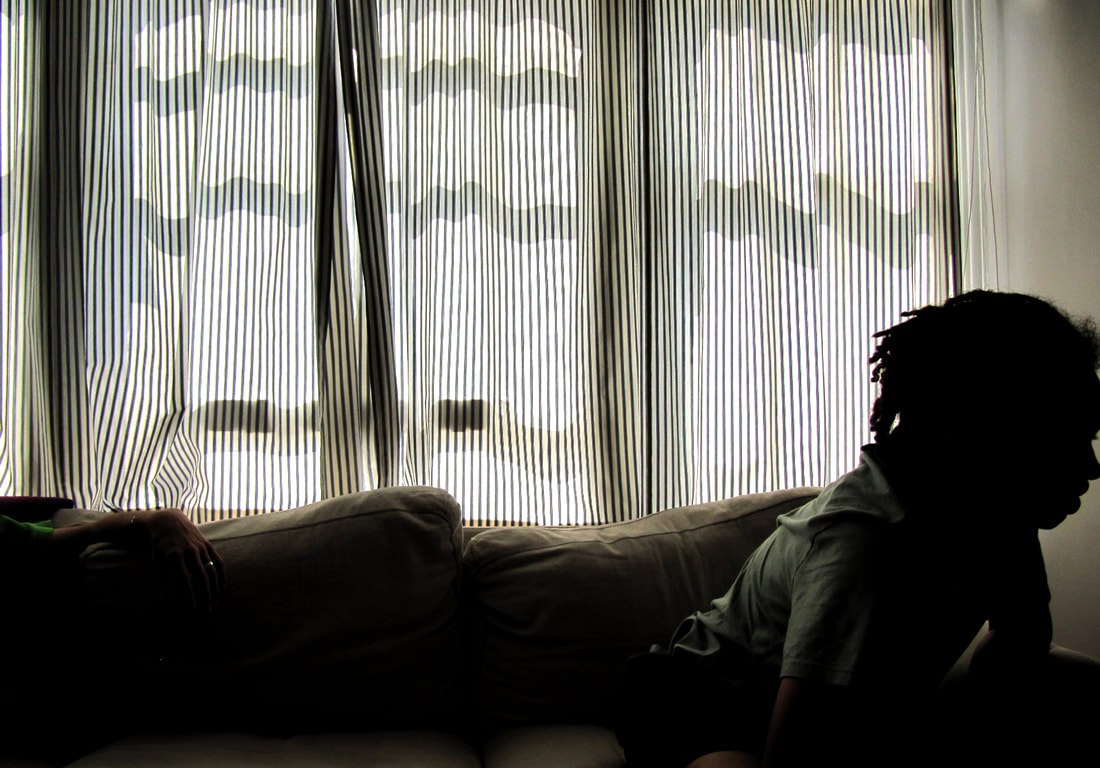
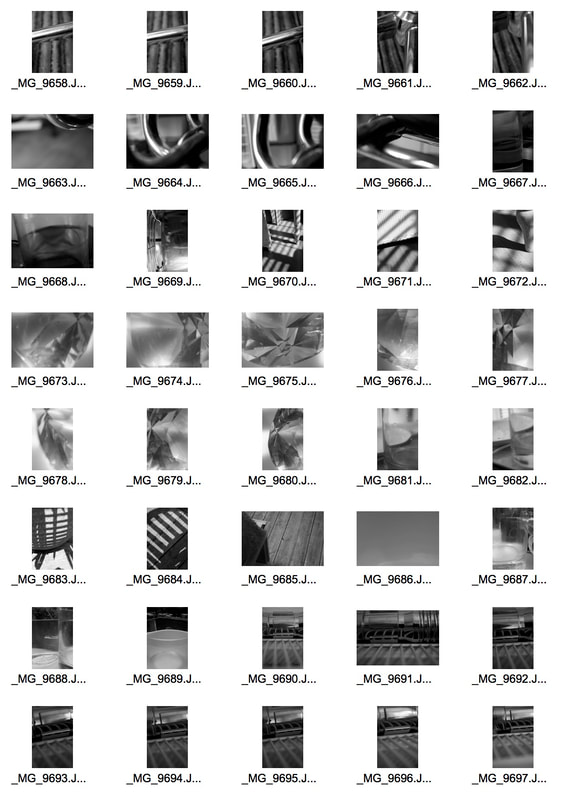
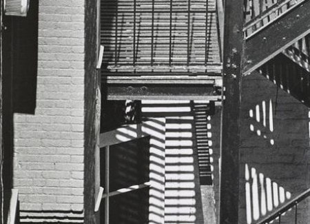
My first word is 'shadow', and i took inspiration from Harry Gruyaert as he is a photographer who uses shadow to his advantage to create very beautiful photos. He is a Belgian photographer who specialises in street photography, and he became famous from his colour photography and exotic style photos, however his use of shadows are what I find the most interesting. He uses light and shadow to add to beautiful photographs, for example, in the image on the top left, the shadow of the windows lays a pattern onto the floor and covers the whole frame. I also like how most of the photos include people, but they are never the main subject of the photo. The photo are usually focused on their surroundings, and the people are just passing through adding to the story of the photo. I want to achieve a similar style to his in my shoot.
|
|
|
|
My response
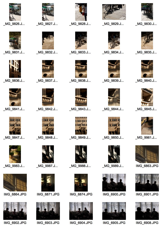
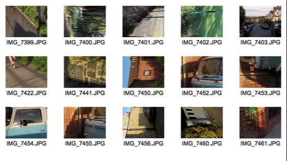
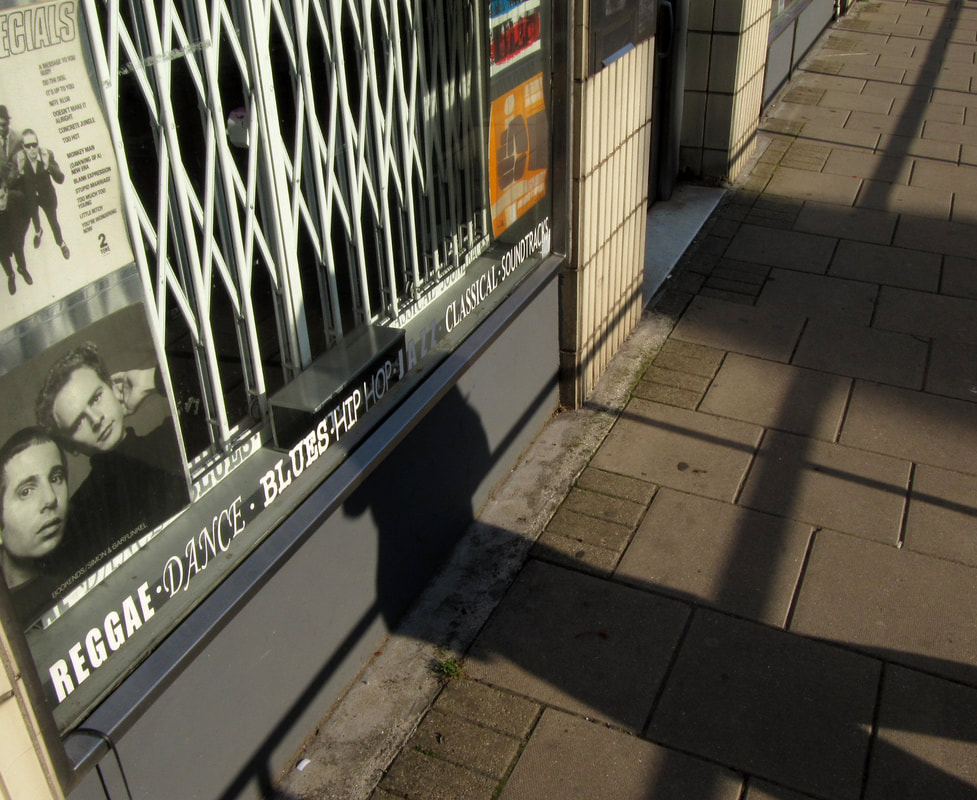
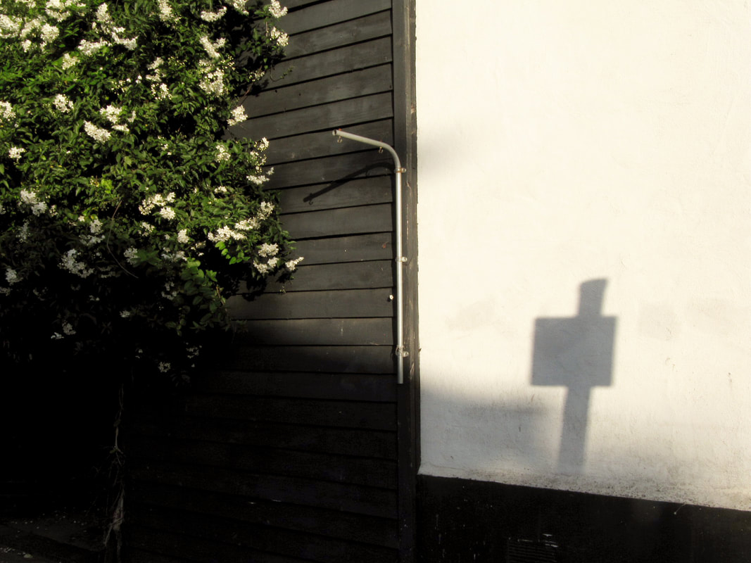
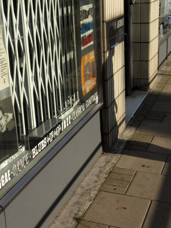
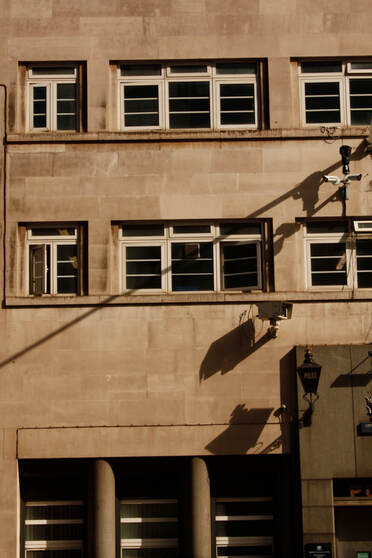
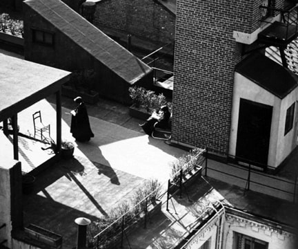
These are my final photos under my 'light and shadow' word theme. For this section, i carried my camera around with me evrywhere i went as i was shooting in a street photography style, shooting at random moments when i found a good subject with shadow. For some photos i was shooting from the hip in order to capture photos while moving. I am happy with the range of photos and the style of them all, and as i was shooting in late afternoon, the colour in the photos is similar to Gruyaert's. Though some of the photos do have people in, or their shadows, i wish i had been able to get more, as they always make the photo more interesting, like in Gruyaert's photos. My favourite two photos from this section are the photos outside the record shop as their are lots of different textures in the photos, lots of shadow, nice colour and also both have shadows of people walking past.
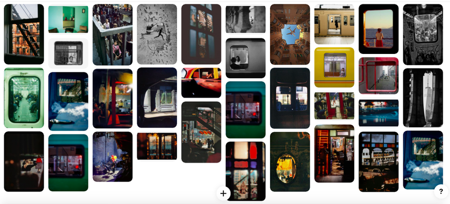
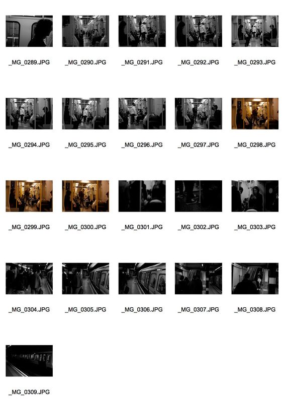
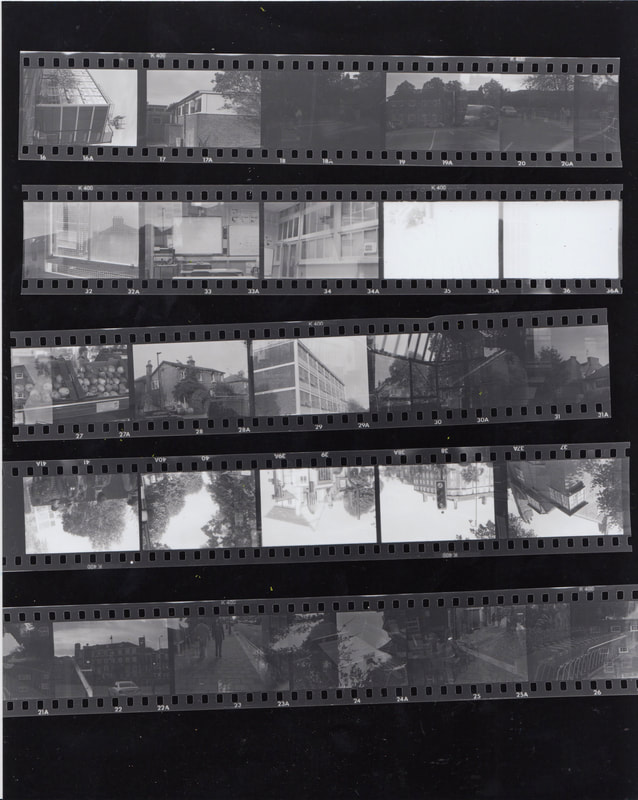
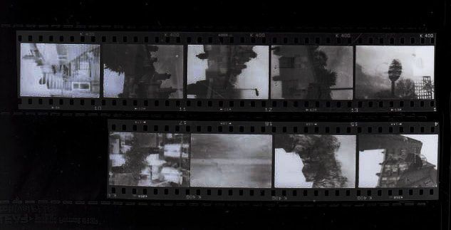
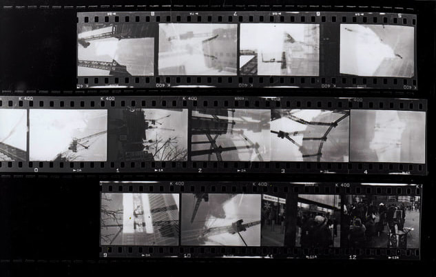
Contact sheets
|
|
|
|
|
|
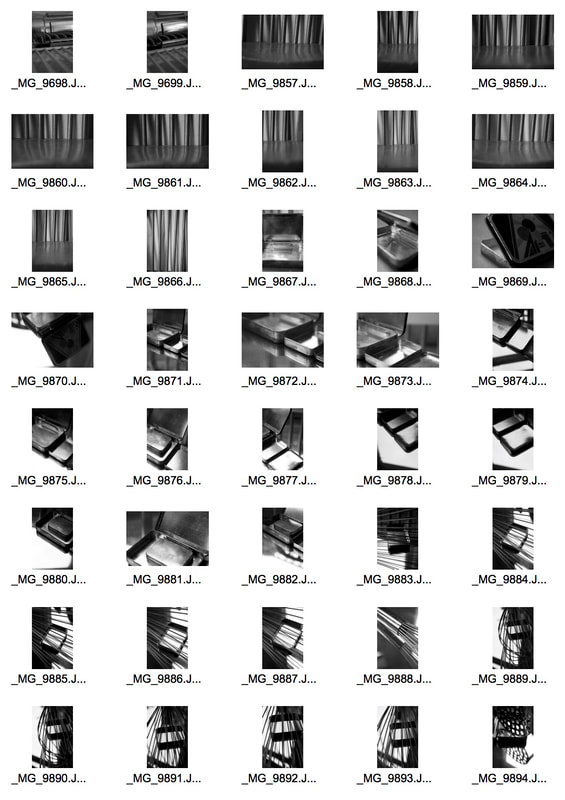
There is quite a variation of ways I incorporated light and shadow into these photos and some of them had a good outcome, but I don't think there is much potential to develop this theme.
Depth
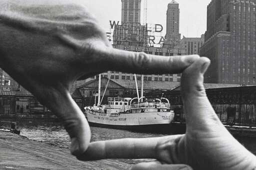
'Hands Framing New York Harbor' - Shunk Kender 1971
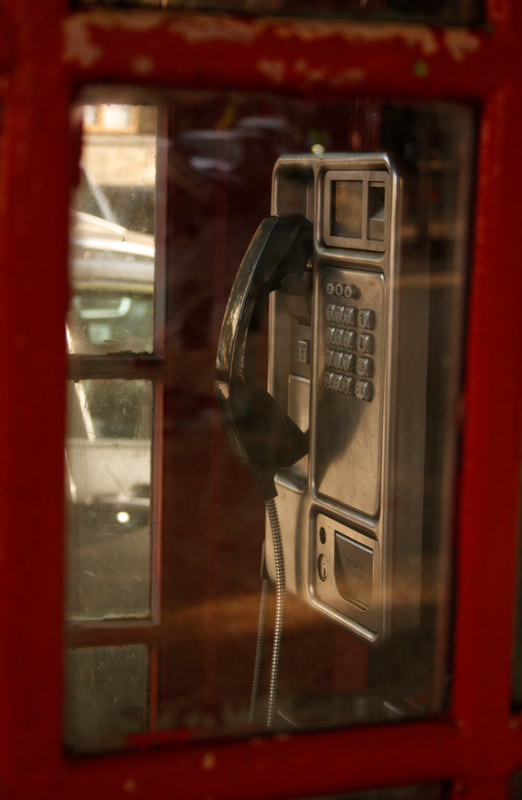
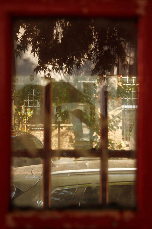
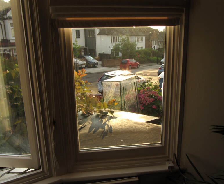
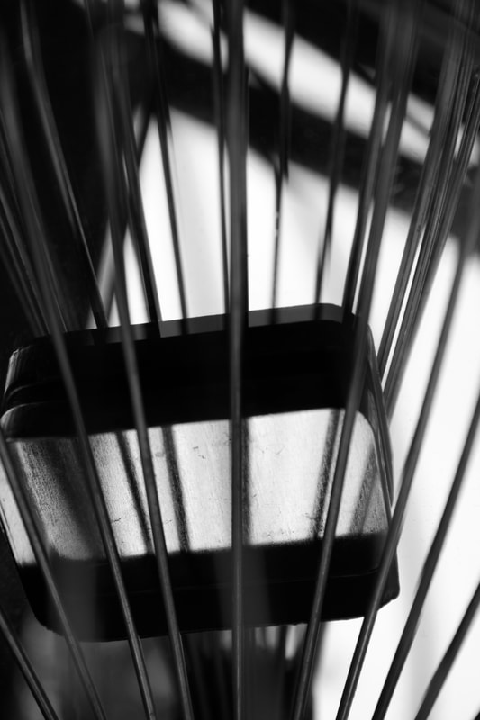
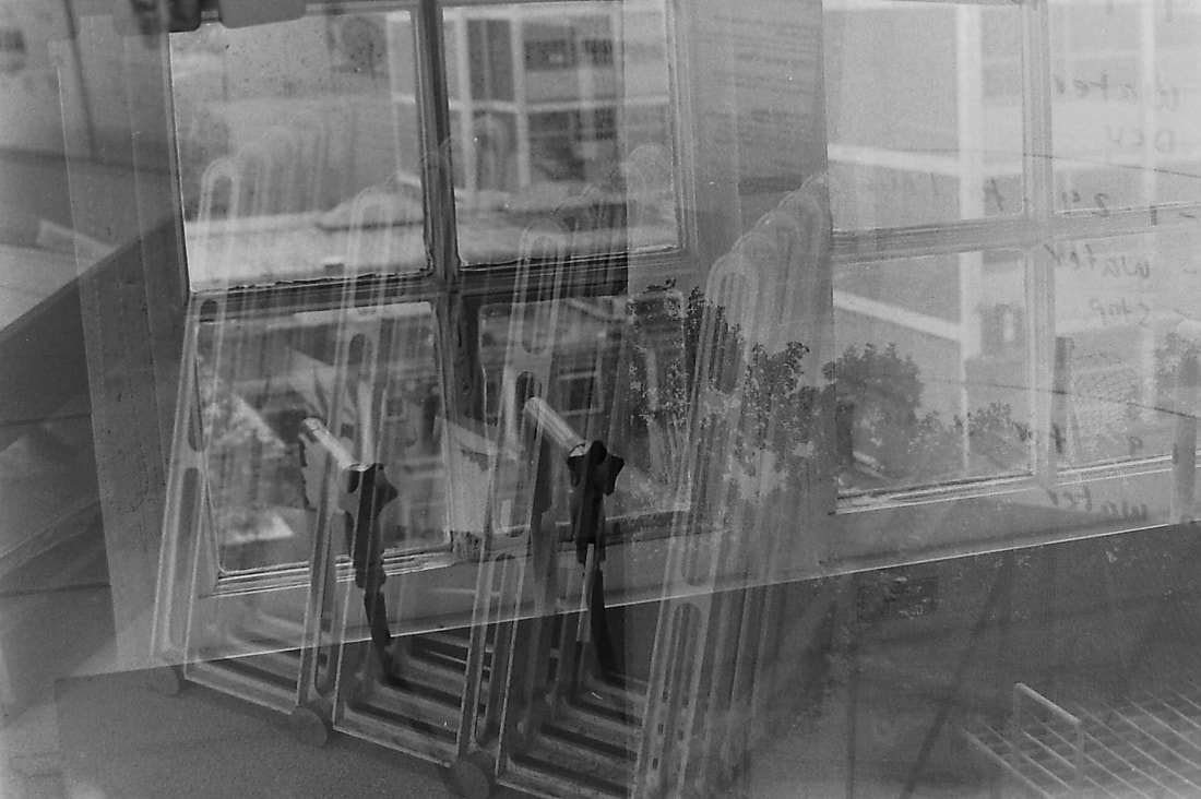
In this section, I wanted to create depth in the photos by including blurred foreground subjects and background subjects. This meant that I was shooting mainly with sub-frames. Sub-framing is when you use something in the photo, like a window, to frame something else. This was partly inspired by the photo by Shunk Kender, which shows the photographers hands framing a boat in a harbour, while you can still see the surrounding scene. The photographer was trying to display the idea that, in photography, we are able to choose what we capture, out of everything in sight.
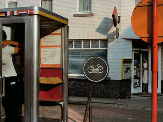
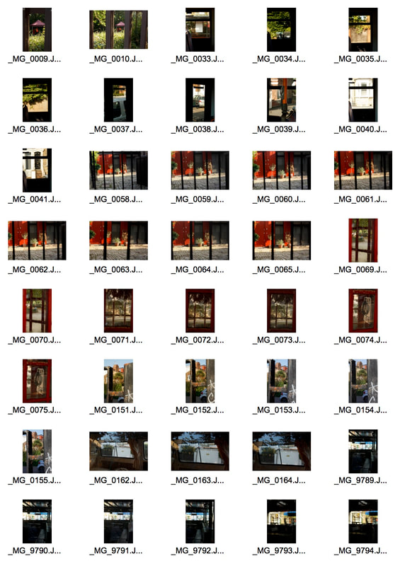
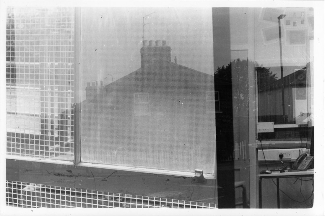
Sub- framing is something I have done before, and it's surprisingly difficult because its often hard to get the right timing and have a good subject through the frame. In three of my photos, the frame is good, but it's not too interesting as their is no clear subject. This means that the top left photo is my favourite, because there is a clear subject, which is the telephone. I also really like how the sub-framing affects the photo, because it gives context on what type of telephone it is, and the slight reflections on the glass add to create depth in the photo.
Sub- framing is something I have done before, and it's surprisingly difficult because its often hard to get the right timing and have a good subject through the frame. In three of my photos, the frame is good, but it's not too interesting as their is no clear subject. This means that the top left photo is my favourite, because there is a clear subject, which is the telephone. I also really like how the sub-framing affects the photo, because it gives context on what type of telephone it is, and the slight reflections on the glass add to create depth in the photo.
|
|
|
|
|
|
|
|
|
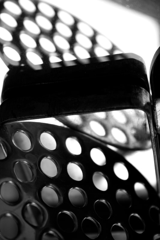
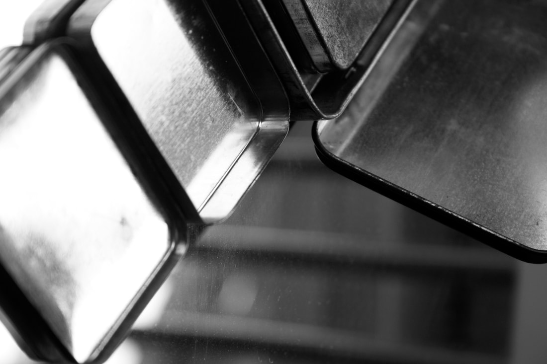
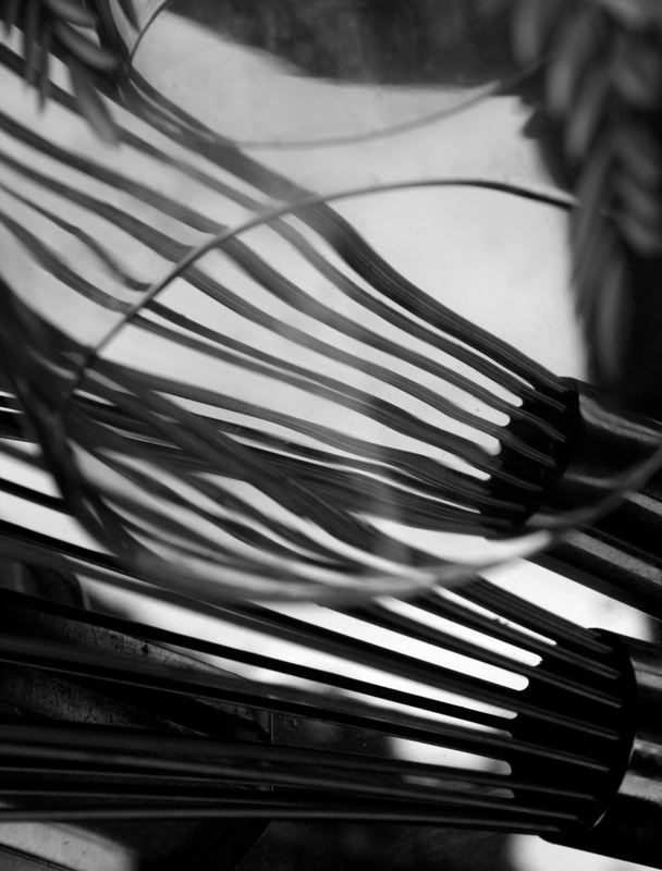
Perception
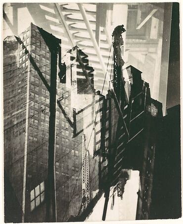
Andre Kertesz
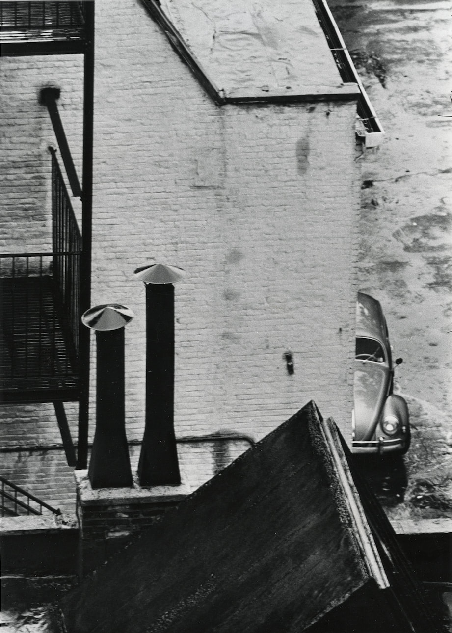
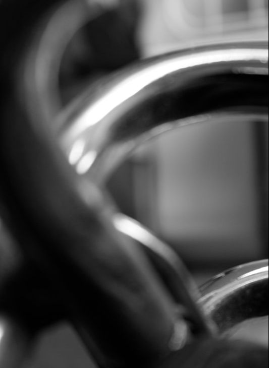
Andre Kertesz was a photographer who worked in the 1920s- 1950s in both still life and city- landscape photography. In both of these areas, his photos are recognisable as they are usually very hard to understand or grasp what you see in the photo. This is because of the strange compositions and subjects that he likes to shoot. For example, in the photo on the left, we know that there is a car, chimneys and walls but it is hard to understand where everything is in proportion to each other. This is because of his composition. He chooses a small frame instead of showing us the big picture. There are also other aspects that contribute the confusing photos, like use of reflections or shadow. This is because shadow and reflection can be distorted, like in the two photos on the left. With this style of photography it is all up to the perception of the viewer and their reading of the photo.
|
|
|
|
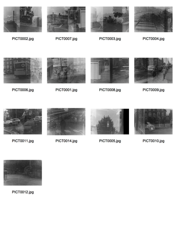
My response
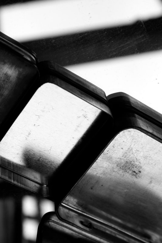
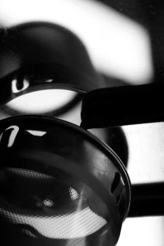
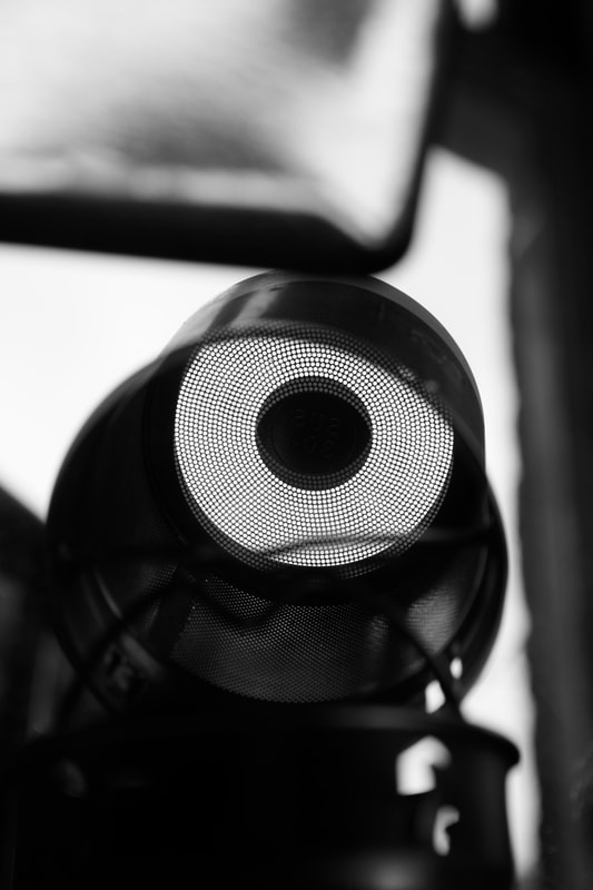
This is my response to 'perception'. In this task, i experimented with different ways to achieve a confusing photo, and found that there are some things that help to do that. For example, using reflection and metallic objects to shoot with. This makes it hard to understand where the subject is and where you are viewing it from. I also helps to shoot in black and white as colour can sometimes reveal the objects and distract you. It makes it easier to just focus on the shape and form in the photo. i also rotated some photos to make it even harder to grasp. This was my favourite word to work on and i want to develop it further.
|
|
|
|
|
|
|
|
|
|
|

|
Research 1: Defining perception
The very obvious definition of perception is the sensory experience of the world. How you perceive the world through sight, smell,sound and taste.
However, it is he way we interpret that sensory information that affects how we interact with the world. We all interpret and interact with these things differently due to our own experiences and past. This is the main theory that I'm interested in, in terms of 'perception'. How every person has a different view and perception of a photo, painting, film because of their circumstances.
Research 2: Thomas Vanoost
|
|
|
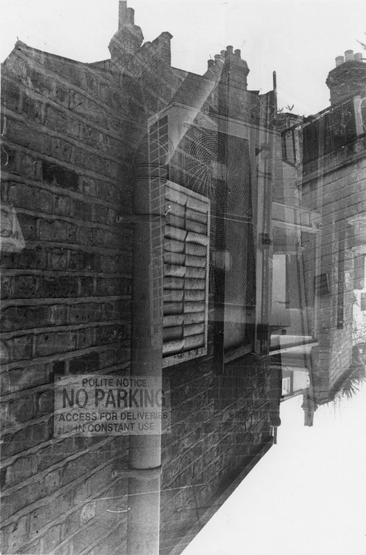
Thomas Vanoost is a Belgium photographer who loves to explore notions of chaos, time and instability. He does this with double exposure photography. He often takes photos of very live places with moving people, and then exaggerates that with his double exposures. I see his style of photography as an opportunity to develop the idea of perception in photography. In his photos, the two exposures are always from slightly different angles or distances. This could be different points of view from different people and expressing the different ways people look at things. Everyone has a different view. Also, the photos are quite difficult to perceive, which comes back to my first development about confusing photos.
Research 3: Andre Kertezs architecture photography
I have talked about Andre Kertezs before, however that was more about his still life photography. This time I'm focused more on his architecture and outside world photography. He manages to create abstract and confusing photos even outside where he can't manipulate the subjects. I think he does this by often focusing on small parts of a landscape, often in-between multiple places. He leaves no negative space so that we cannot grasp the distances or placements of things. I find this very interesting because I feel like I already do this naturally when I take photos since I always focus on the details of a landscape. There are also other ways that he creates these images. He uses shadows, reflection and lots of straight lines. The mix of all these aspects challenge the perception of the viewer.
|
|
|
Development 1: Double Exposure
|
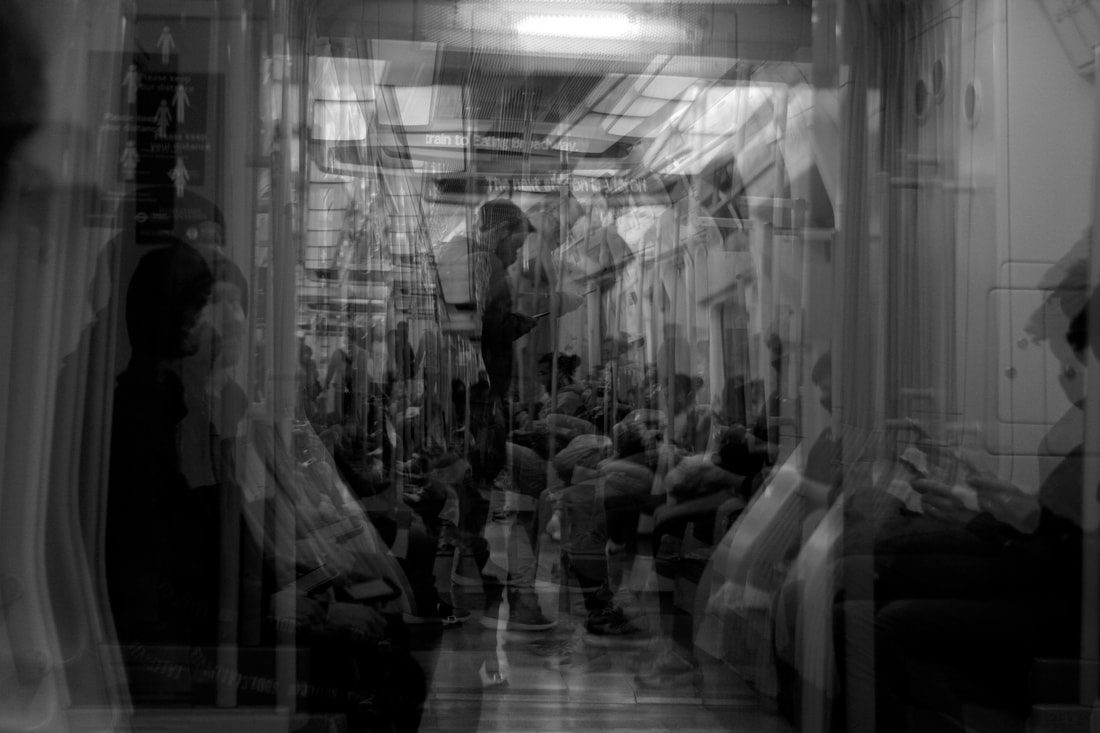
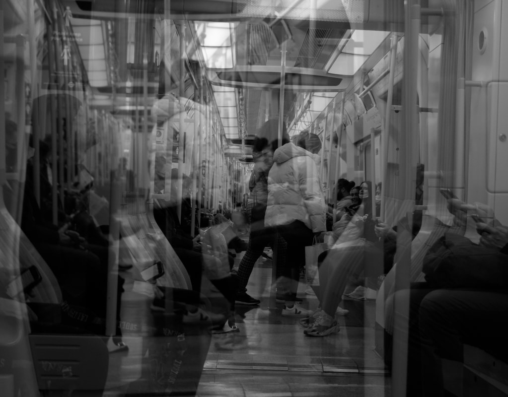
The idea of this development is inspired by my research into Thomas Vanoost's double exposure photography. His work tries to create a chaotic feeling but I wanted to use double exposures to represent different people's perception of one thing or place. It shows how people view things from different angles because of their experiences. By shooting in a busy place like a train station, I can capture different perspectives and we can try to understand how people's lives have led them to that spot. I think the photos are quite interesting and the idea has potential to look very good. If I develop it, I would want to shoot the exposures in a more strategic way and maybe use film and do it manually.
|
|
|
|
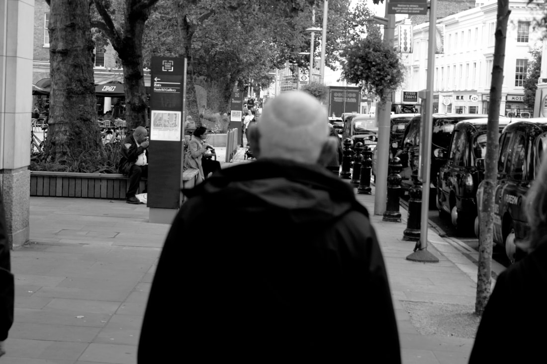
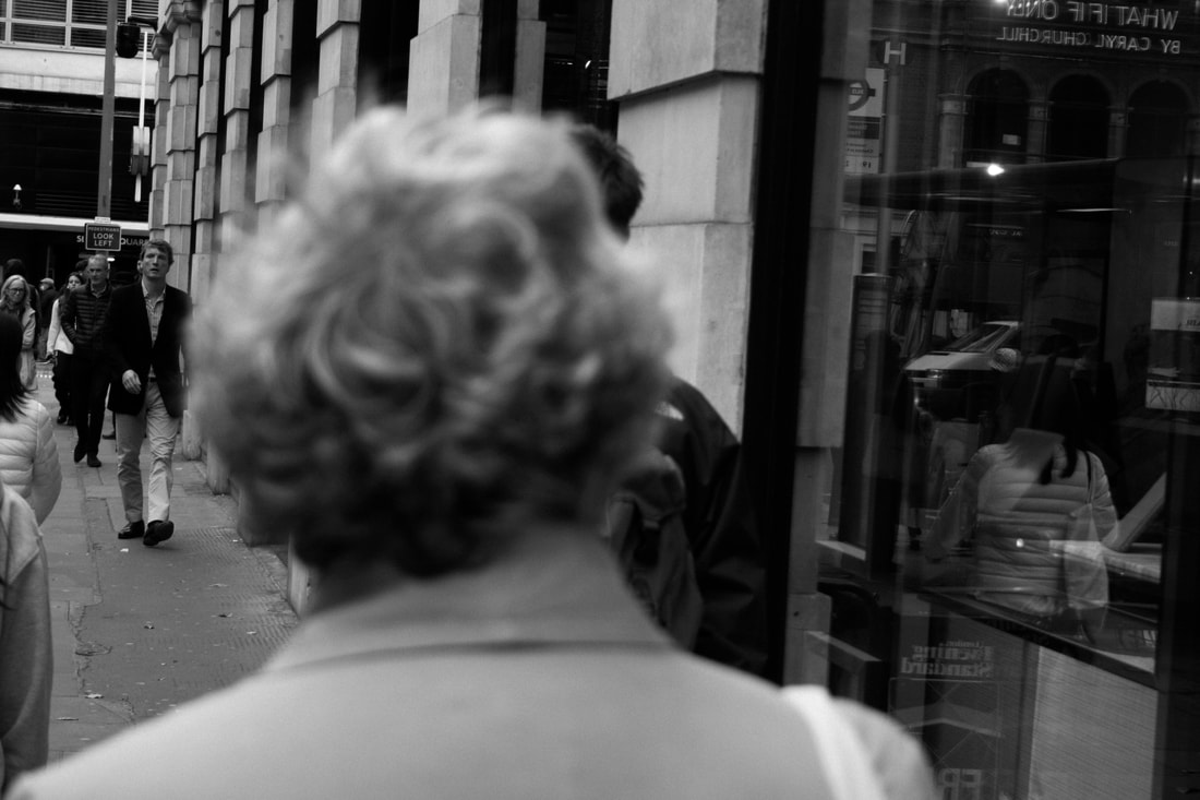
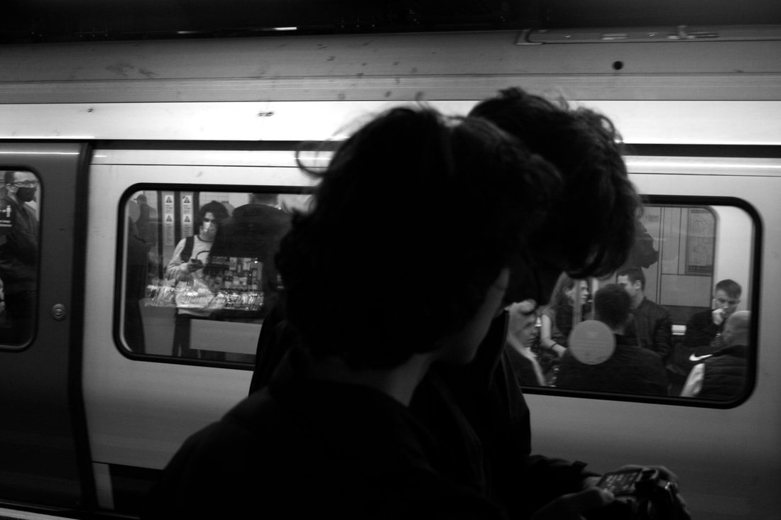
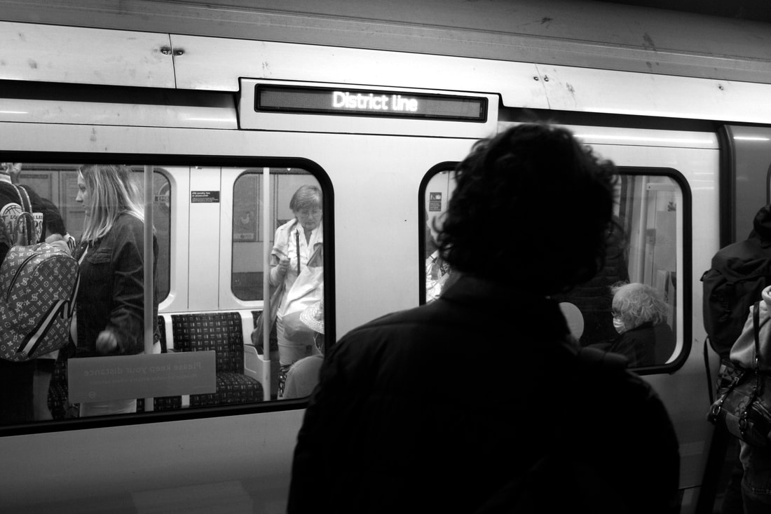
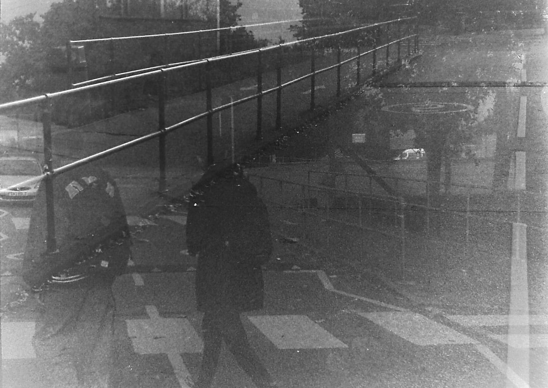
Development 2: Subject Out of Focus
|
For this development, I decided to shoot street photos, but play with perception by keeping the main subject out of focus and having the background in focus. I think this idea challenges the viewer's perception since they are used to seeing a main subject in focus. It also becomes slightly confusing because there are often people in the background who are in focus who begin to look like the main story of the photo. I think the best photo from this shoot is the one on the middle left because the background is very clear and there is a man walking towards the camera who could be seen as the main subject.
|
|
|
|
|
|
Development
|
|
|
|
In this development, I was trying to determine how I would shoot the double exposures. In the photos above, I was including close ups and wide shots in the same frame, and below I was shooting multiple shots of the same subject from different angles with people walking and moving through each frame. These were all shot in digital so that i could prepare for when i start shooting in film.
|
|
Development- Film test
In this Development, I was testing creating double exposures on film. I did this by shooting a roll and then putting it through the camera again, shooting new images in top of the old ones. I had to try to under expose each photo by a stop so that it wouldn't be too exposed since there are two images on each frame. This did work, however all of the photos were overlapping and not in line with each other. This meant that I only got one decent photo in the whole roll.
|
|
Development- Film test 2
This is a second test for double exposure on film. This time I used a different technique where I only ran the film through once, but for each shot I winded it back onto the last frame. I think this works a lot better because you can choose both frames without having to remember the order of the photos. This is essential for when I take street photos. This roll had a few more successful photos but the frames still overlapped in some places. From the successful photos I can tell that double exposures look much better on film than digital. My favourite from this roll is the photo on the top lef
|
|
|
Development
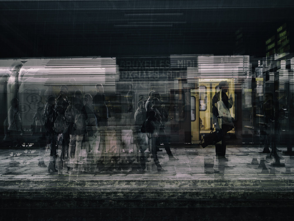
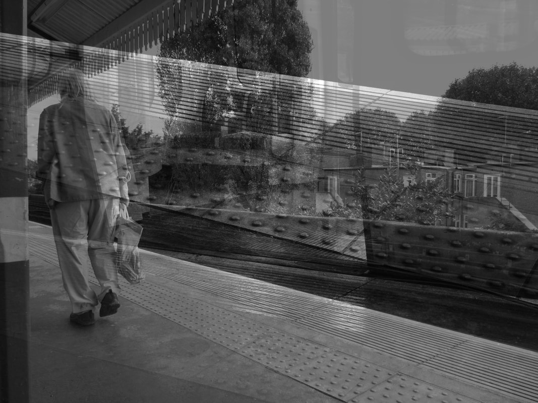
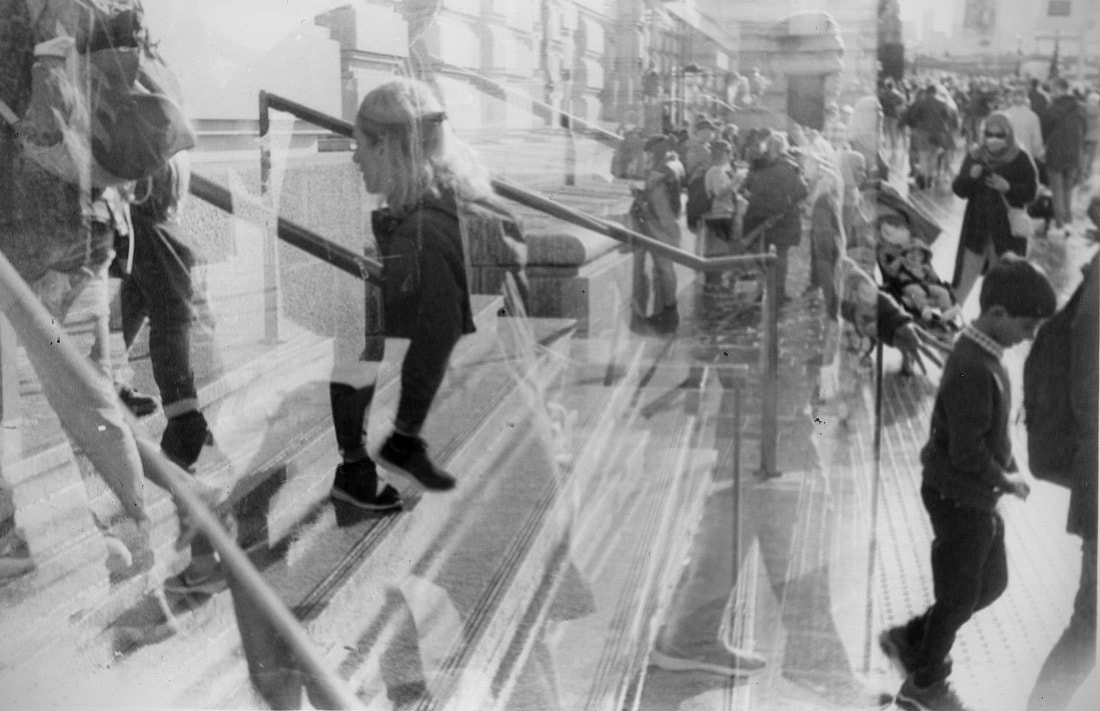
In this development, I was taking double exposures of street photos on film, using the techniques from the tests i did before. However, while taking this roll, i took some normal, single exposures in between the double exposures. This means that the the photos won't overlap as much and you can get clearer double exposures. In each double exposure, I was trying to represent multiple peoples' points of view in a busy place. Each frame is someone's perception of a place and I wanted to show how each person's perception is different. I also like how the busy scenes create chaos and confusion. The best photo from this development is the one in the middle left as it appears the most busy and is clearly taken from two separate angles or perspectives.
|
|
|
|
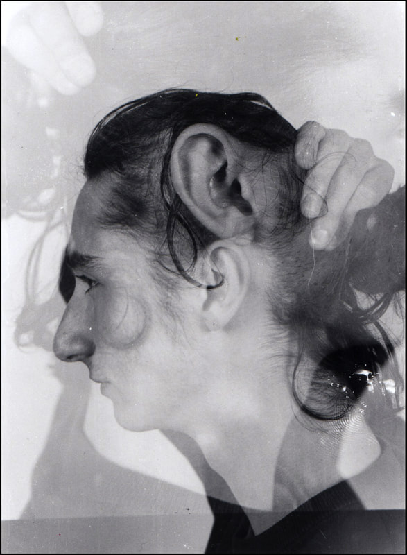
Portrait development-Walker Evans
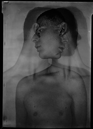
This is a photo by Walker Evans, a famous photographer from the 1920s. It is a double exposure of a person looking in two
directions. I really liked how the double exposure distorted his face and body, and emphasised on things like his ears.
I thought that this related to my 'perception' theme as it could show how someone perceives them self. People have
insecurities and see themselves' in a distorted way and i think the double exposer could display this.
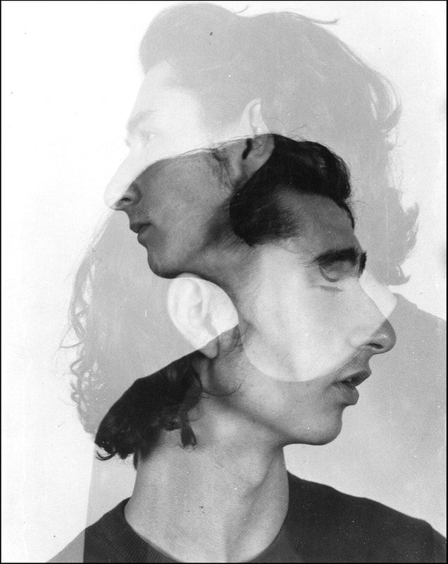
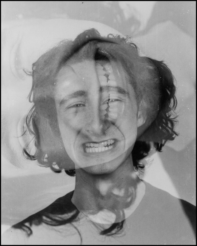
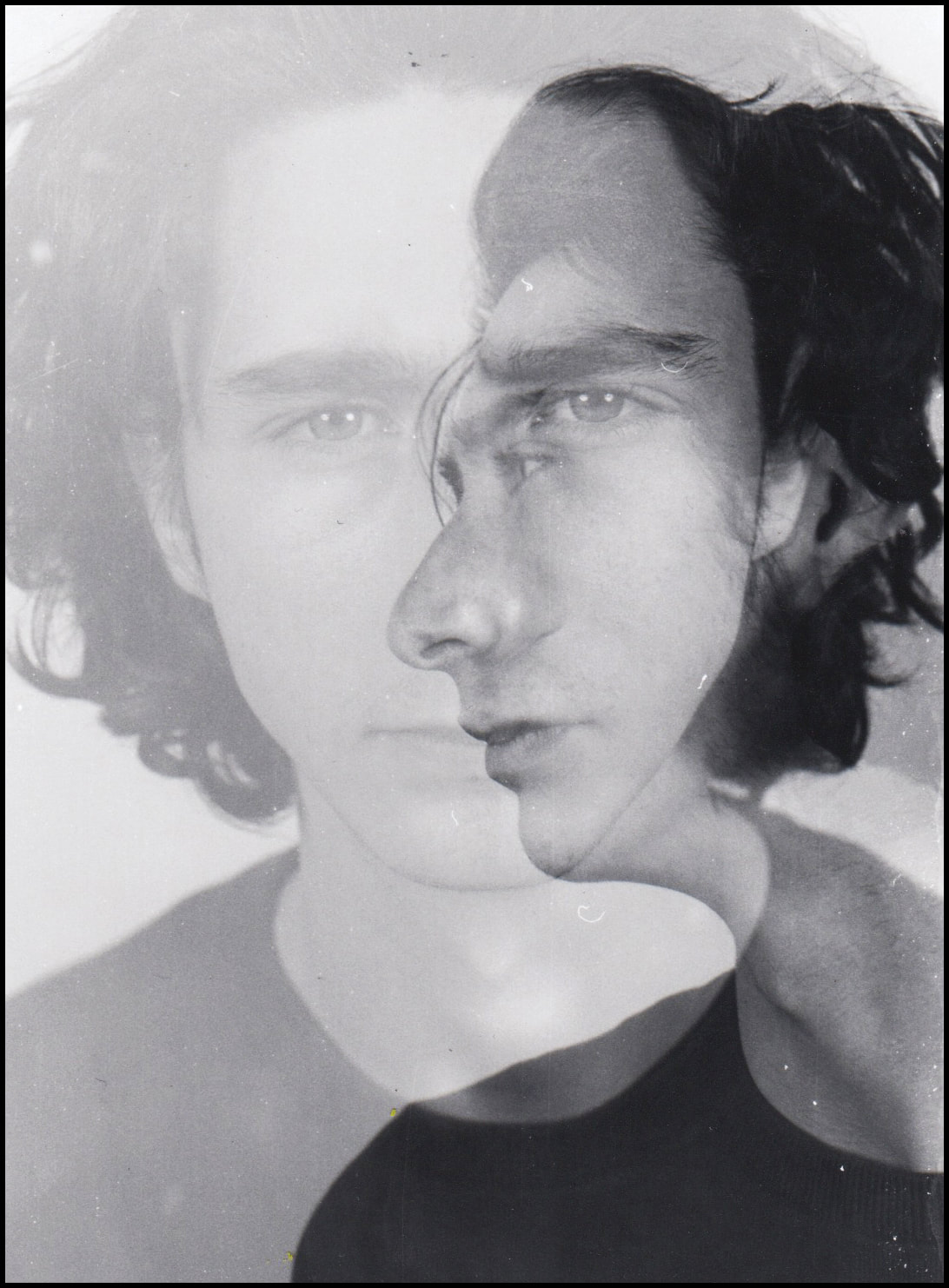
The photos below are my response to Evans' portrait. I tried to show focus on multiple, possible insecurities people can have, for example teeth, nose and ears. I think these photos are a very good result and do, in a way, reflect how people may percive themselves'. I also think this development shows how i have improved in using film to take double exposures, and also shows why film creates a better image for it. the areas where both exposures overlap are darker and this is why it's more effective than digital.
directions. I really liked how the double exposure distorted his face and body, and emphasised on things like his ears.
I thought that this related to my 'perception' theme as it could show how someone perceives them self. People have
insecurities and see themselves' in a distorted way and i think the double exposer could display this.
The photos below are my response to Evans' portrait. I tried to show focus on multiple, possible insecurities people can have, for example teeth, nose and ears. I think these photos are a very good result and do, in a way, reflect how people may percive themselves'. I also think this development shows how i have improved in using film to take double exposures, and also shows why film creates a better image for it. the areas where both exposures overlap are darker and this is why it's more effective than digital.
|
|
|
|
|
|
Walker Evans
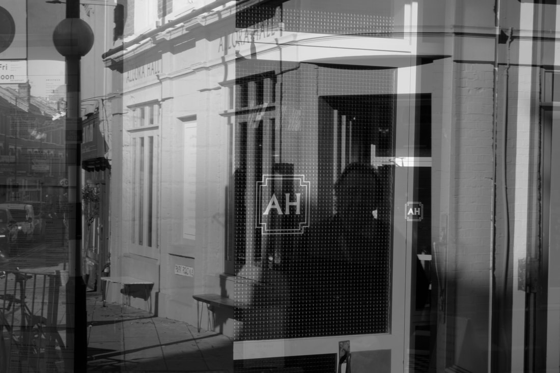
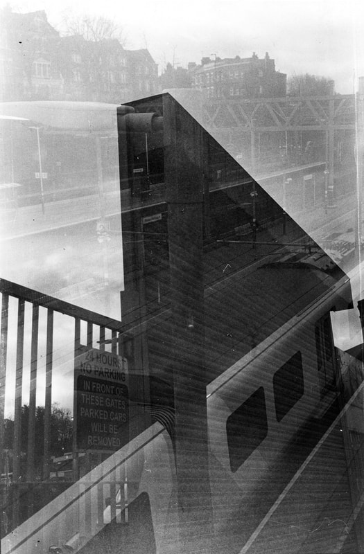
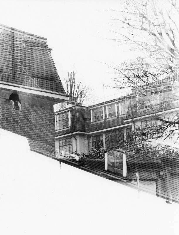
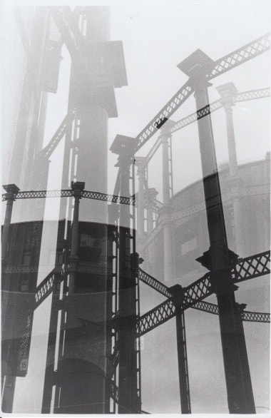
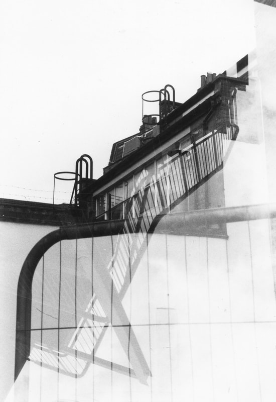
This is another Walker Evans double exposure photo that I want to use as inspiration. The last photo I spoke about was a portrait, but this Is all architecture. I really like how the photo is confusing and chaotic. It's almost abstract because of the double exposure. I think the photo is so confusing because of the number of lines and shapes, but also I think it's because Evans took one of the exposures upside down, and this throws the viewer off. This type of double exposure definitely relates to my idea of spectators viewing photos in different ways and having different readings, and it shows that it can be done in an outside setting.
This is my response to Walker Evans' double exposure, architecture photo. I think the results are good, and some of them are quite confusing. For most of the photos, I exposed one shot upside down or one shot was landscape. I think this really worked and is effective to make a complicated photograph. in some cases, it makes it difficult to find where each photo starts, like in the top left photo. I think my technique for these double exposures is very good, however I want to use better subjects and shoot in different places. eg. construction sites.
|
|
|
|
|
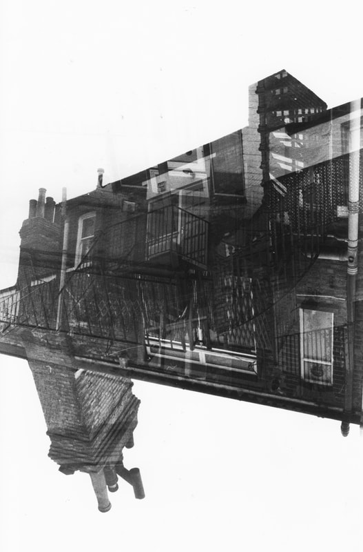
Shooting More
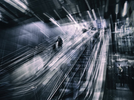
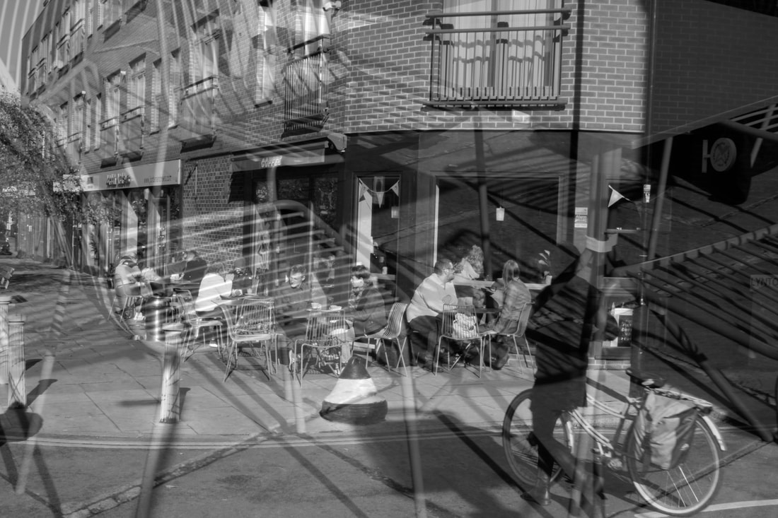
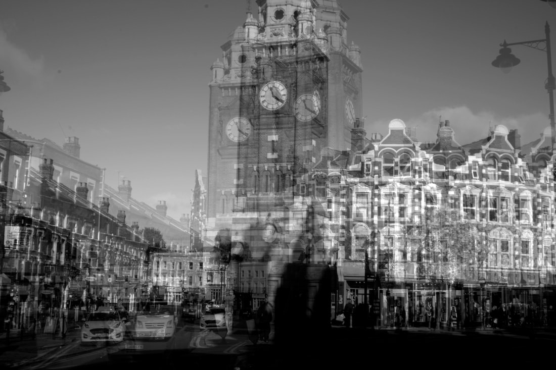
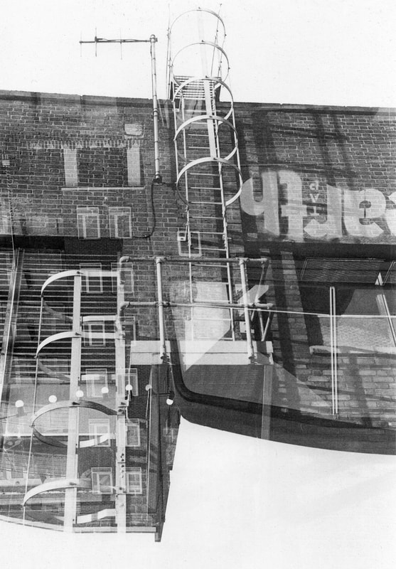
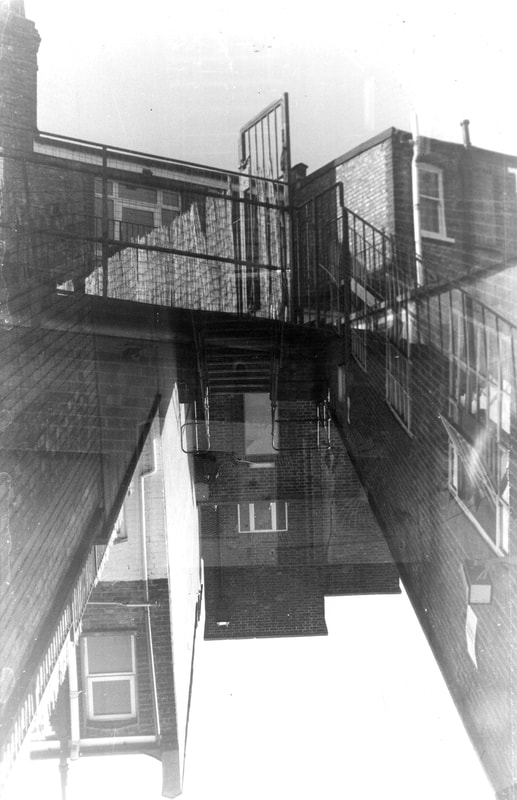
This is another roll of film I shot in response to Walker Evans' double exposure photo. I tried to experiment more with the idea of turning the camera between exposures, and I think it worked very well. This is because the sky is shown in both exposures, giving the photo no top or bottom, they can be interpreted both ways. I also think these photos are much better than my last roll because of the quality of the scans. There is much more contrast and they are more crisp, which I think is very important in the outcome. The photo on the top left is possibly my best photo I have taken in the project so far. I think it captures the confusing idea I am going for a there are many aspects, such as the trees, throwing you off. It almost has a kaleidoscope effect.
|
|
|
|
|
|
Failed Roll
This is a roll that failed in the process (as they were very dark and I had to edit them a lot) but I think these three photos are still interesting. The photo on the left is a very good example, as it has two very different perspectives which create an impossible scene. I think it demonstrates that, with these photos, I am reconstructing various places and buildings to make something new. the photo on the right I find interesting as it has lots of different textures.
|
|
|
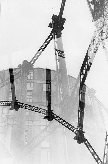
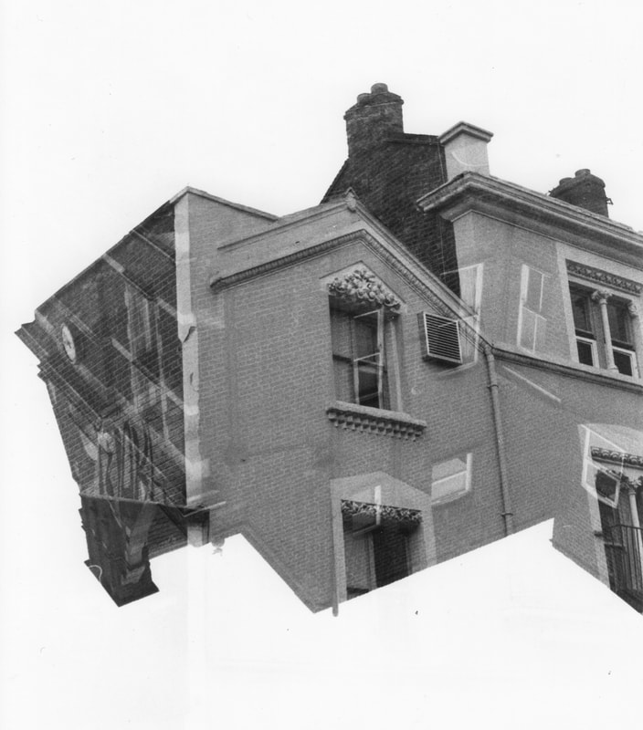
Shooting More
|
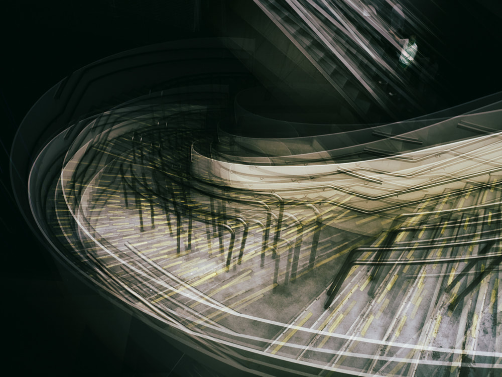
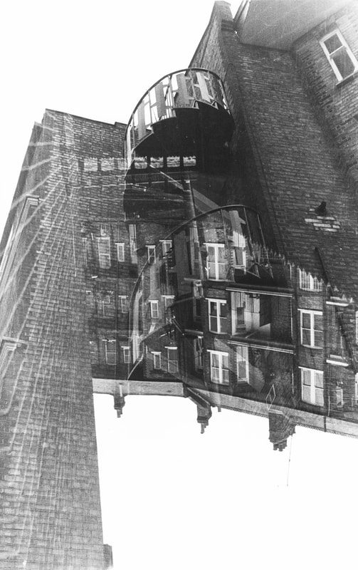
This is the third successful development in shooting double exposures outside. The definition is not as good as the previous one, but I found that shooting in locations like muses is very effective because of the range of different objects, textures and shapes that add to the cluttered effect I want. The top right photo is the best from this series of photos because of the unusual shape created from the wall that comes close to the camera. Also, the spiral staircase in the middle creates a lot of viual confusion which I am happy with.
|
|
|
|
|
|
|
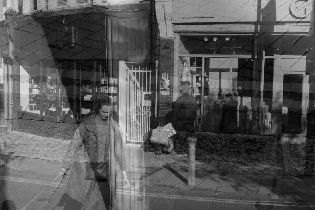
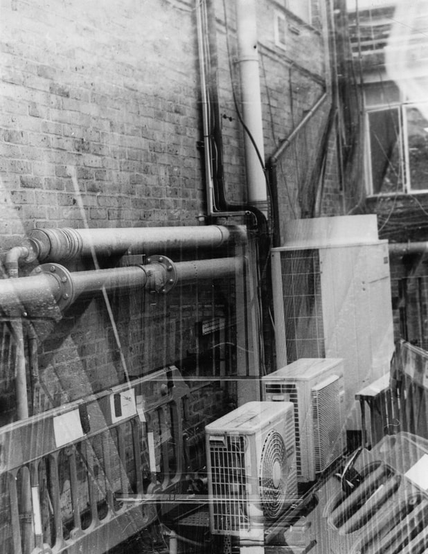
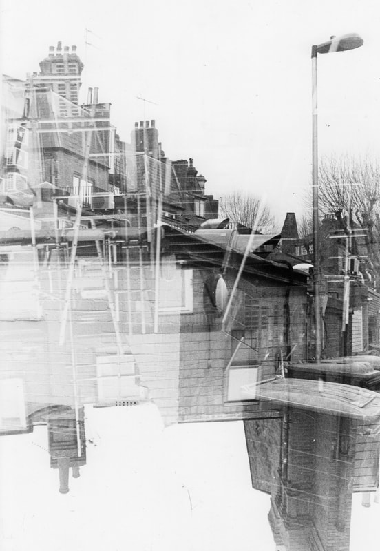
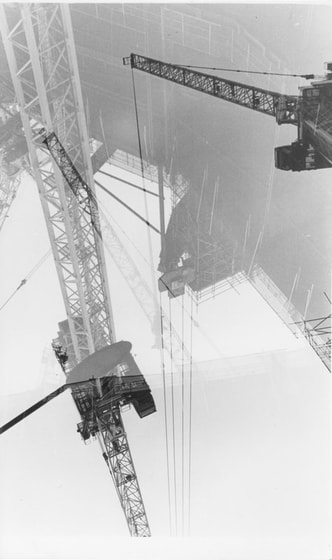
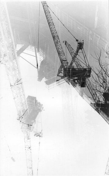
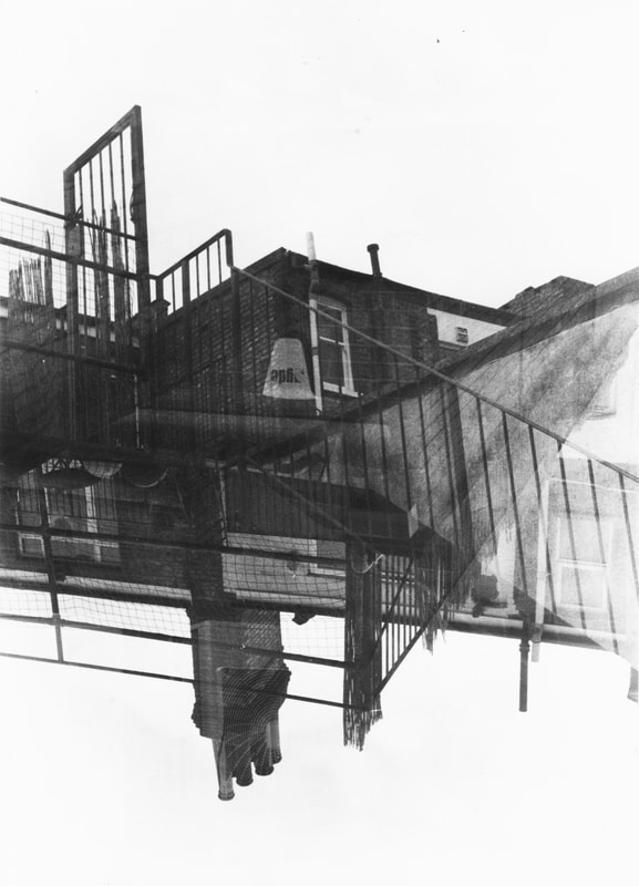
Shooting on construction sites
|
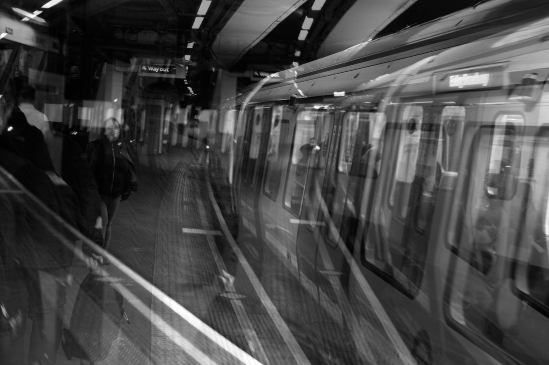
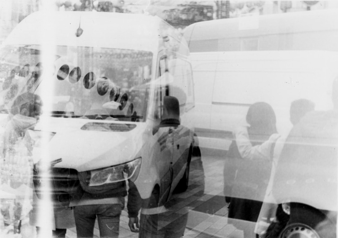
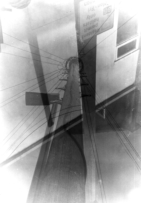
In this shoot, I tried taking the double exposure photos in a different environment. I thought it would be a good idea to take them in a place with lots of construction because of all the straight lines that over lap. I shot on King's cross which has a lot of cranes and building sites, however I don't think the outcome is very good. I feel like the frames are too sparse and do nit have very much going. This is the opposite of my aim and I think it happened because the subjects were too far away and can't take up much of the photo. I think the results are much better when I can get close to the subjects.
|
|
|
|
|
|
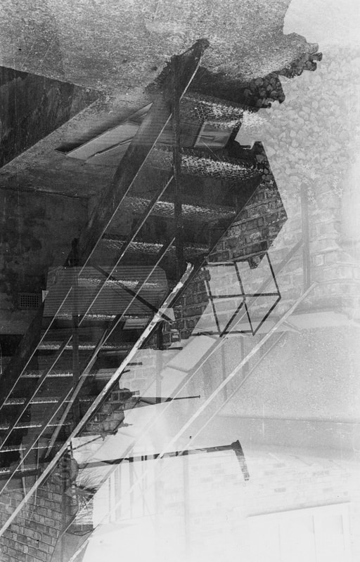
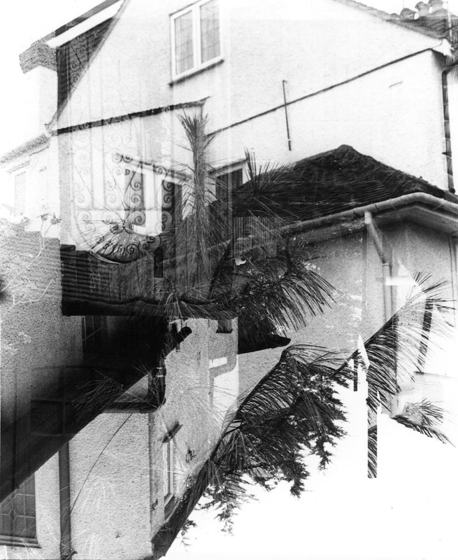
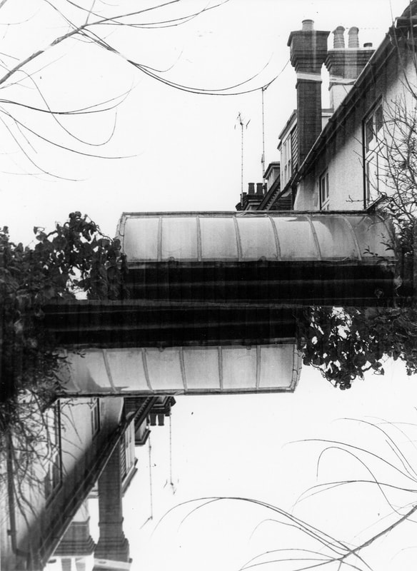
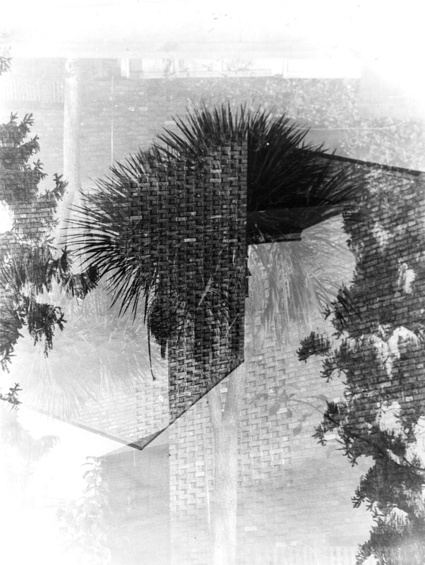
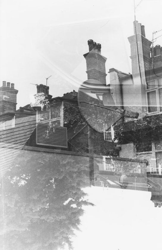
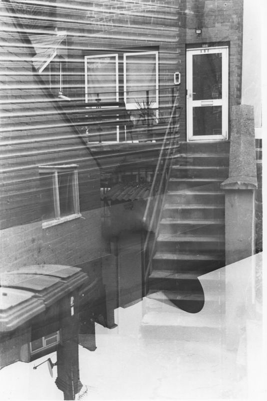
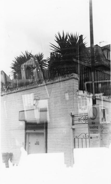
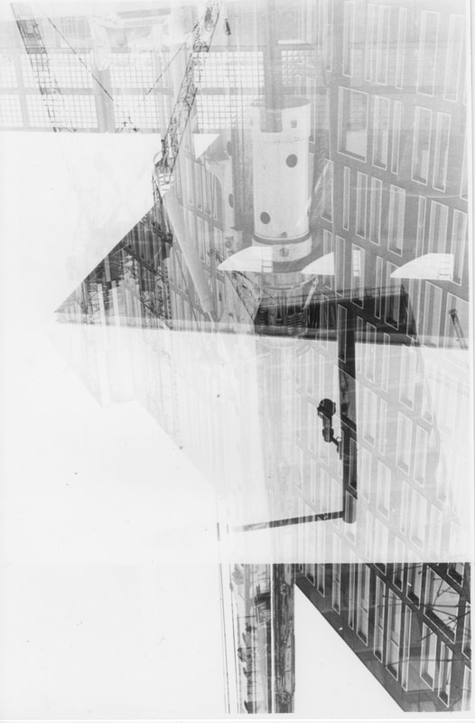
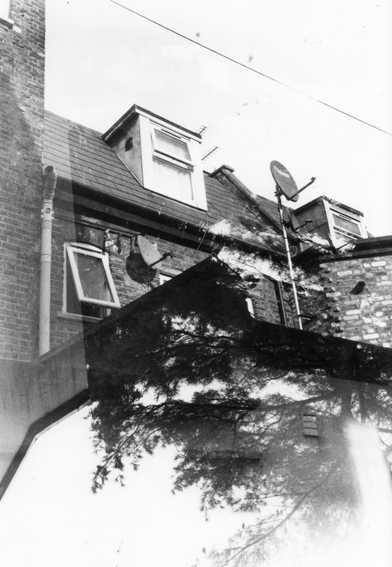
Final shoot in response to Walker Evans
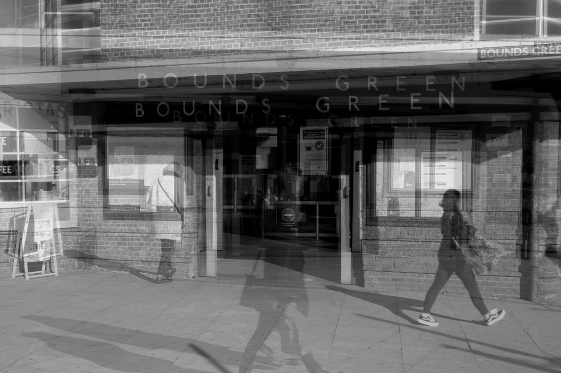
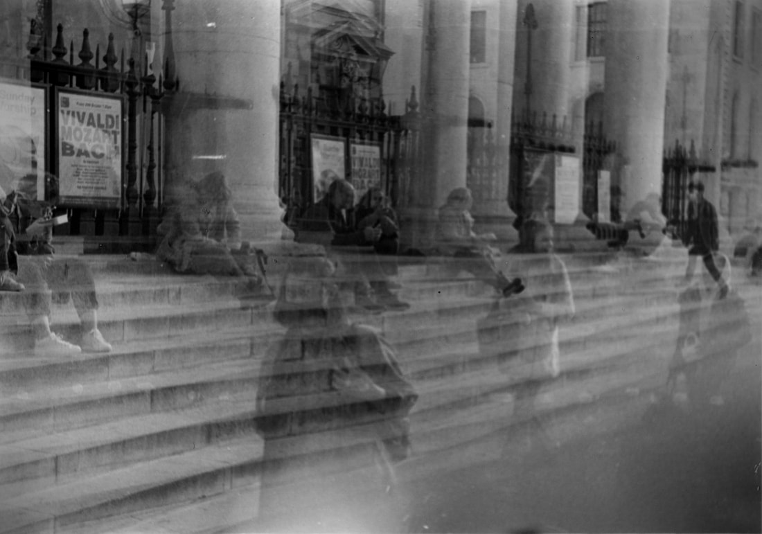
This is the last shoot i did outside, trying to create double exposures of buildings. I decided not to take them in industrial settings after the last shoot, so these are all taken in muses where there is a mixture of different things that can all be captured in one photo. I think all of these photos are quite successful and it shows that it is important to be able to be close to the subject. I really like the top left photo because the texture of the trees creates a very unpredictable pattern within the building. Although the top right photo is not very cluttered and filled with information like usual, I think the shape is interesting and the fact that it doesn't fill the frame and has negative space all around on one side.
|
|
|
|
|
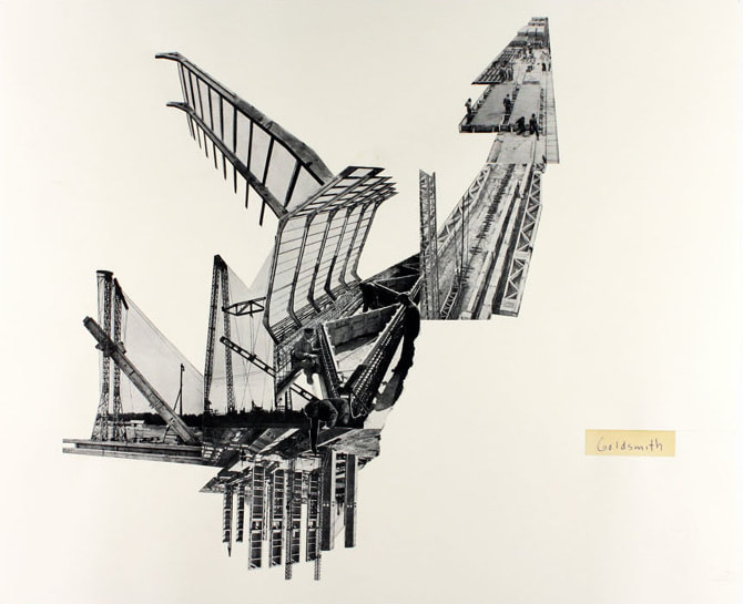
Marshall Brown
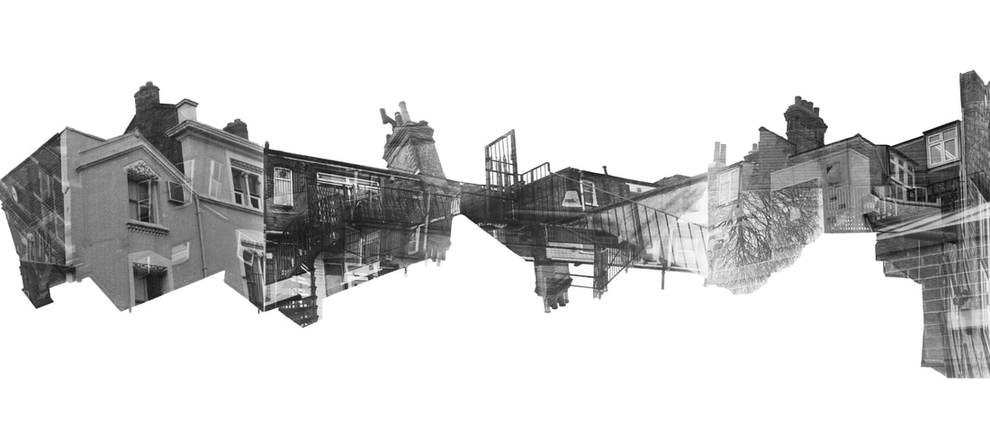
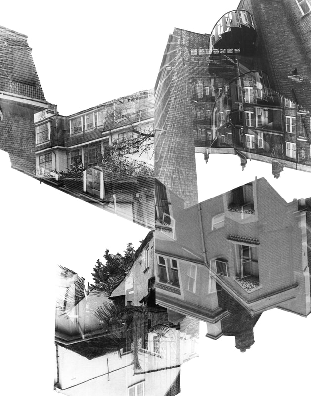
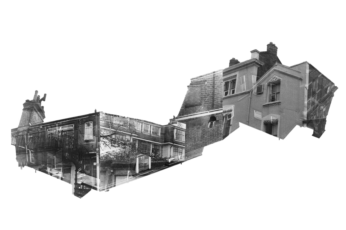
Marshall Brown is an architect/artist who uses collages to create visions of future possibilities in the urban world. He makes connections between themes using his style of collaging, which is done physically on paper. I really like how the shades and colours don't always match, but he uses the lines to connect the photos. I also like how the outcome is not always an obvious place or building, but more of a suggestion to what it could be, escpecially the middle photo. this could relate to my project, as i don't want the viewer to be able to see a clear outcome, just a combination of things that is up to interpretation. I want ot try to put my photos in a collage like Brown's using a white background and explore negative space.
|
|
|
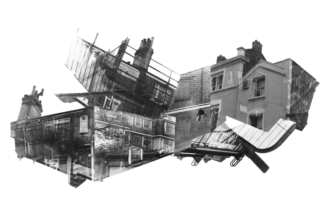
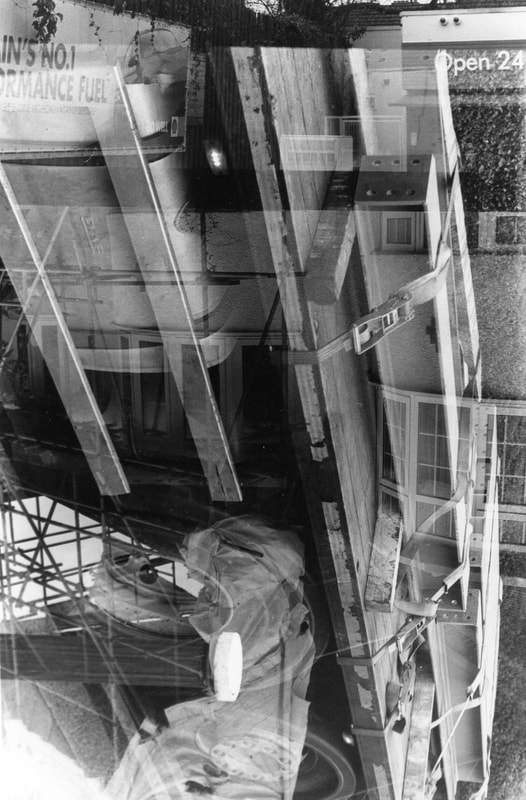
This is my response to Marshall Brown's collages. I tested a few different possibilities and arrangements like a long, panorama style one, but the final collage is the best. I really like how none of the photos touch the boarder and leave an interesting negative space like Brown's do. I also really like the amount of detail and different elements (brick wall, tree branches, fences, rails) that is shown throughout the collage, because i brought together multiple photos. The two slanted photos add a lot to the overall effect, as it feels like the whole thing is skewed. It definitely still reflects my idea of perception and how we view things differently, but i also found that i am reconstructing my surroundings and creating new structures with my photogrpahy.

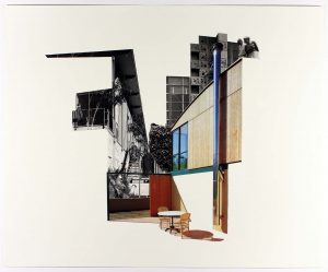
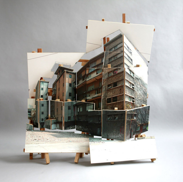
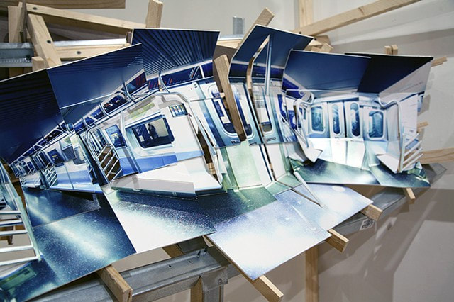
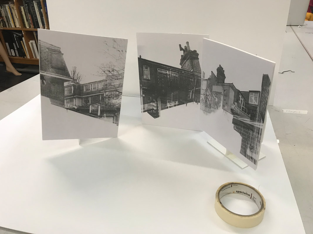
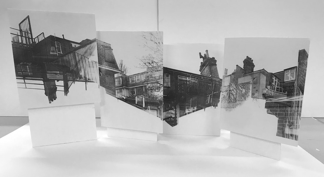
Isidro Baasco
To further develop the idea of combining my photos, I am looking at artist Idris Basco. He is quite similar to Marshall Brown as he also is influenced by architecture in his work, and creates collages out of photos. However, Basco brings the photos to a 3-dimensional medium and builds structures to display them. He recreates scenes he photographed into a cubist style collage which is displayed on wooden frames. By bringing some sections of the scene forward, we see a different perspective, like in the piece on the right of the train. He has the power to create a much more immersive experience with the wooden structures and can also transform buildings into completely different shapes. (shown in bottom right photo). I really like how the slight distortion and untidiness creates scenes that appear both unrecognisable and familiar. I plan to display my double exposures in this type of 3 dimensional collage.
|
|
|
In response to Basco's photography structures, I tried to display my photos in a similar way. I printed my photos out on paper and stuck them to a foam board. By taping foam stands to the back of the photos, i was able to set them up and move them around, displaying some at different angles and distances to line the photos up.
|
|
|
This is the final display i built with my photos. It is much less complex than Baasco's as he uses lots of different segments to create his final photo, however i don't believe mine should be so intricate because the individual photos are already interesting. I displayed them in the same way i made the digital collages, so that the images line up from one to the other. The video demonstrates what it is like in person better than any photos as it shows multiple angles and the idea that it must be viewed in a certain way fro them to line up.
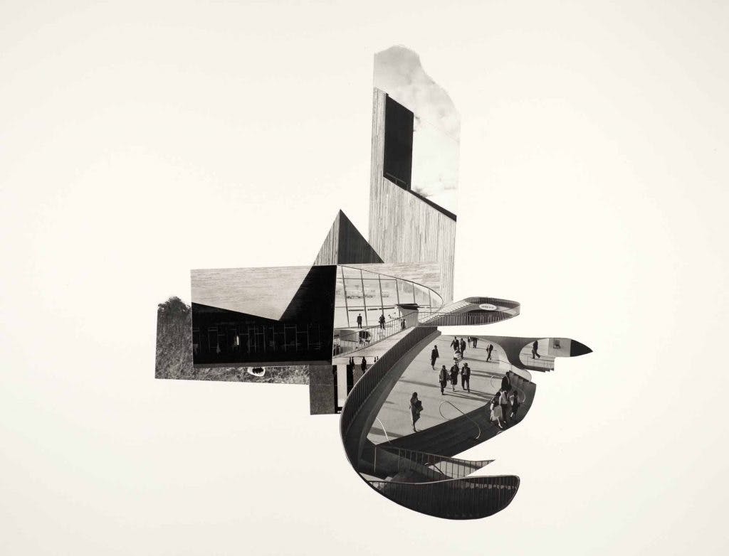
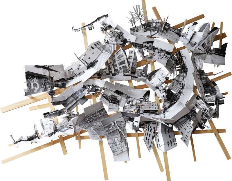
Final Piece
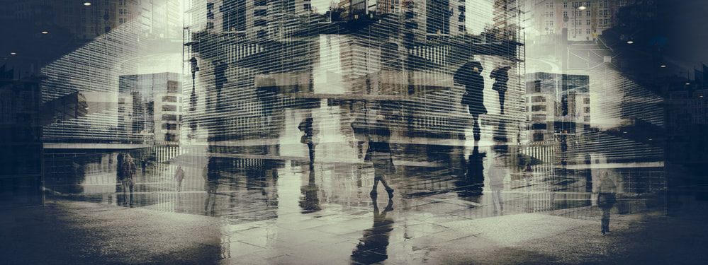
This is my final piece for Word Theme project and it is the most successful collage from my Marshall Brown response.
It is the most chaotic one I managed to make and the use of negative space is effective.
It is a combination of same of my best double exposures which took lots of shoots to refine, as well as the method of collaging which took a lot of attempts to get to this image.
It is the most chaotic one I managed to make and the use of negative space is effective.
It is a combination of same of my best double exposures which took lots of shoots to refine, as well as the method of collaging which took a lot of attempts to get to this image.