Breaking structure
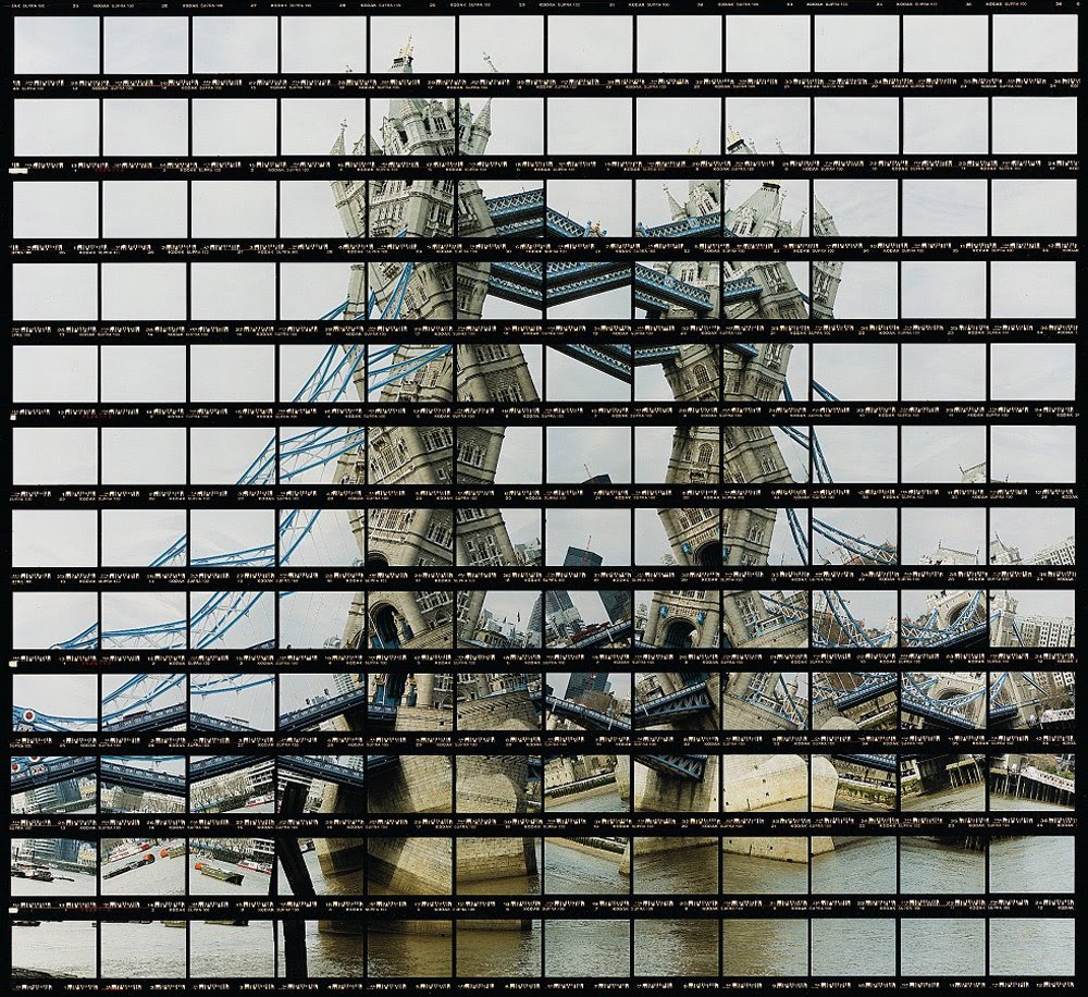
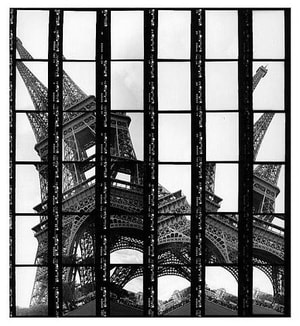
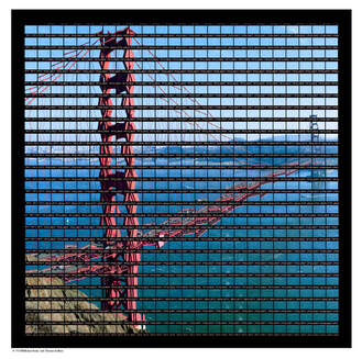
Thomas Kellner
Thomas Kellner is a German fine art photographer who likes to change the object of the image and question what we see. As you can see, he photographs structure and building in a unique way in order to distort them. They are mostly famous structures so that we can see something we know, changed and manipulated. He does this by taking many individual, zoomed images of the scene from left to right, including small changes to create the distorted effect. He uses analogue photography so he has to create a giant contact sheet, all in the correct order. This is much more difficult than using digital because i can't crop or edit, the contact sheet has to be perfect.
|
|
|
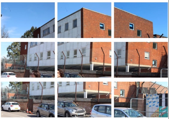
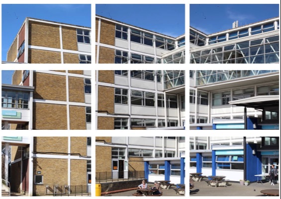
My response
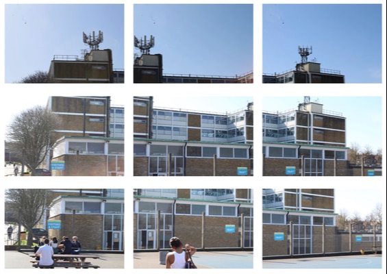
This is my response to his work taken in school. My camera's zoom was quite small so i could only achieve 9 photos for each building. I think i did a good job at creating the distorted effect on these buildings, however the aren't very strong as they are surrounded by trees and cars, and the small amount of photos takes away the effect that Thomas Kellner's work created.
|
|
|
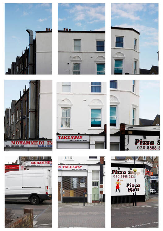
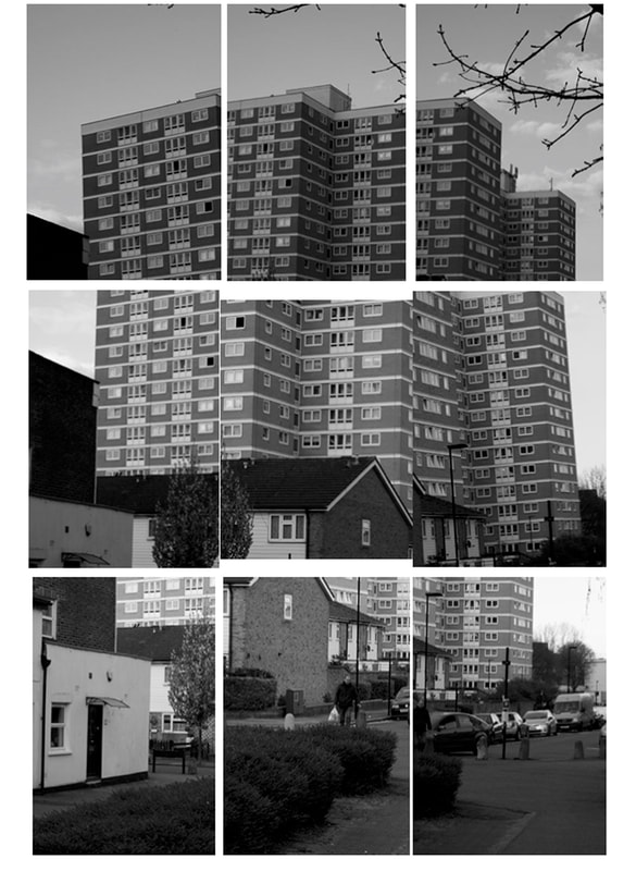
This is my second response to Thomas Kellner's work. This time the photos are taken outside of school and I think this makes them a lot better.The back and white photo is my favourite because all the small windows look multiplied and I managed to achieve the distorted effect much more than all my other attempts. I still couldn't zoom very much, so the contact sheets are only 3 by 3. Also, some things in the frame are shown twice, like the houses at the bottom of the building.
|
|
www and ebi? What did you learn from the pieces that you did in the lesson? Where some buildings better than others?
Variation and Similarity in Landscapes and Structures
Paraic and Kevin McGloughlin
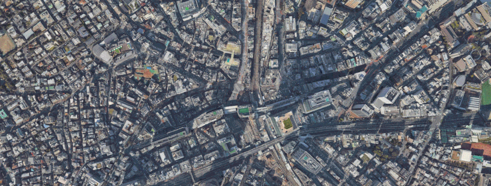
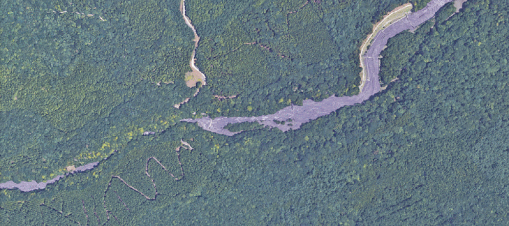
Paraic and Kevin McGloughlin are brothers who have worked together on projects such as their structural GIFs. The images in these Gifs are all taken on google earth and then compiled into an animation which shows various landscapes which are usually from birds eye view. Things like roads usually connect and move around, and aspects with similar shapes like fields or stadiums are focused on a lot.
EPOCH from Kevin McGloughlin on Vimeo.
My response
These are my 2 GIFs I made in response to their work. I took screenshots from google earth and compiled them into a moving image similar to Paraic and Kevin McGloughlin's. Mine were both based on famous places in Japan and trying to explore them further through google earth. The first GIF is based on the Shibuya crosswalk and I zoomed in on it and then showed various photos from within the square. All the photos are supposed to show the range of different people who come here and how it looks at different times. The second GIF is exploring Mount Fuji and how vast it is. I tried to show this by zooming out along the foot of the mountain up to the top, increasing as the camera goes along. Then the camera revolves around the peak of the mountain showing it all. I think I prefer the second GIF because it has better movement while the first GIF shows random photos. This is what I tried to develop on in my second attempt and I think it works better.
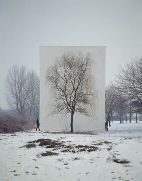
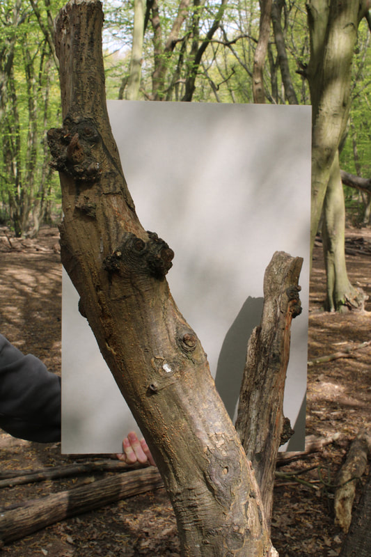
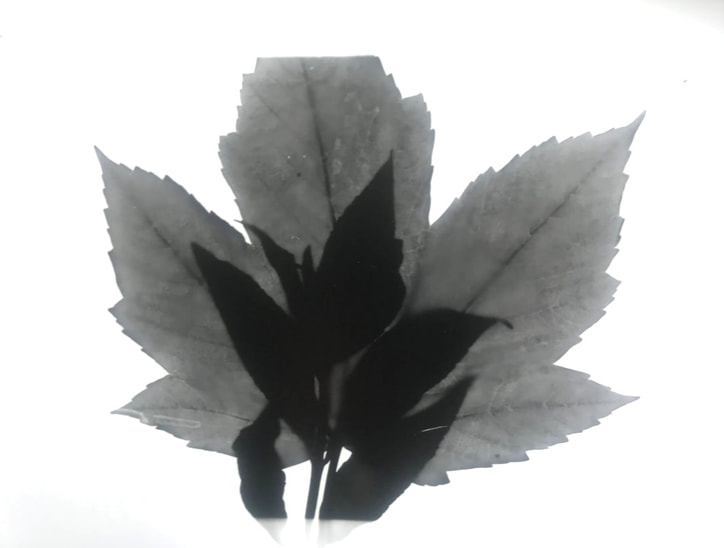
Structure in nature
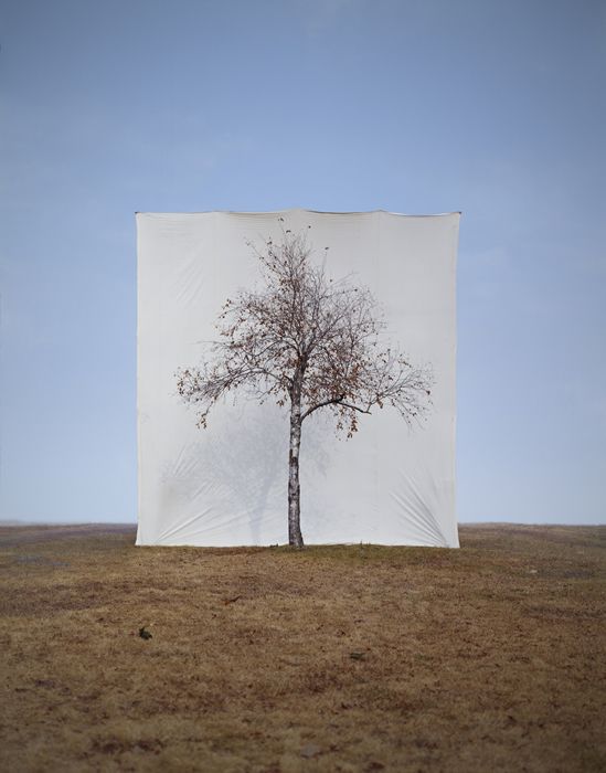
Myoung Ho Lee
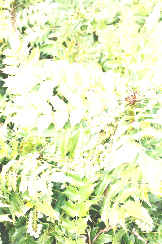
Myoung Ho lee is an artist/photographer who began to take photos of trees in 2004. In this project, he wanted to bring forth natural structures like trees from their environment and celebrate their beauty. Most of the subjects chosen are quite common trees that would usually go unnoticed but his work distinguishes them by placing a large sheet behind them. I really like the photo on the left and the middle photo because they are so peaceful and because the clear sky, as well as flat horizon make a surreal photo. However, i also like how the photo on the right has other trees, as we can see how the tree has been separated fro the rest.
|
|
|
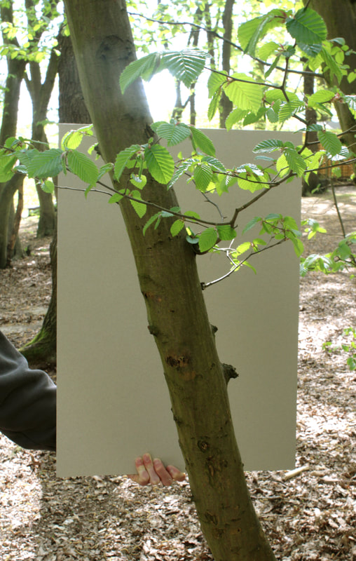
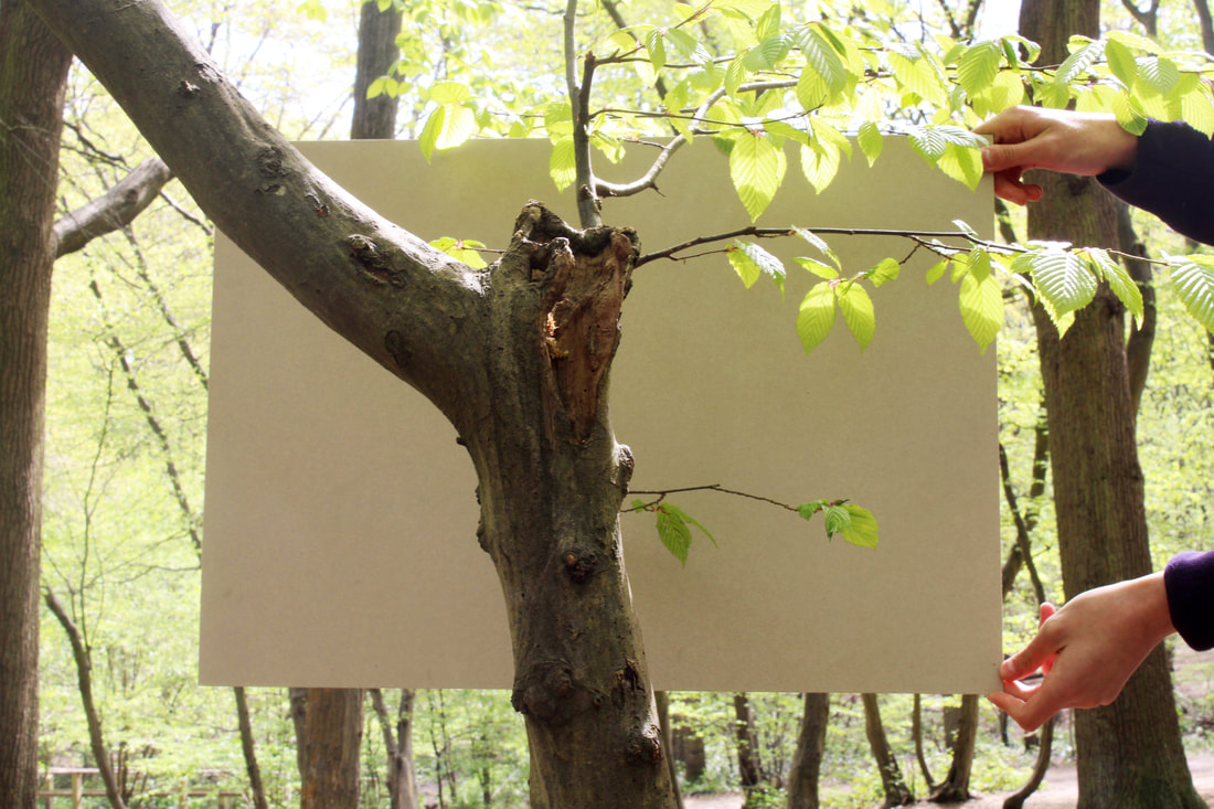
My Response
|
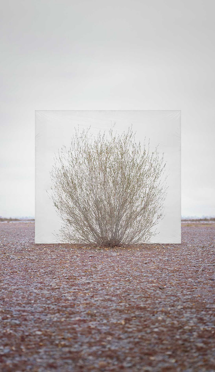
In this task we were required to imitate Myoung Ho Lee's work, though we had to do it on a smaller scale as we couldn't use a crane. This meant that we used pieces of board and photographed smaller pieces of nature, like branches and bushes, rather than trees. The background was supposed to also be in focus by using a higher aperture. This is so we can compare the surroundings to the piece in front of the board and I think I managed to do that well. However, I think the photos are boring and don't create the same effect that Myoung Ho Lee's do as they don't show the big picture.
|
|
|
|
|
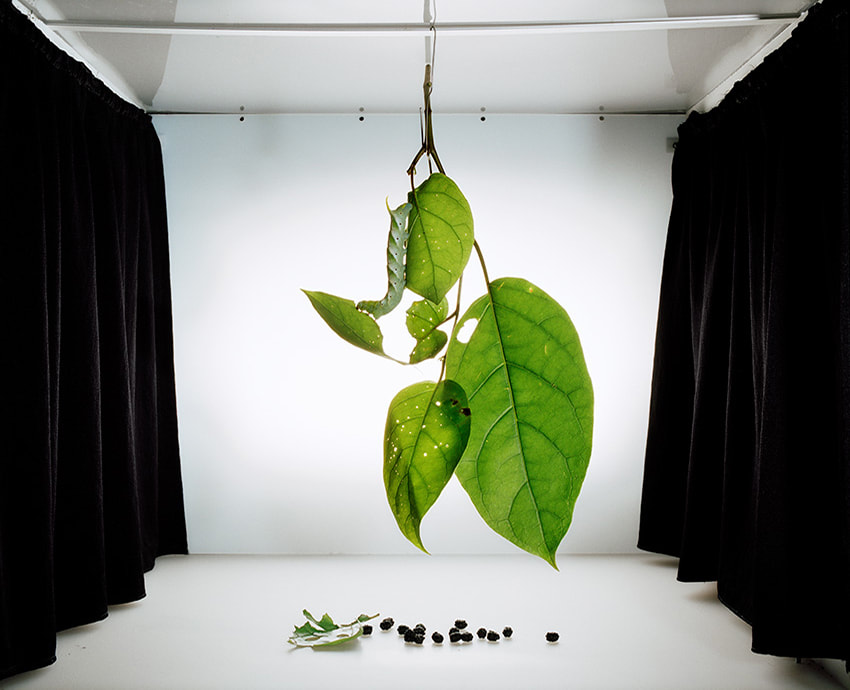
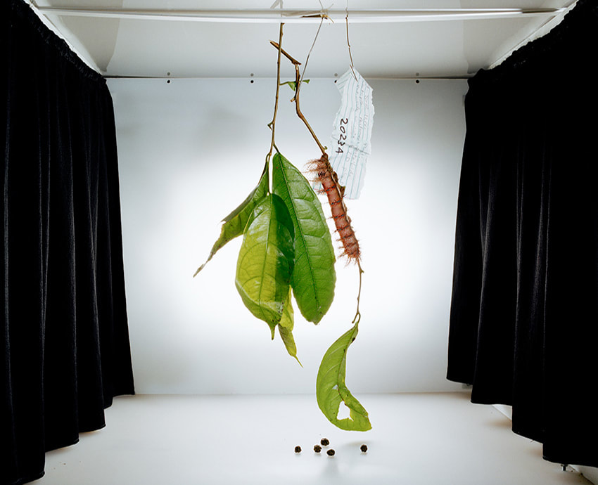
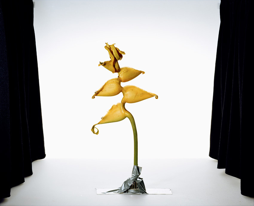
Sanna Kannisto- Field Works
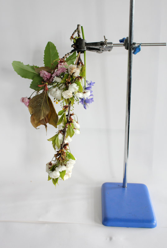
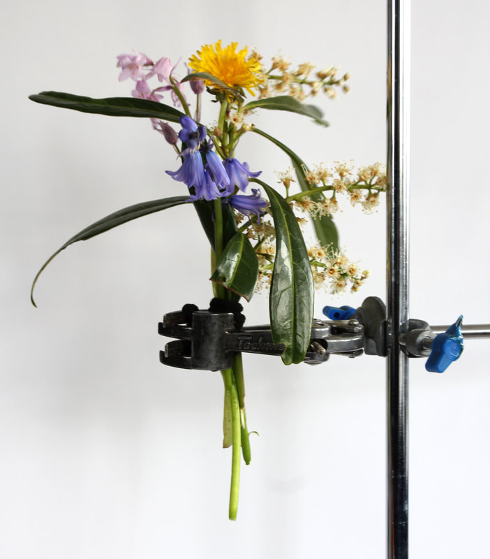
Kanisto is a photographer who works in field environment and is interested in inspecting nature more closely in an inclosed space. As you can see, she photographs individual plants and animals within a artificially lit box. It looks similar to a scientific photograph, though se thinks that her photographs are different as scientific ones show specimens in isolation, and Kannisto’s work addresses the acts of staging and image-making. She uses drape curtains on the sides as it feels like a theatre in which we are viewing the piece of nature.
|
|
|
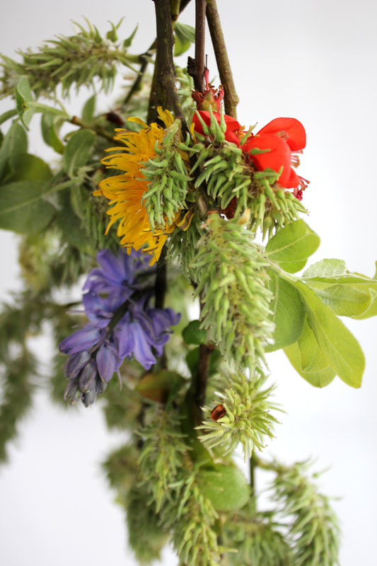
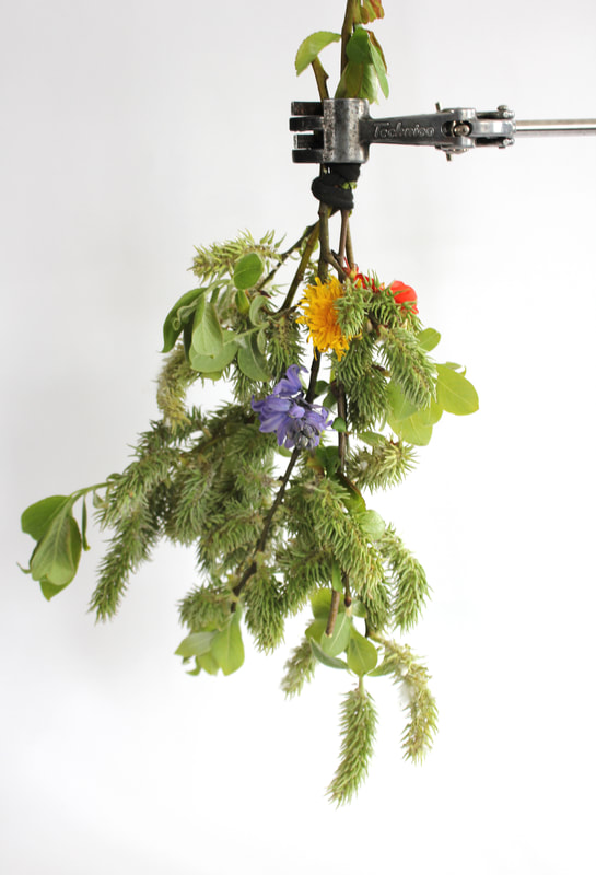
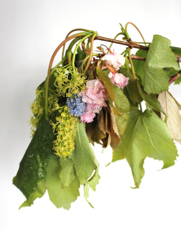
My response
|
This is my response to Sanna Kanisto's photography. We imitated her work by photographing different plants in a stand. I tried to choose plants and flowers I found worked together and had complimenting colour and textures, for example one of them has yellow, blue/purple and red flowers like the primary colours. I also tried to get different types of shots, including detail shots and a wider shot, showing the whole stand. I think I did well in trying to achieve a good exposure and colour in the photos, as well as a light background in order to show off the subject more. my favourite image is the top left.
|
|
|
|
|
|
|
Photograms
Roxanne Worthington
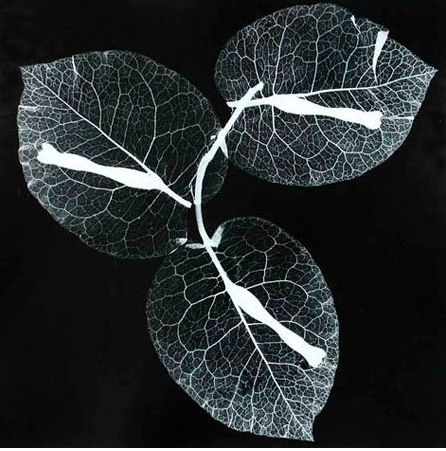
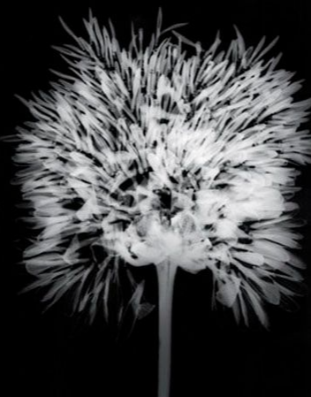
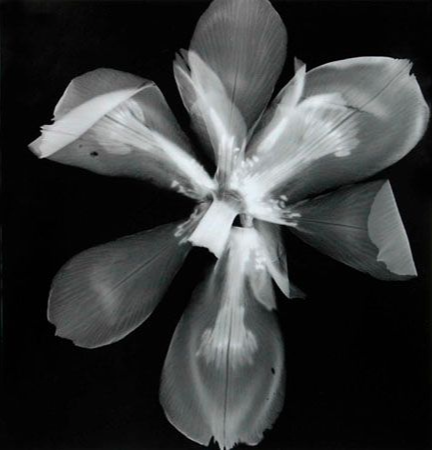
Roxanne Worthington is a photographer with a series called 'Breath'. It is a series that shows the delicate side of flowers by using photograms.This means that she put the plants straight onto the light sensitive paper and expose it. The use of the photogram forces us to see them in a special and intimate way. It seems that she used a high aperture and long exposure time as the light has gone through the thin parts of the plants and created a beautiful, detailed texture. My favourite photo of hers is the one on the right because it looks especially delicate and it demonstrates how the photogram can sometimes be more detailed.
|
|
|
My response
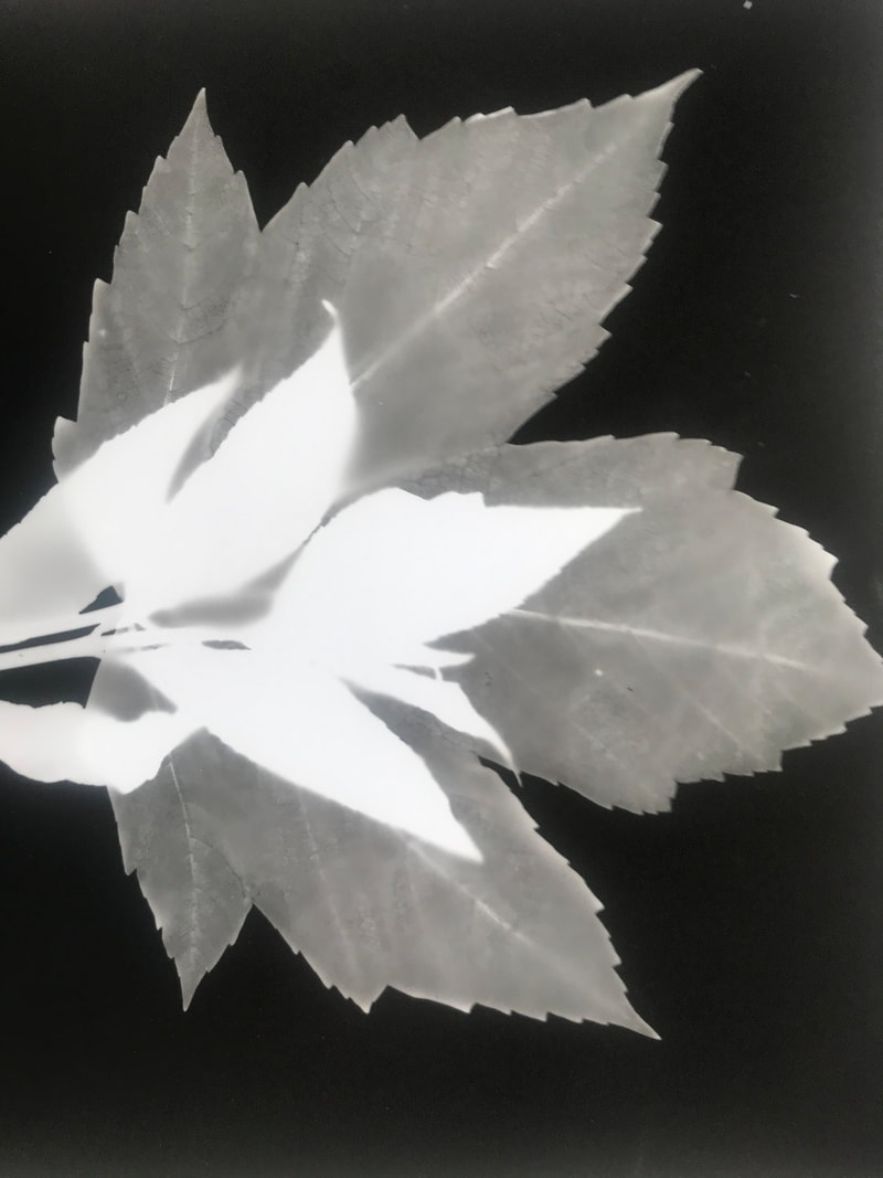
|
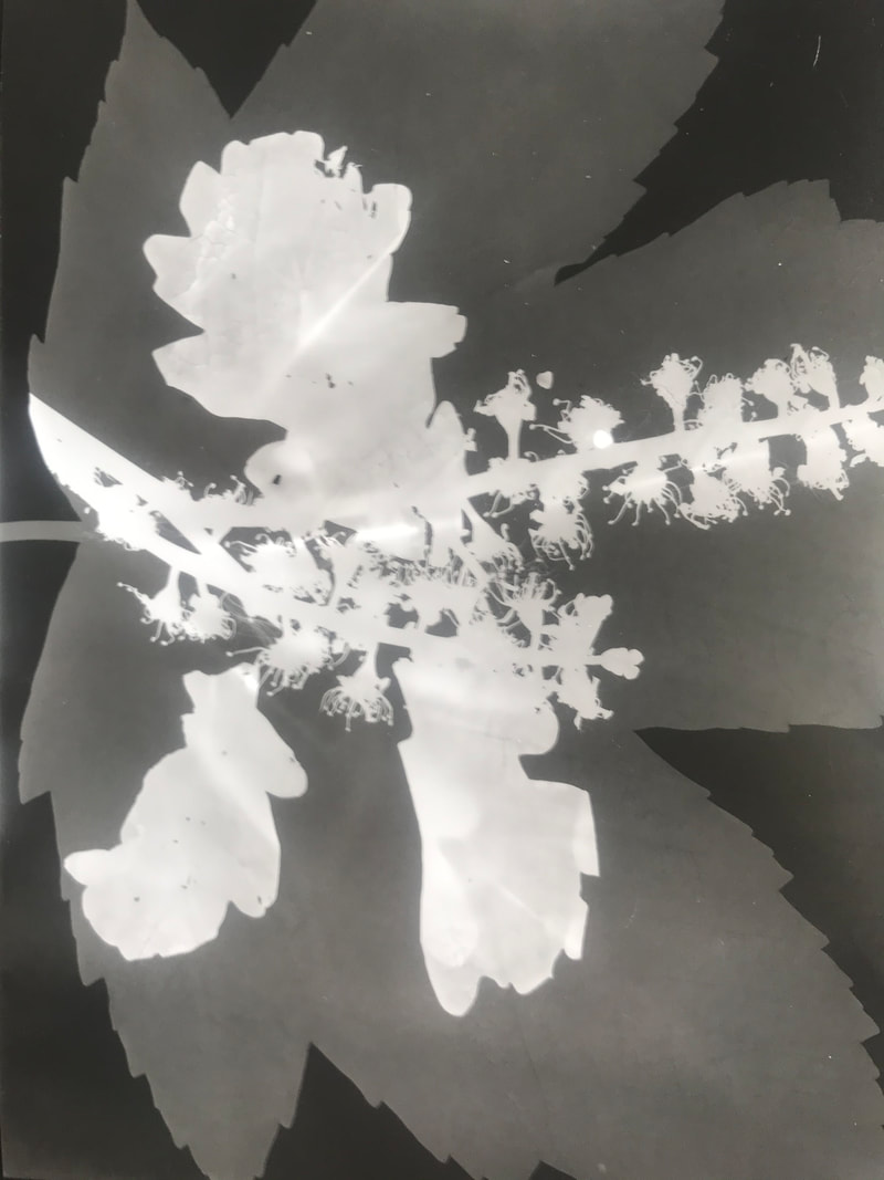
|
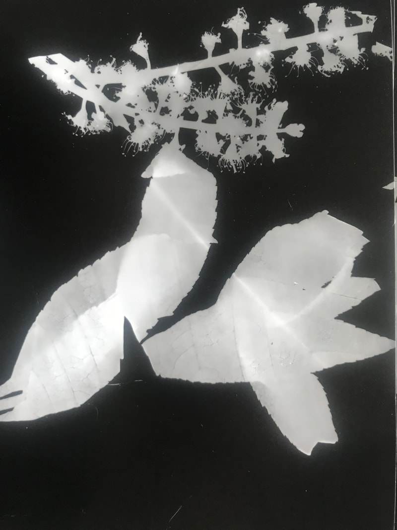
|
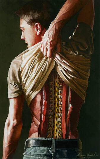
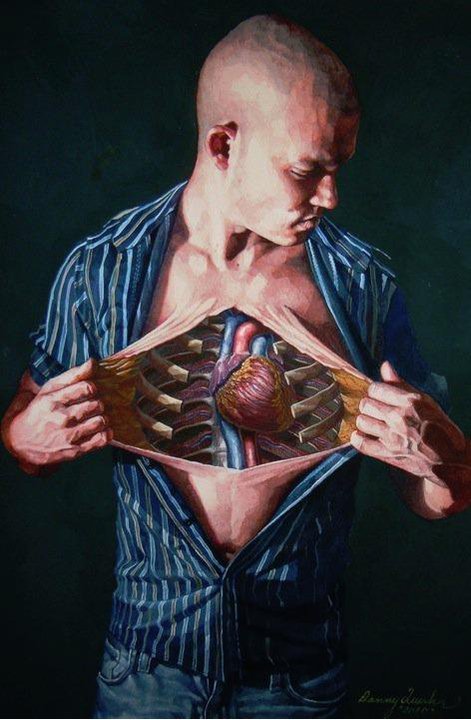
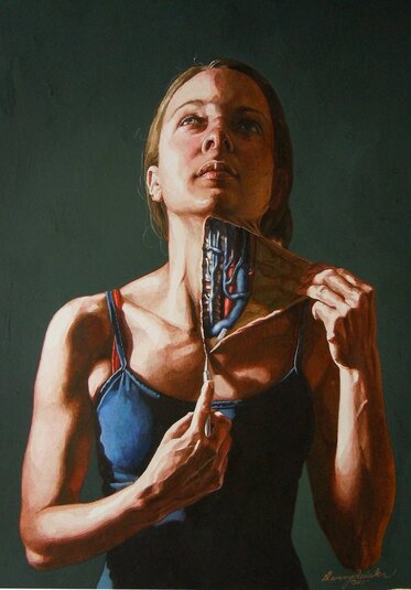
Structure of the body
Danny Quirk
Danny Quirk is an artist/painter who specialises in photo realistic painting. He is interested in the structure of the body and the many layers and complex structure of what happens underneath the skin. The paintings include ordinary people ripping or cutting open their skin to reveal the detailed arrangement of the muscles, bones and veins. He also paints the same things straight onto peoples' skin to create an even more realistic effect. It seems quite disturbing and dark, however Quirk sees it as more of an exploration of anatomy than simply a scary image.
|
|
|
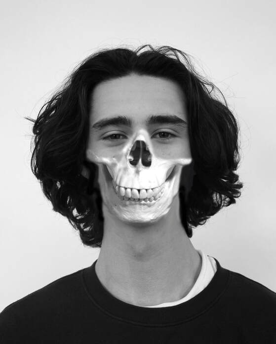
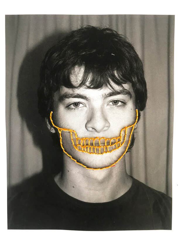
My response
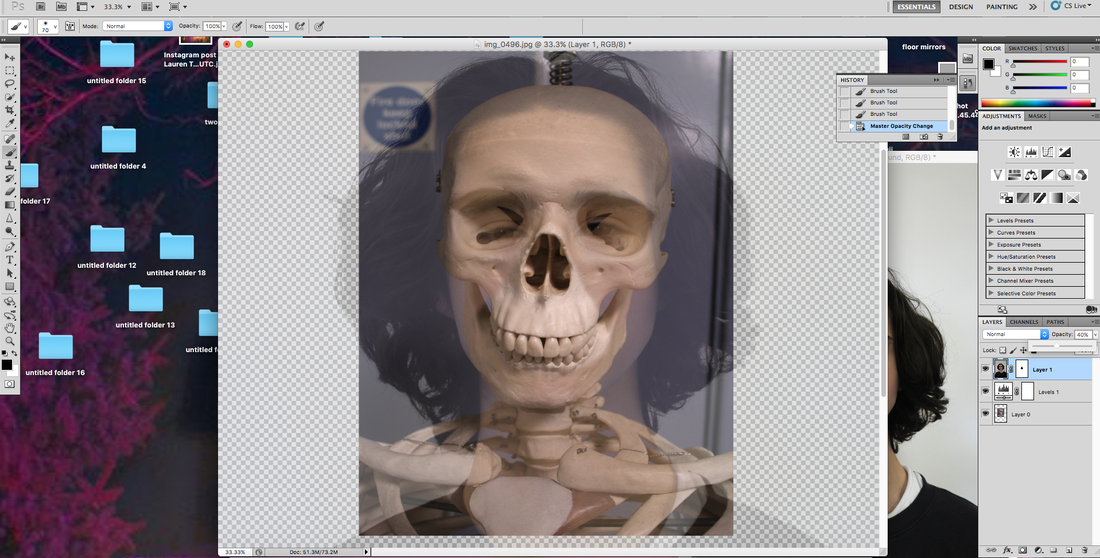
This is my response to Danny Quirk's art style. It is slightly different because it is only using a skull and not muscles or veins. We could cover any part of the face with a skeleton to create the effect. I chose to just do the jaw and nose section because I like how you can still see expression in the person's eyes. The effect is good but I don't think I managed to capture the same idea Quirk had as it doesn't look like the skull is underneath the skin being revealed.
|
|
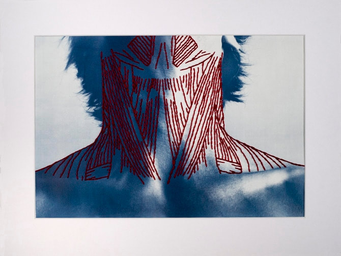
Stitching underlying structure
Peter Hickley
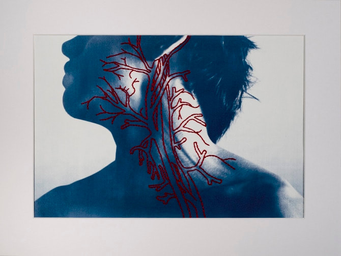
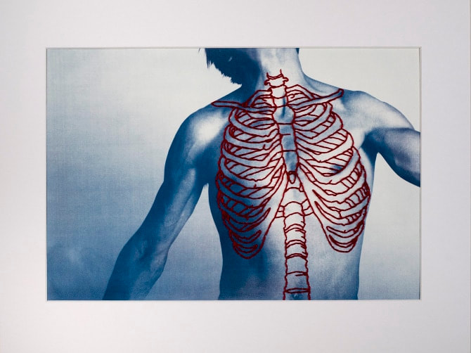
Hinckley's work is similar to Danny quirk's because they both focus on the underlying structure of the human body and how it would look if it was brought to view. Hinckley's work is different because he sews onto the image instead of painting. he shows veins, bones and muscle by using red thread on a blue print. I like there contrast between blue and red, as well as the detail in the sewing. My favourite from these is the one on the right because of the detail of the muscles.
|
|
|
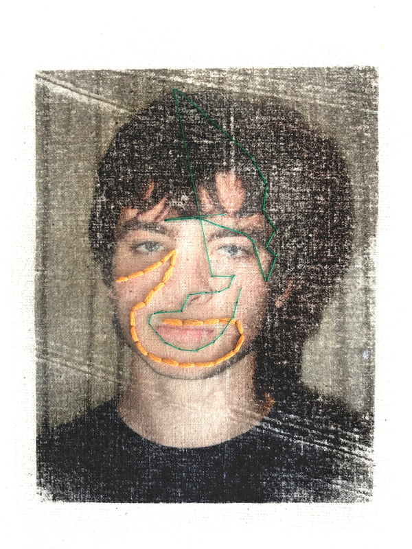
This is my response to Hickley's work. I chose to do just the jaw of the skull on my photo because I like how you can see the rest of the face clearly while there part of the underlying structure is still showing. I managed to do all the details of the teeth on the larger piece of paper, and I like the yellow thread on the black and white photo. However, the smaller piece of fabric was too small for me to do the same design.
|
|
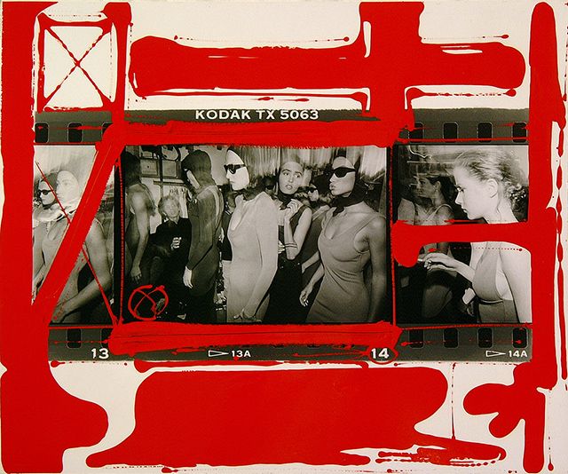
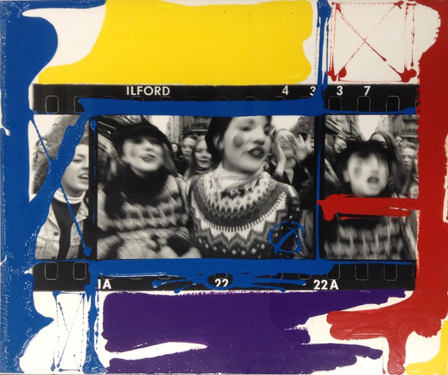
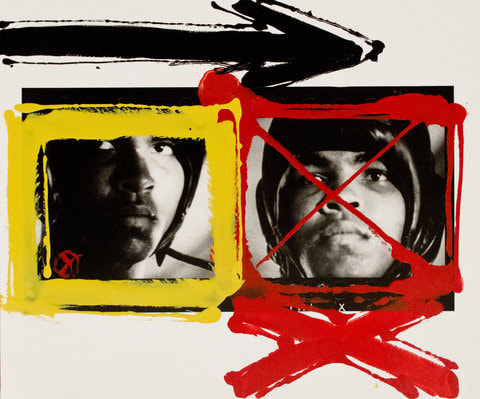
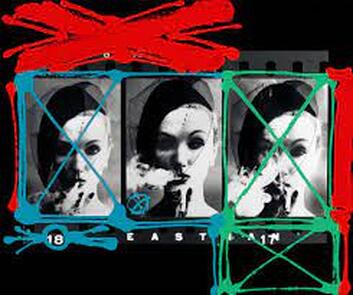
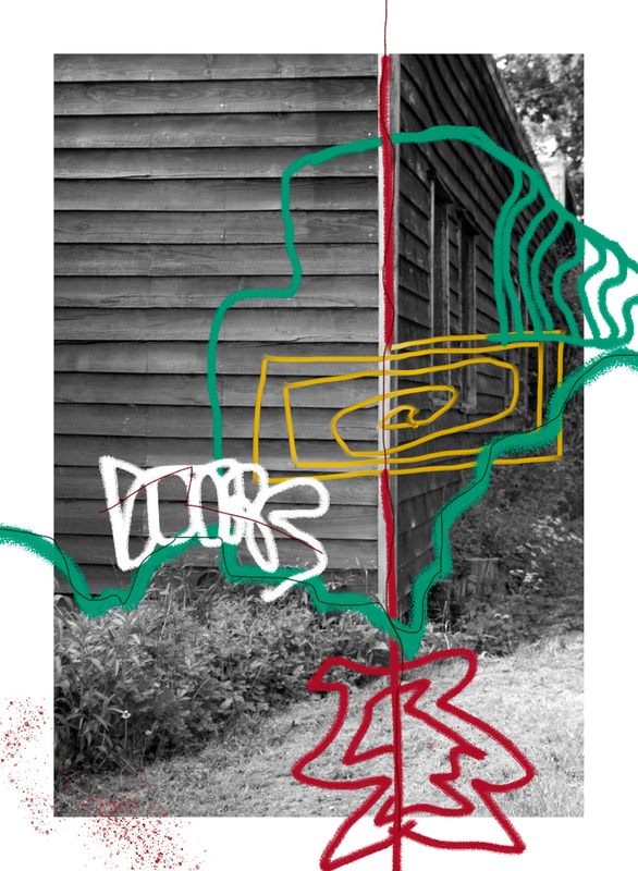
Three Strands
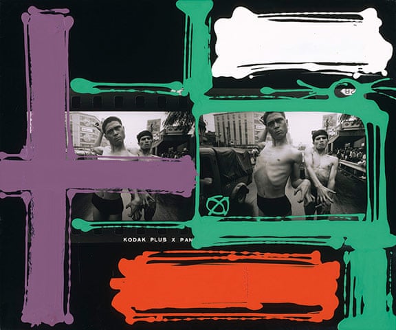
William Klein
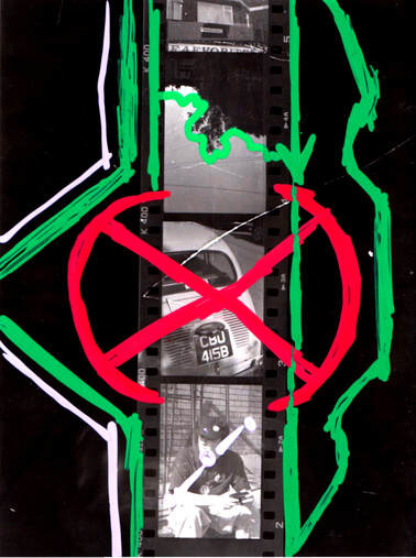
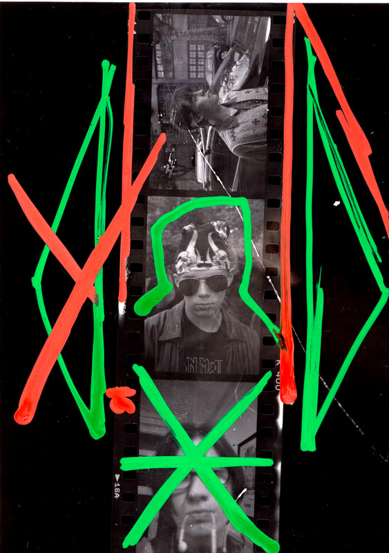
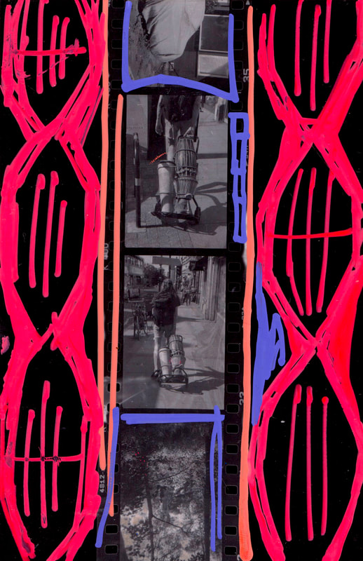
William Klein is a portrait photographer who also does this style of photography. In this series, he takes small parts of contacts sheets and then paints and draws over them. His theory is that he can revive a medium, like a contact sheet which is usually not displayed, by colouring and painting over them. I really like this idea and how the painting looks very messy and hand drawn. I also like the impact of the bright colours contrasting against the black and white photos as well as the contrast of messy and detailed. He has broken down the structure of the conventional photo by using the contact sheet and also by using paint. In my response I plan to use similar types of photos(portrait), but I want to experiment moe with the way I paint.
|
|
|
|
|
|
|
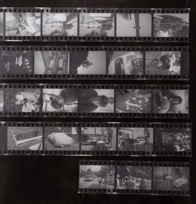
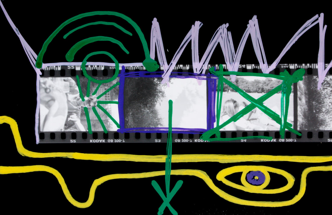
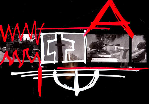
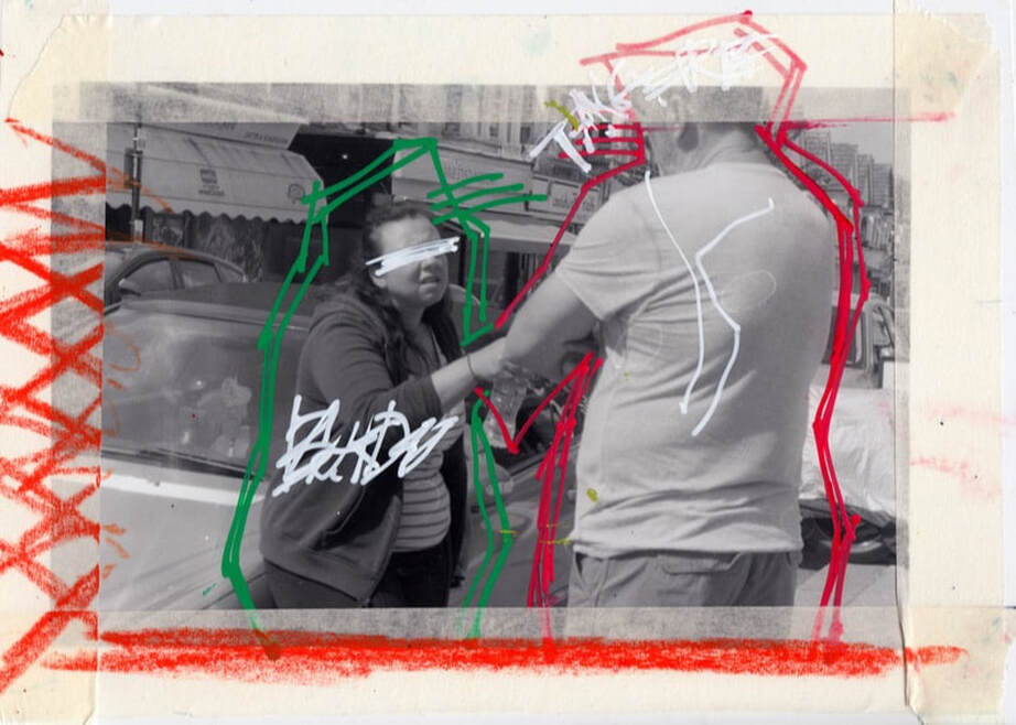
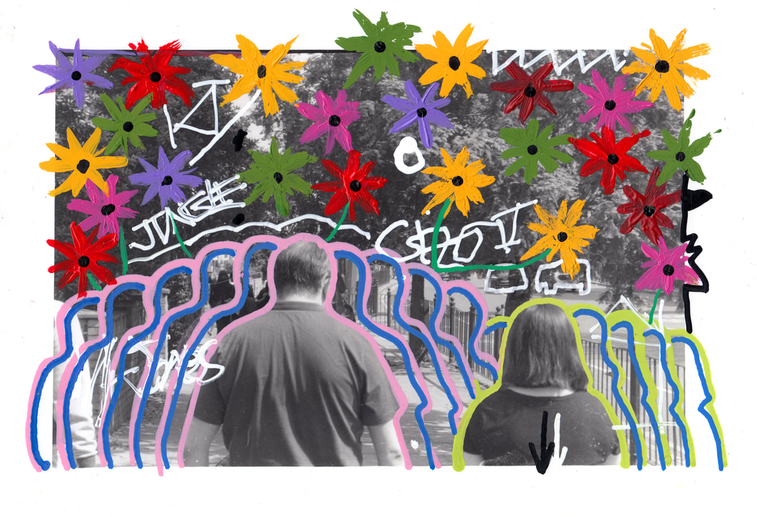
This is my response to William Klein's contact sheets. I took a selection of photos of every day, possibly mundane subjects and intended to draw on the contact sheets I made from them to give the photos more life and vibrance. I also used some old pieces of film, like in the first two contacts, which I think is a good use of Klein's idea of reviving the photos.I then did the same technique of drawing and painting on to prints, but used full images. Some of these were done in photoshop digitally and some were done with pens and paint. I think my painting does a good job in giving the contacts and photos life, and the style of painting developed through the different attempts. With the bottom photos having more detail.
|
|
|
|
|
|
|
|
|
|
|
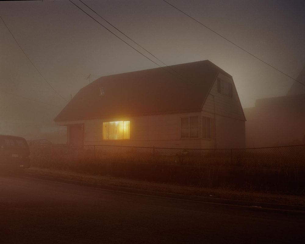
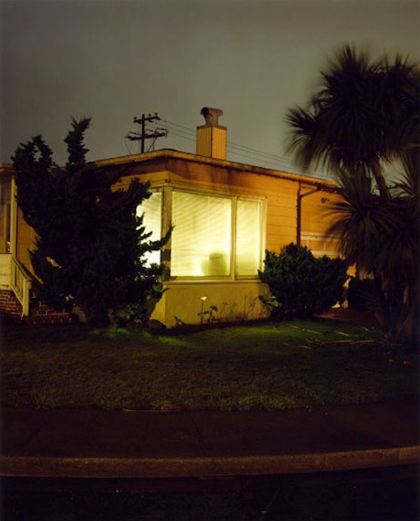
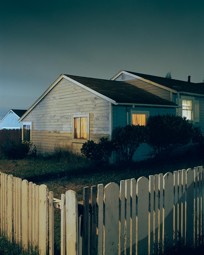
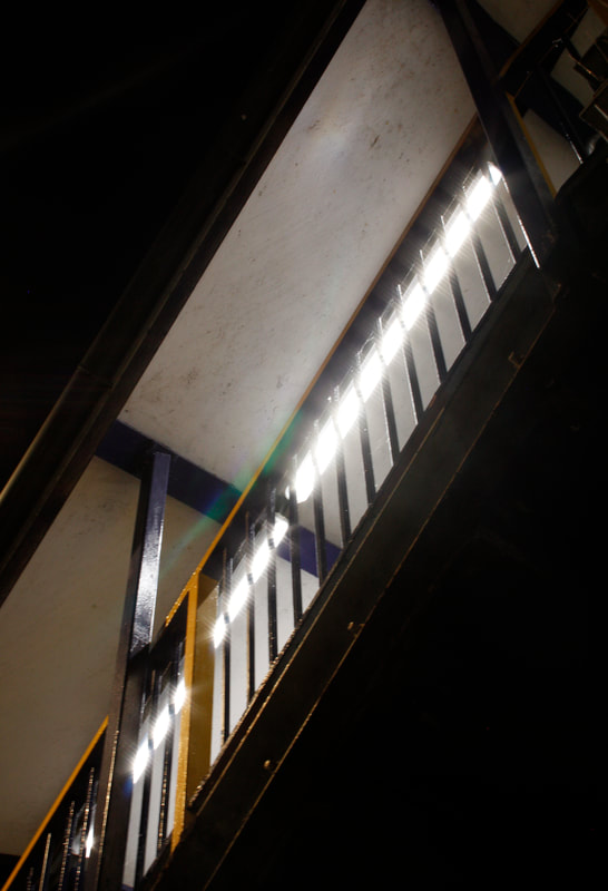
Night Photography-Todd Hido
Todd Hido is an American based photographer who has a series called 'homes at night'. This series has many beautiful night photos of houses which all tell a very specific story and look very cinematic. The photos almost have a feeling of loneliness as we are outside at night looking into a warm looking home with bright lights on. This contrast creates that feeling as well as the fog that is often featured in his photos.My favourite from these is the photo on the right because of the clear sky and the calm colours. In my response I want to use similar compositions to this and similar colours, but my photos will most likely look different as I will be shooting in the city.
|
|
|
|
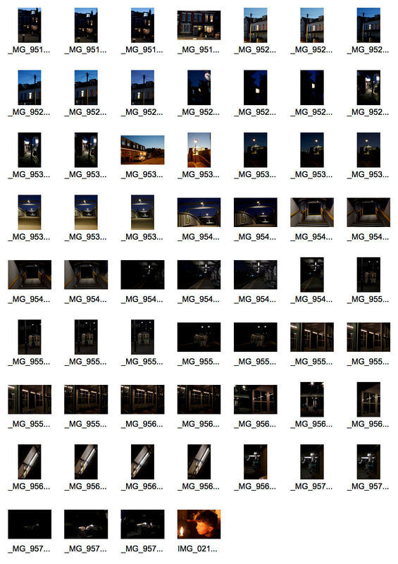
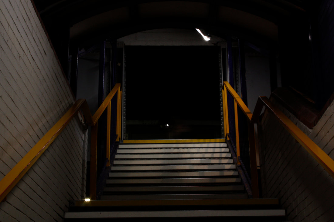
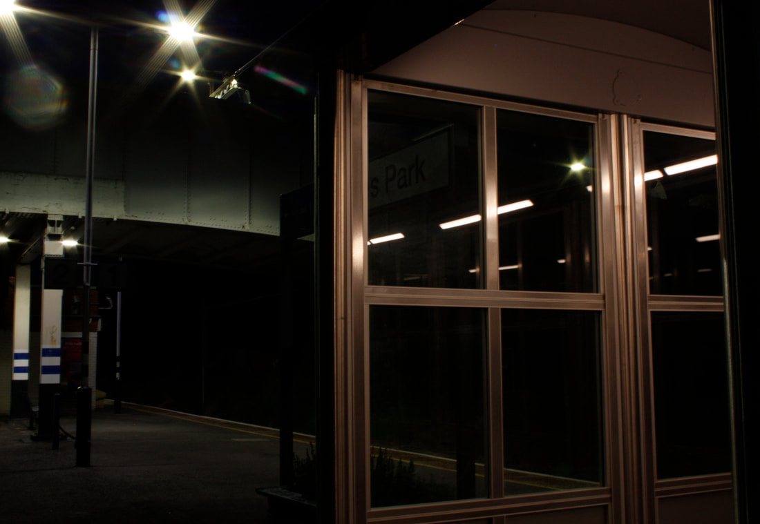
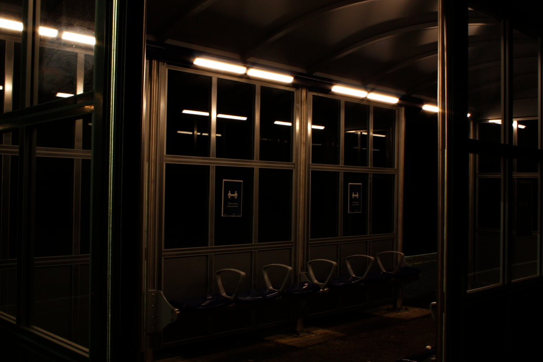
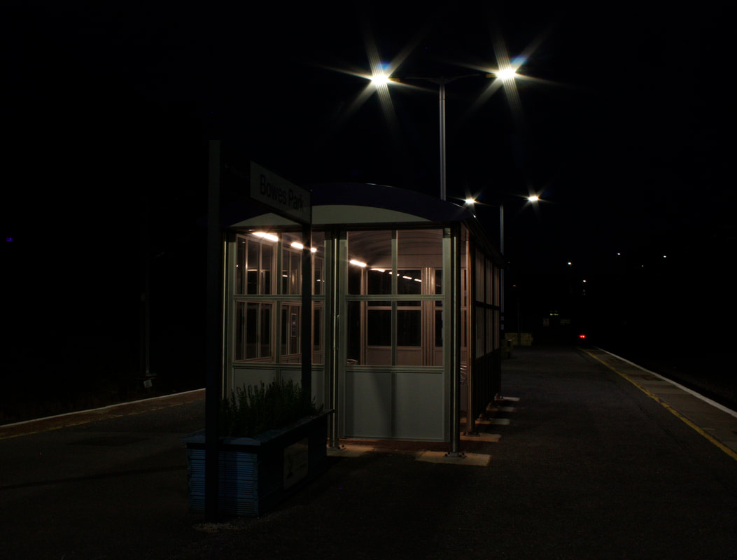
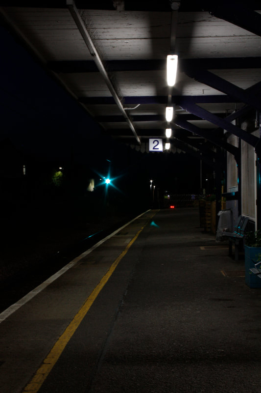
This is my response to night photography. The shoot was done at a train station, which I think is a good location to demonstrate the features of night photography as it can be quite empty at night. It's also suitable because of the lights and different structures in a station. However, I'm not sure if the photos are very related to 'structure'.I used a tripod and an average shutter speed of around 2 seconds. I like the exposure in the photos and how they are quite dark with only some highlights. I prefer the photos which include the shelter because of the reflections of light through the glass windows and the colour that is created inside. Some of them have a cinematic style which I'm happy with.
|
|
|
|
|
|
|
Chosen Strand
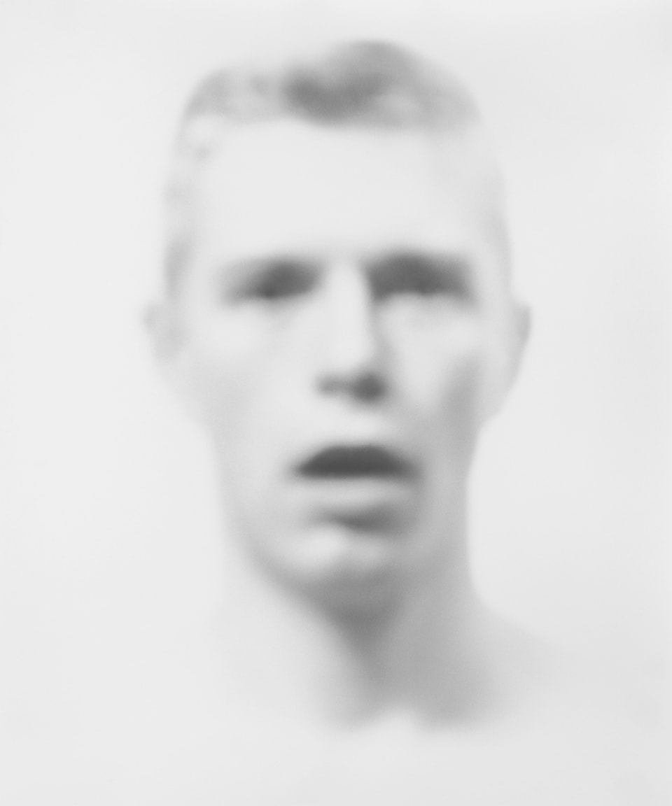
Bill Jacobson
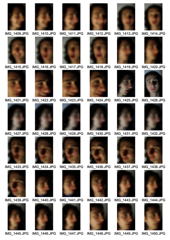
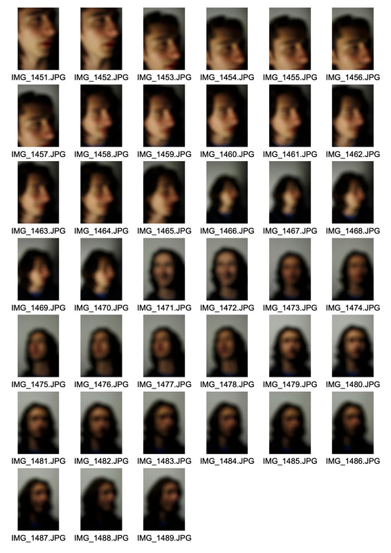
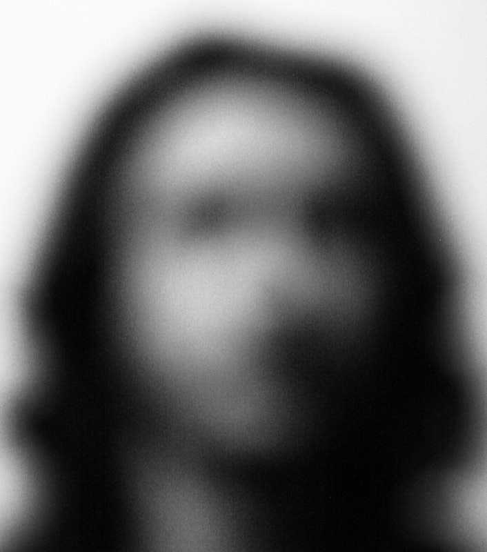
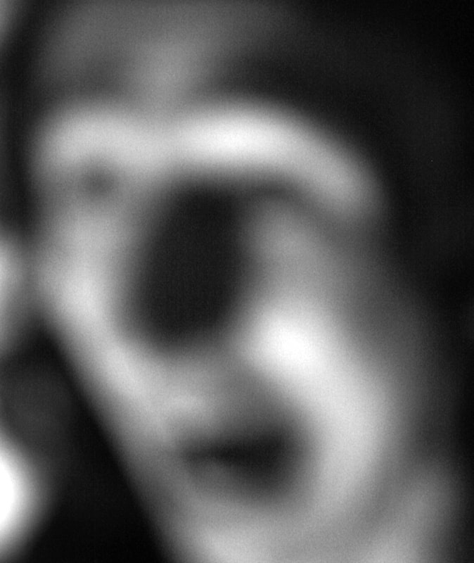
Bill Jacobson is an American photographer with many different series' and he believes that his work “parallels an inner journey through a world we are constantly experiencing with the uncertainty of the mind’s eye rather than the sharp clarity of a camera lens.”. He is widely known for his out of focus photographs of both figures and landscapes, and his most famous series called 'Interim Portraits' (1989) focuses on portraits. He shoots blurred photos in a white studio with very bright lights. By over exposing these photos, you can only see a very light outline of the person and they become a ghostly figure as there is only a small amount of undefined shadows. This project was meant to evoke the loss that people were feeling during the AIDS epidemic of the time. Taking out of focus images is very rare in photography and i think the way Jacobson uses it is very interesting and effective to create his portraits. This is a technique that breaks the 'structure' of photography and the conventional rules that placed since we are usually told to focus on a subject.
|
|
|
|
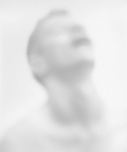
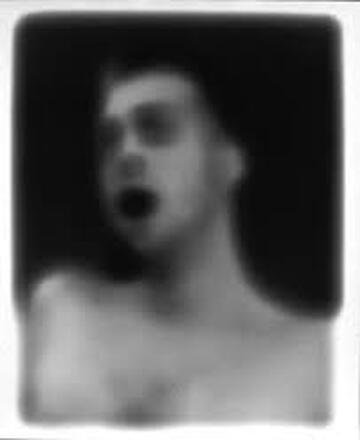
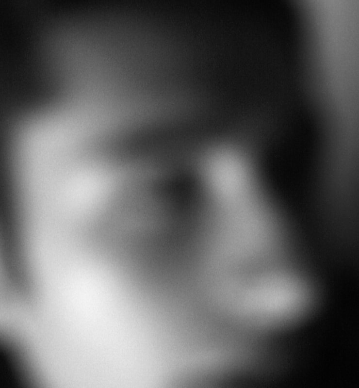
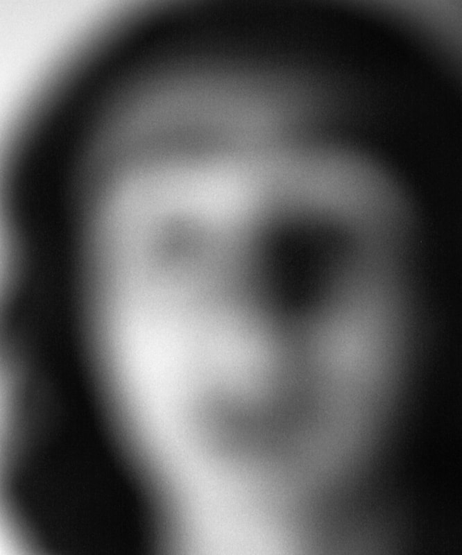
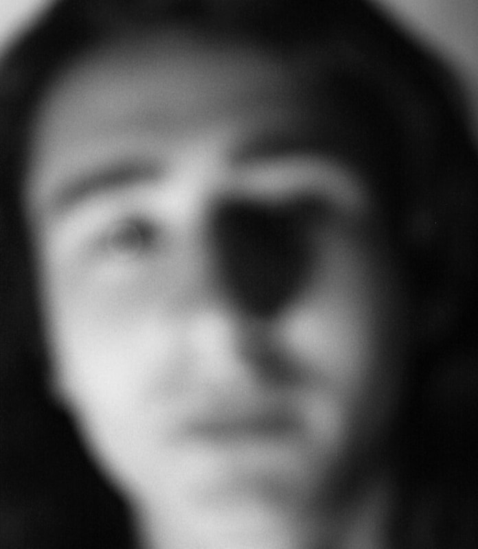
In response to Bill Jacobson's 'Interim Portraits', i did a shoot in a similar style while shooting fully out of focus. Similarly to Jacobson's photos, mine create a rough shape out of the model's face and some of them are even more blurred than his because i moved further away. I quite like the increased blur because the face has so little definition and the photo on the left is just rough shapes. However, it is still easy to recognise the face in the photo. I also edited the photos to be black and white like Jacobson since I think colour gives away too much information on wear the features are. Unlike Bill Jacobson, I did not over expose these photos. I actually used one light source in a fairly dark room to achieve a lot of contrast on the face which created the rough dark shapes like the eyes and mouth. I also composed in a different way to Jacobson, by cropping quite close, not even showing the full face in some of them. I think this causes the photos to be more ambiguous as we cannot see the big picture and overall shape.
|
|
|
|
|
Developing on Bill Jacobson
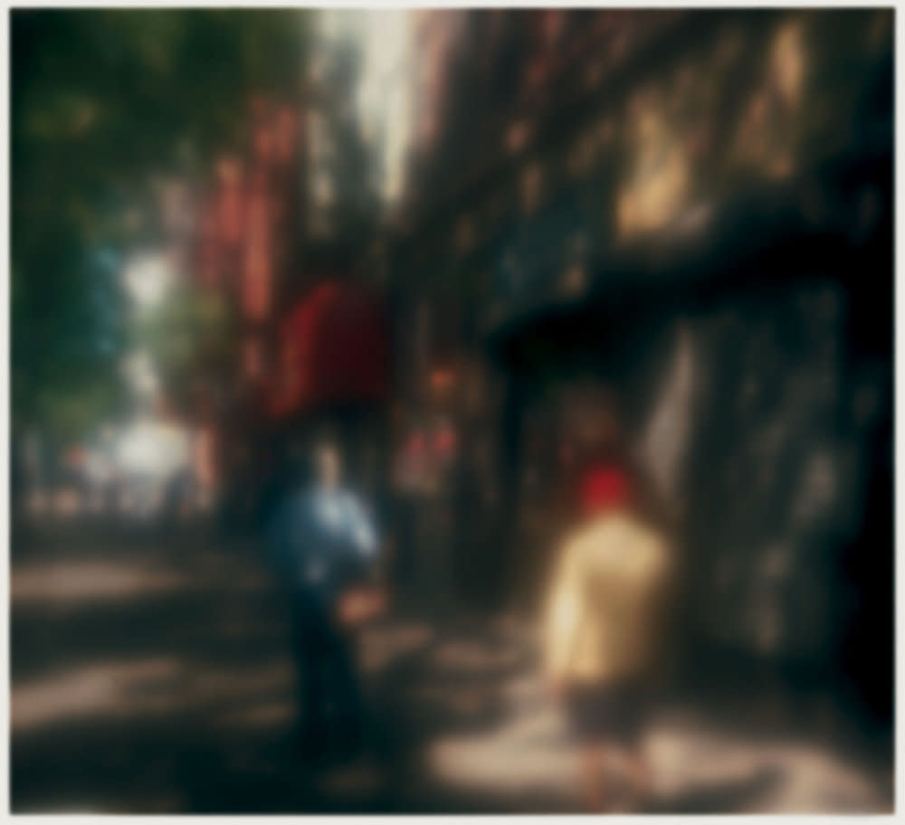
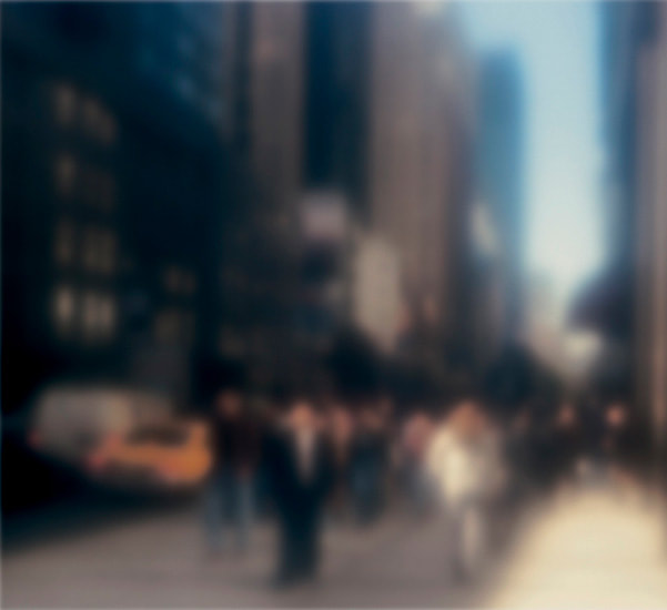
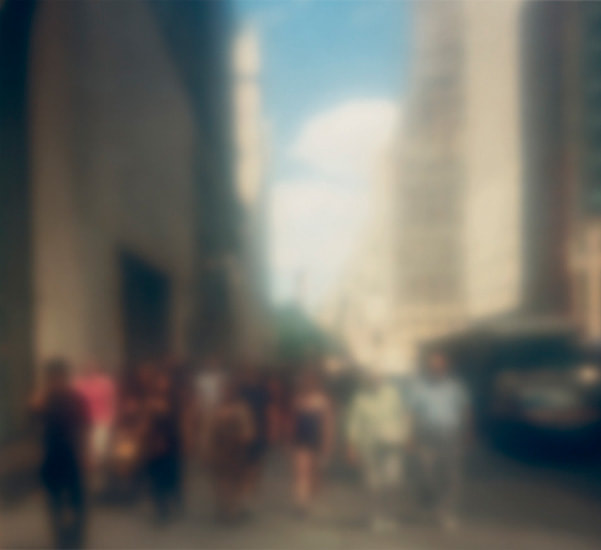
After the first shoot where i looked at some of Bill Jacobson's photos from his series 'Interim Portraits', i found another series of images in which he also shoots out of focus. However, these photos are shot in the street with a wider composition showing lots of different things, including people. Even without focus, the photos tell a story and have a feeling. The vibrant colours mixed with the blurred effect creates a humid and warm feeling in the photos and also causes the people to blend into the surroundings as they are on the same level, being out of focus. I think that the photos relate to the them of structure as they break down the conventional ideas of a 'good photograph' by not using the correct focus. Even without this essential aspect, the photos still have a very strong outcome. In my work, I plan to use the same blur but take photos of nature instead of street, as I think it will emphasise the warm feeling I like in these photos.
|
|
|
|
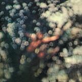
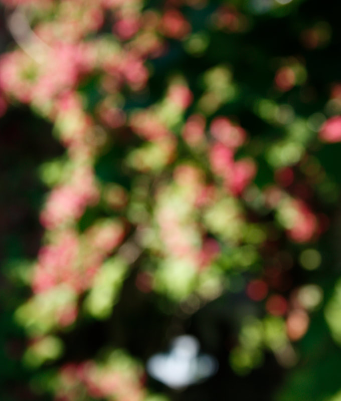
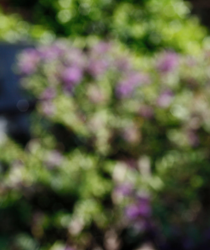
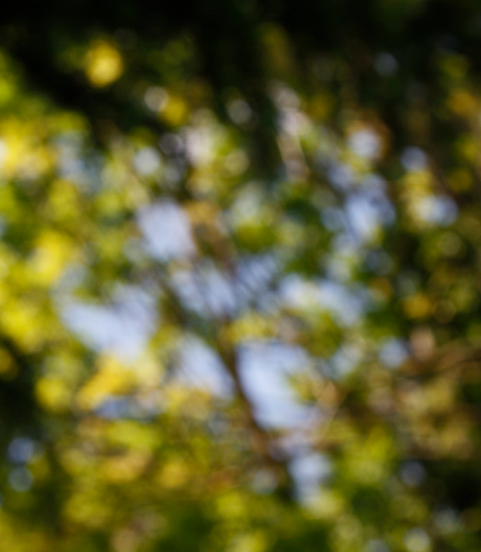
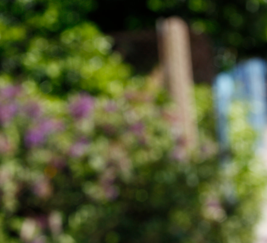
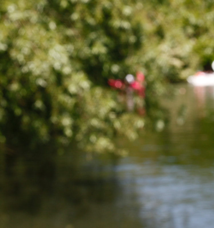
This is my response to Bill Jacobson's coloured, blurred photography. The photos in his untitled series of photos are street photography while mine are all of nature. I really like this because it has the warm feeling in the photo even without focus. The colours that come from nature are stronger and more vibrant than in the street, and I think works well with this out of focus style. I achieved these colours by shooting on a sunny day and finding the most colourful flowers and plants which compliment each other and create contrast. By removing the the definition created when you focus an image, we are able to appreciate and pay more attention to the colour and what it can suggest about the content of the picture .My favourite photo from his shoot is the image on the top right because I like how the yellows and greens mix together and how there is a circle of blue sky through the branches. Kind of looks like Pink Floyd's 'Obscured by Clouds' album cover. (shown on the right)
|
|
|
|
|
|
Development - Exposure
|
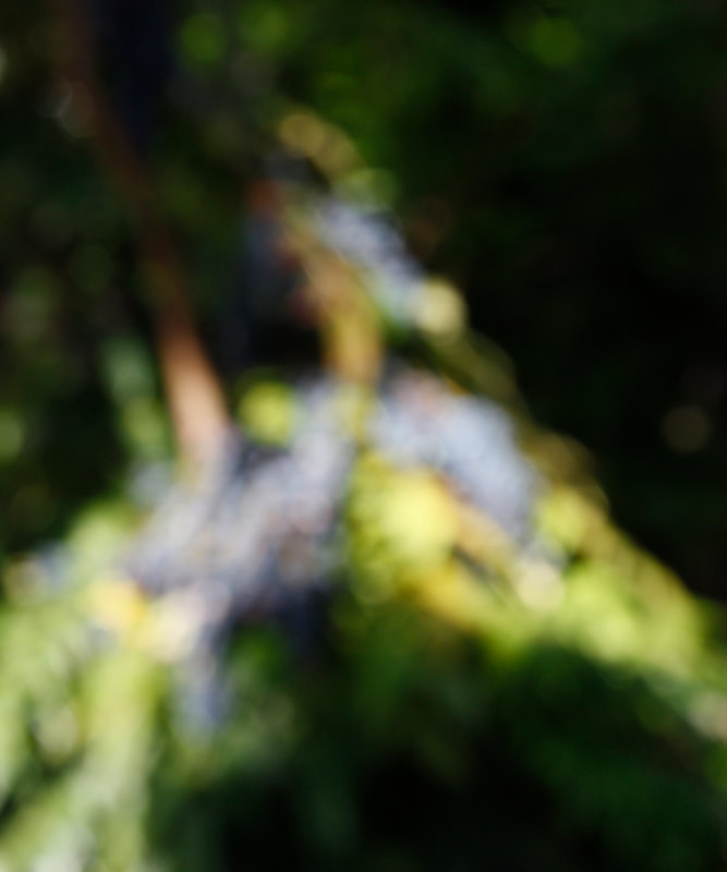
In this development, I experimented another aspect of photography which usually has conventional ideas around. Photographers will usually correctly expose their images or possibly over or under expose by a couple of stops. In this shoot i wanted to wildly over expose my photos to a point where you can see only the darkest shadows. I did this by keeping a low shutter speed in lots of light. I took photos of nature and plants the same way I did for the original strand inspired by Bill Jacobson. I think the natural and wild shapes created in the plants works well to create slightly abstract photos when over exposed. My favourite from this shoot is the photo on the right as the blinding light exaggerated by the exposure looks great through the branches. I don't think exposure is as interesting to experiment with as focus, but I could combine the two in the future.
|
|
|
|
|
|
Motion Blur
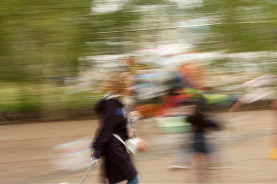
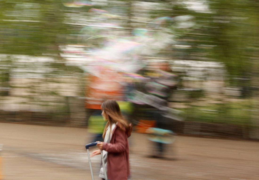
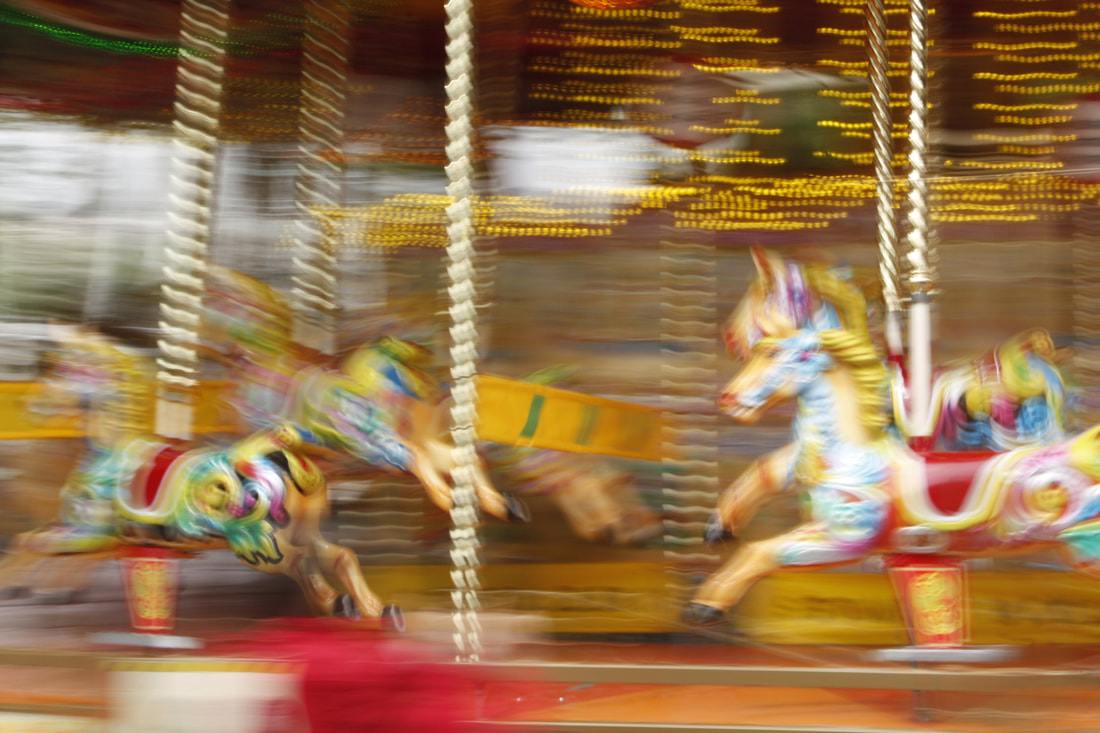
In this shoot, I experimented again with a different aspect of photography that is not usually praised. This was the use of a slow shutter speed and creating motion blur in photographs. I did this by setting my shutter speed to around 1/6 of a second and keeping a high aperture to keep the exposure correct. I then would find subjects that were already moving, like people walking by, and follow them with my camera while shooting. This meant that the subject was the most focused thing in the frame while the surroundings are very blurred. It is interesting how a slower shutter does not freeze time like a fast shutter does, but captures a few moments all in one image. The photo on the right does this the best since the person is quite defined in contrast to the background, creating a lot of movement in a photo that would otherwise be fairly boring. Although breaking the structure of a photo by slowing shutter speeds can create good results, i don't think I want to develop it in this project.
|
|
Development - back to focus
|
In this development, I went back to shooting out of focus photos. However, I wanted to change the tone from the previous warm and vibrant images created on a sunny day of vibrant flowers and plants into a colder feeling. I did this by shooting on a very gloomy, cloudy day and focusing on much less vibrant, dull subjects. Most of the colours grey or browns that are quite typical of London streets. When I compare the two series' of photos, it is quite interesting how much the tone can change without sharp focus. By only looking at colours and simple shapes you can still receive a strong feeling from the photo. However, these photos on their own aren't particularly interesting.
|
|
|
|
|
|
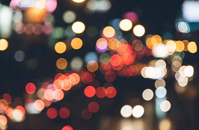
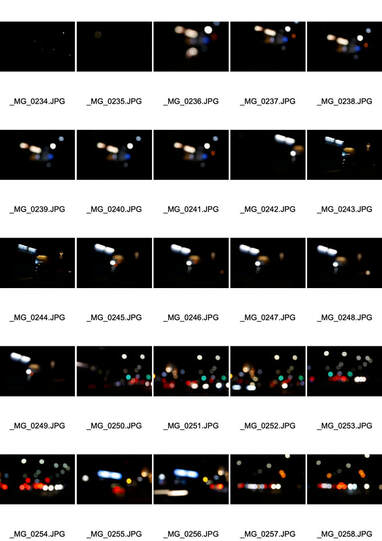
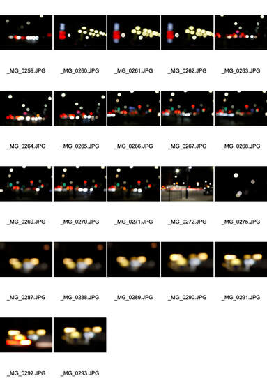
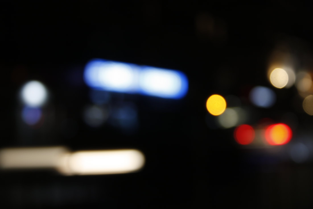
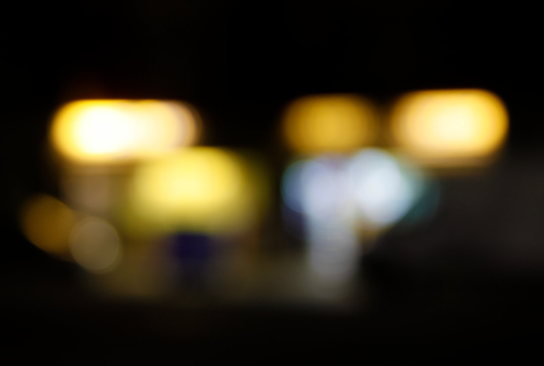
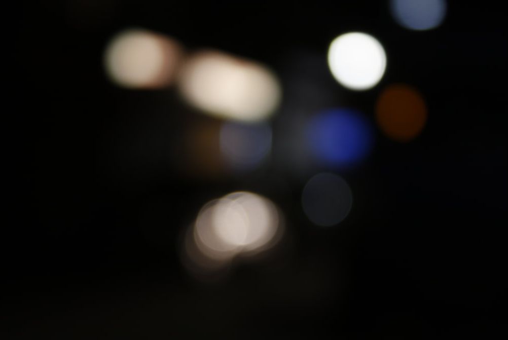
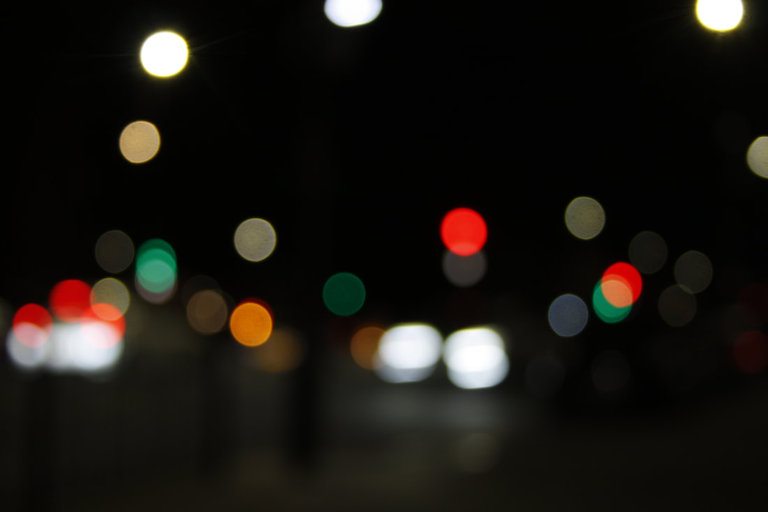
Development - Bokeh
|
Bokeh is a popular technique used in photography that includes shooting out of focus in the same way I have been doing. In this style, photographers try to achieve reflections or circles of light so it will often be carried out at night. The photo on the right is a good example of another photographers use of bokeh. Similar to my last two shoots, I shot out of focus to break the conventional rules of photography. I went out at night in a busy area that had lots of traffic lights and cars so I could shoot the coloured lights. I used a tripod so that there wouldn't be any camera shake. Shooting at night creates a slightly different effect, as there is mostly a black background with some bright circles of light. While taking the photos, I just focused on finding interesting colours and a good layout of lights. It feels like creating abstract imagery directly from your surroundings. For example, the top right photo is a shop front, but is unrecognisable when out of focus.
|
|
|
|
|
|
|
|
Hiroshi Sugimoto
After researching bokeh and out of focus night photography, I came across a photo by Hiroshi Sugimoto. This is the photo I came across.
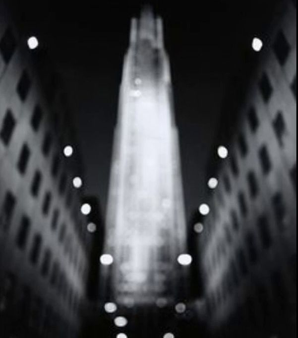
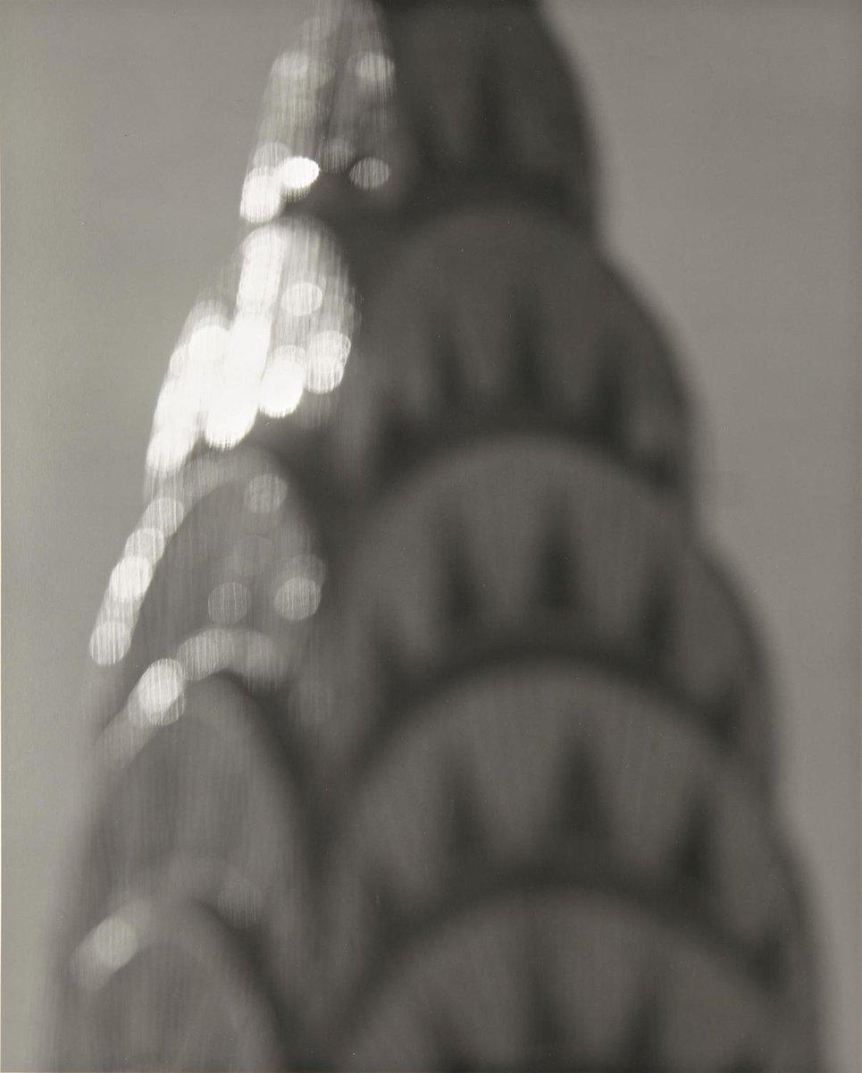
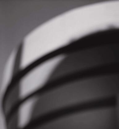
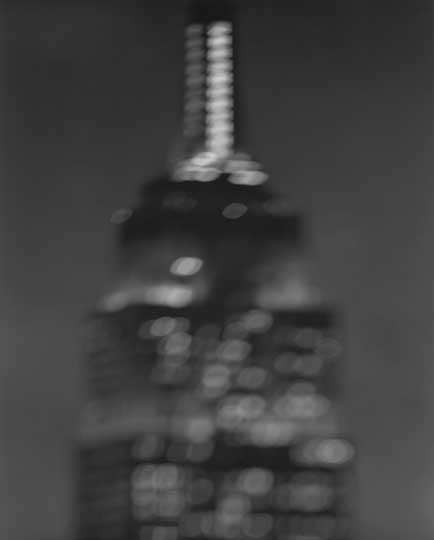
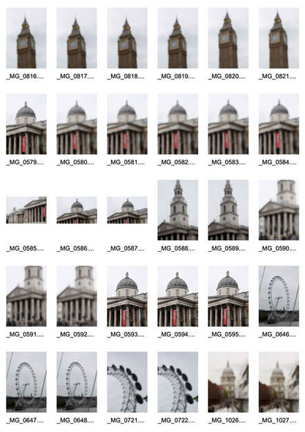
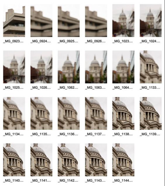
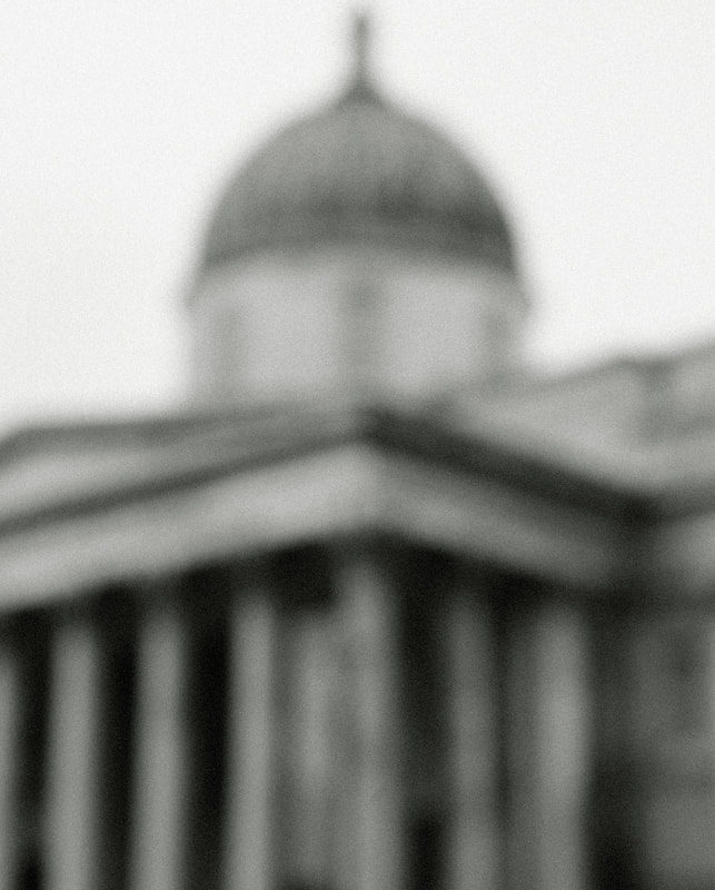
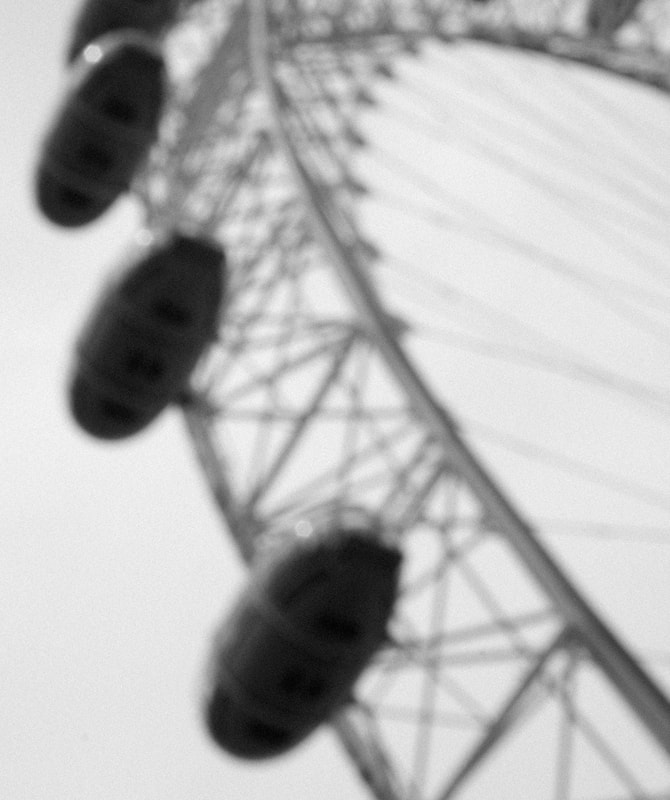
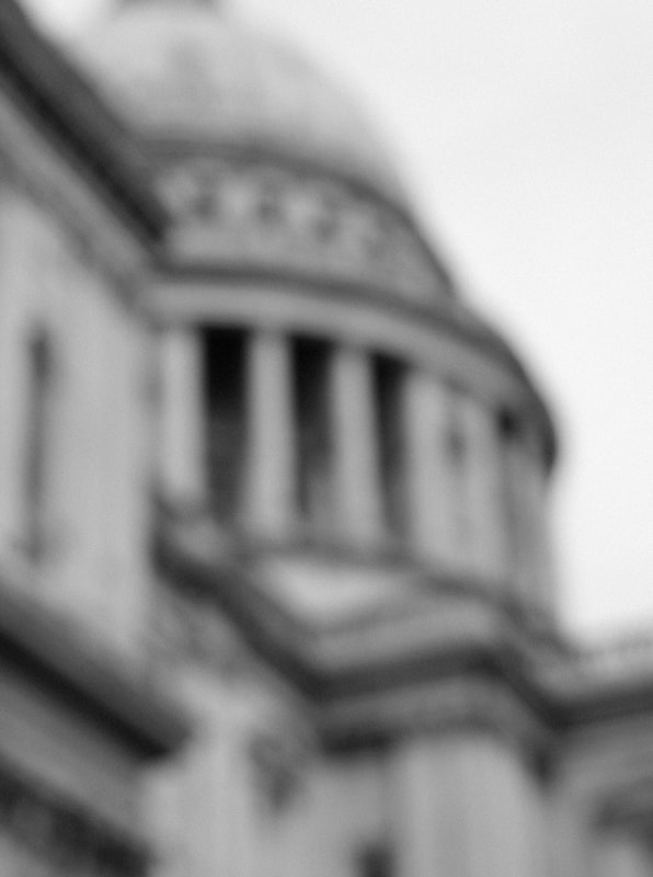
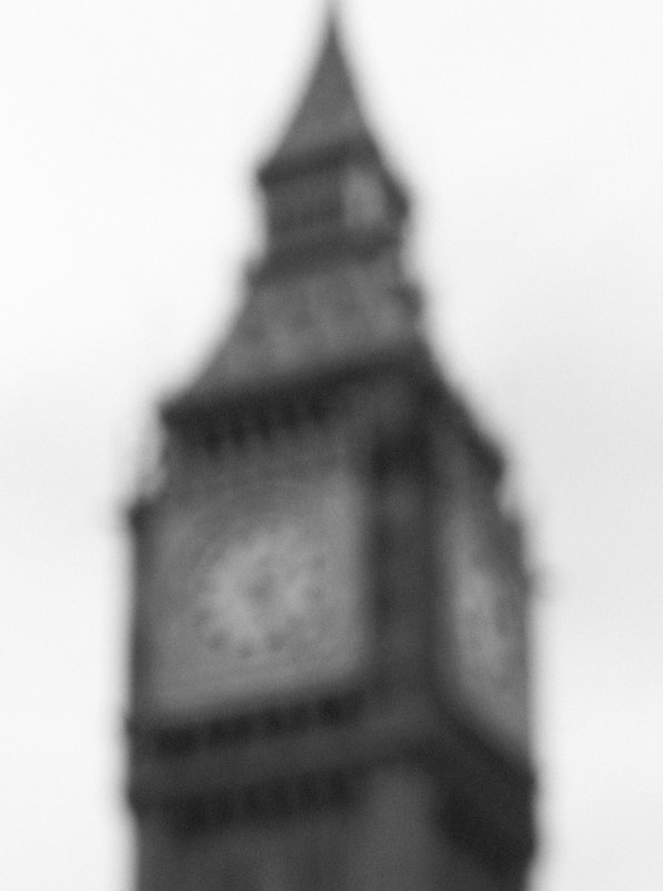
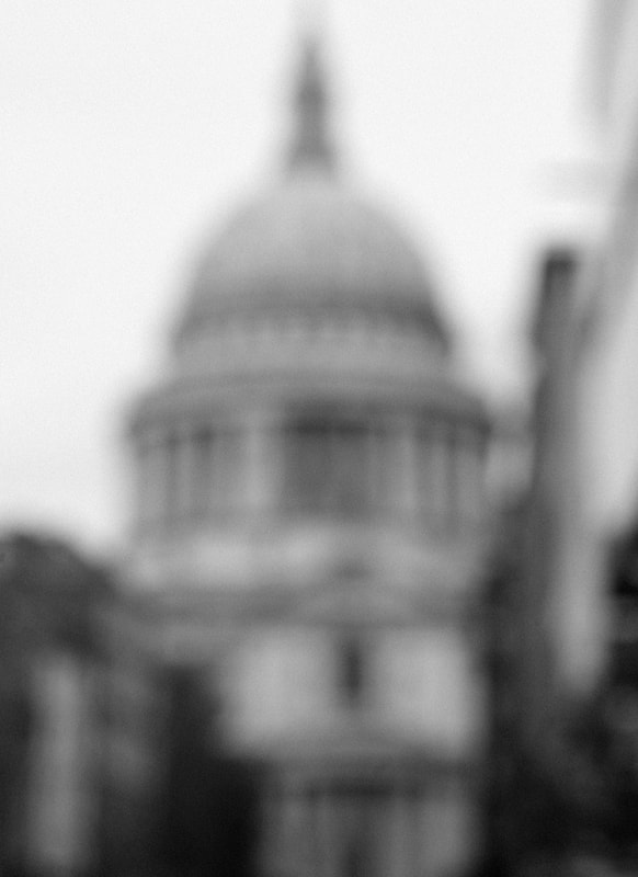
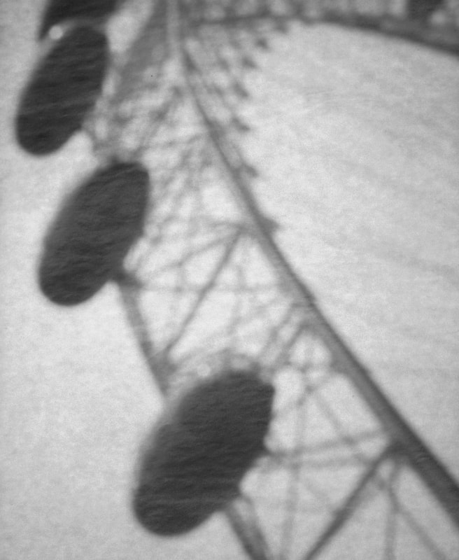
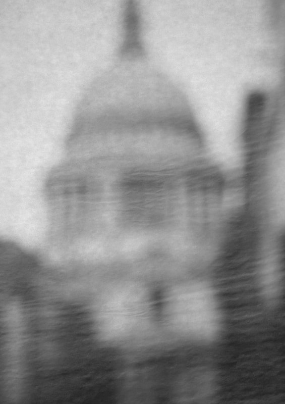
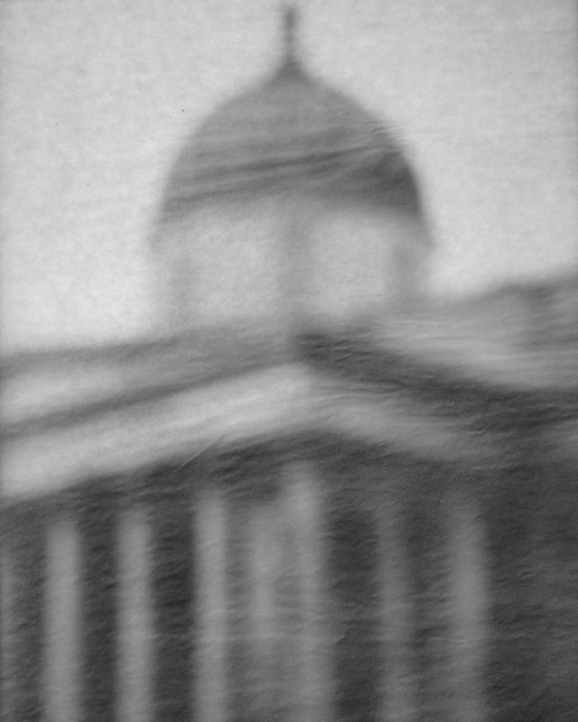
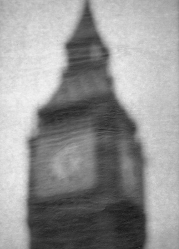
After looking further into him and his work, i found a series he made about architecture. Hiroshi Sugimoto is a Japanese photographer and architect with a range of different projects and series'. About two decades ago, Sugimoto started to photograph iconic, modernist buildings in a series where he would shoot only out of focus photographs. He takes black and white photos while cropping in quite close to one section of the building. The result of these techniques and breaking conventions in photography, create a very ambiguous series of photos where it should be fairly difficult to recognise the subject. However, it is not difficult at all to recognise these buildings as they are so iconic and engraved into our minds. We have seen them so many times that we can acknowledge them even with so little information. The photo on the right has blurred lights all over, and almost no outline of the building but is clearly the Empire State building. This was my take away from his work but Sugimoto's original idea for this project came from his passion for architecture and how he wanted to bring architecture back to its fundamental concept and original vision of the architect. I want to photograph famous buildings in London in a similar way.
|
|
|
|
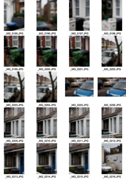
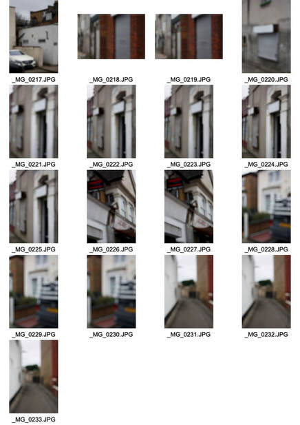
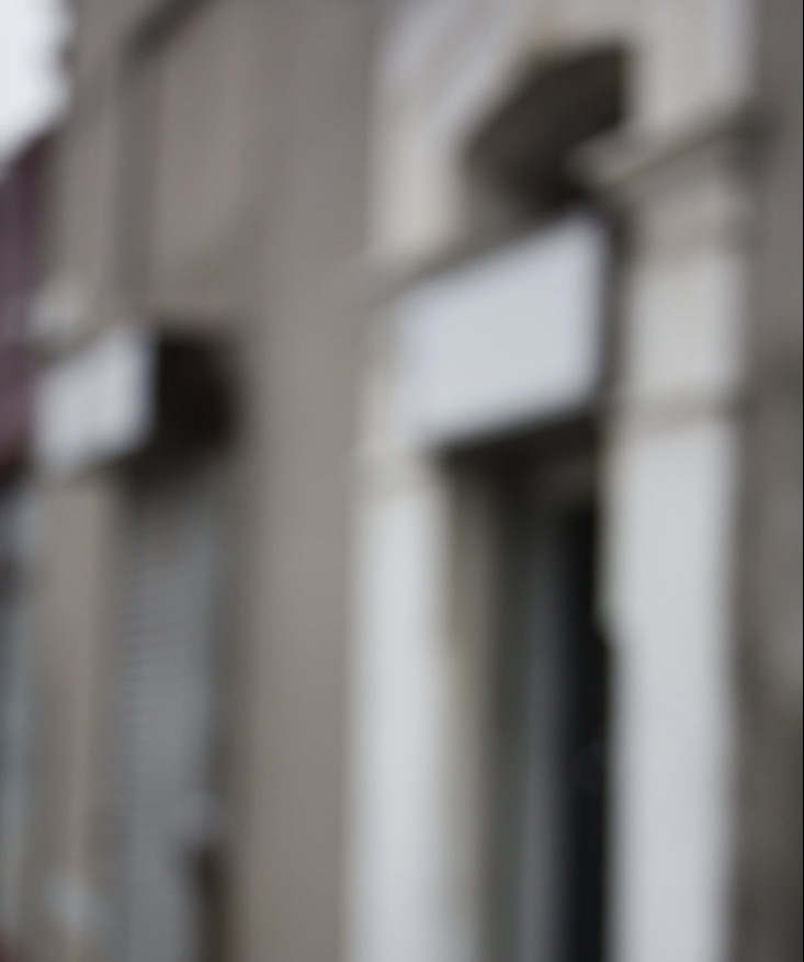
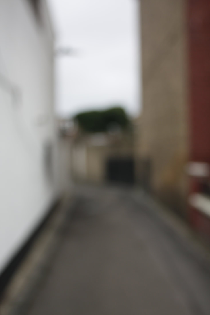
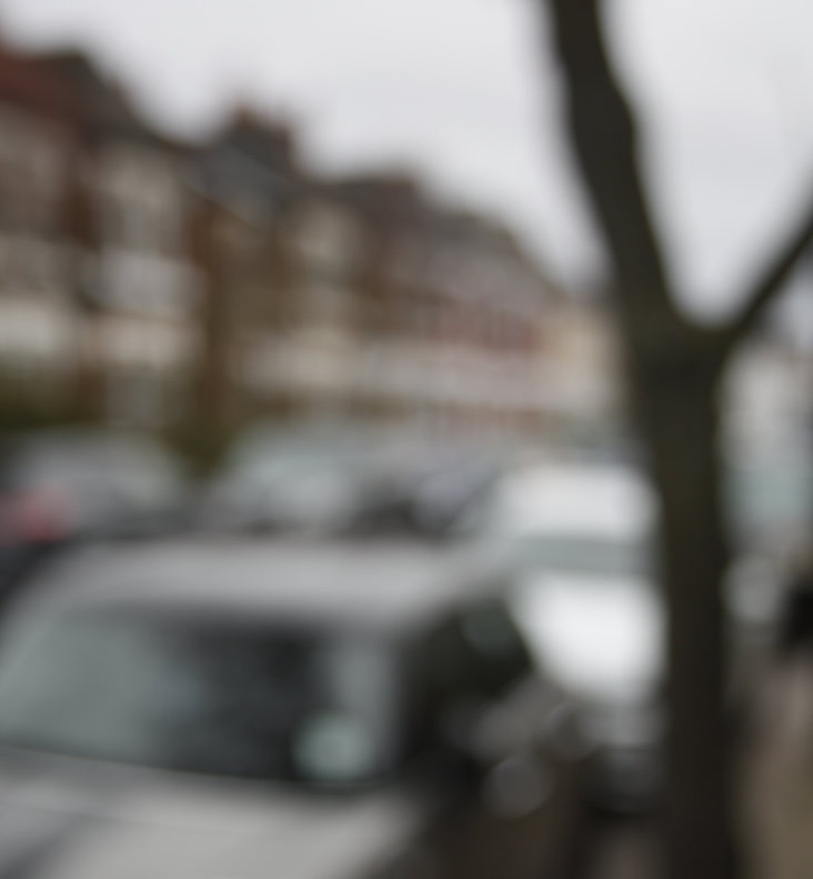
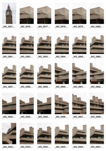
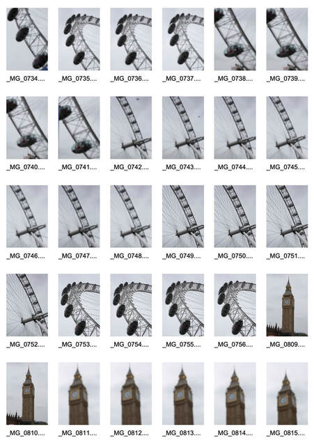
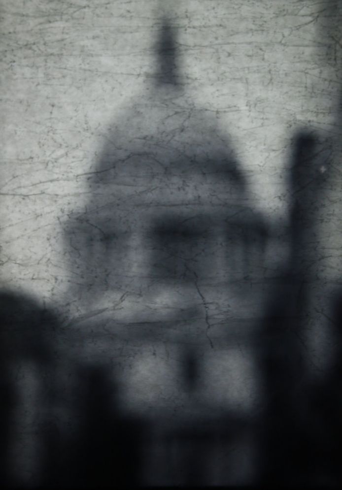
This is the shoot i did in response to Hiroshi Sugimoto, where I went to central London and took photos of some of the most iconic London buildings including Big Ben and St.Pauls Cathedral. Like Sugimoto, I took them completely out of focus and also tried to crop in quite close. Some of them like the London Eye photo, have a different composition to Sugimoto as they are not in the centre of the frame. I have made them all black and white in photoshop as this definitely gives them more ambiguity than colour, and means that the rough shape of the building is the only indicator of what it is. These photos are very successful because the simple compositions and close framing works very well with the blurred technique. With an interesting subject, the project of breaking conventional ideas in photography is more effective. I believe the London Eye photo is the best out of these because of the different composition and because the London Eye has such a unique architectural design. I want to find a way to present these photos to make them even harder to distinguish and breaks the structure even more.
|
|
|
|
|
|
|
|
|
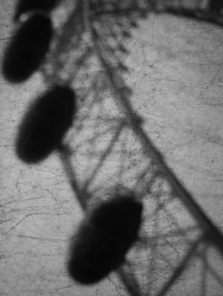
Developing on Landmark Photos
|
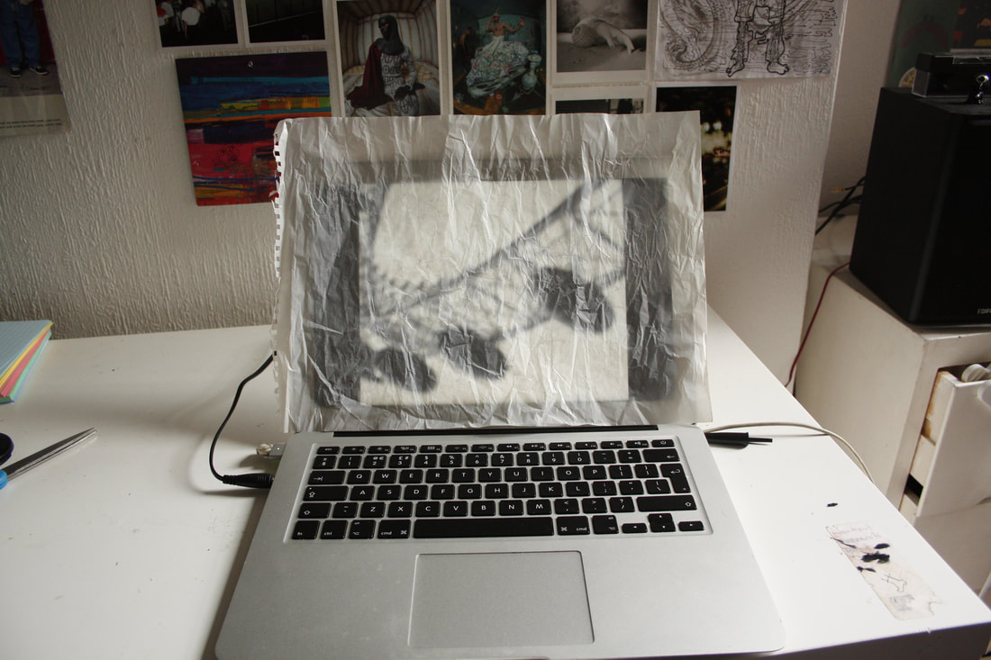
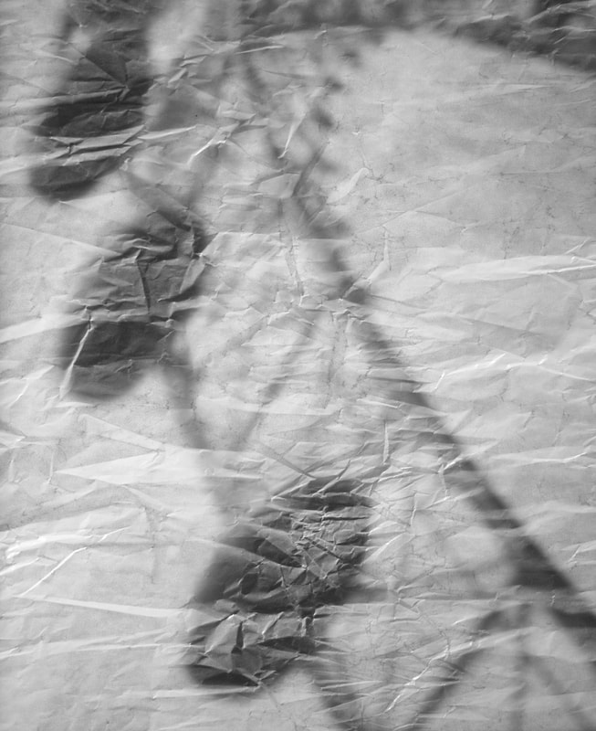
In this development, I wanted to use my successful photos inspired by Hiroshi Sugimoto and improve the idea of focus and how a familiar thing like a landmark is still recognisable when blurred. I created a stronger blur by placing tracing paper over my original photos. The photo on the right shows how I did this which was by putting the paper over my laptop screen and taking pictures of it with a DSLR. I like how I was able to include other, more physical techniques to break down the structure even more. I made sure that there was another light source so that the texture and slight wrinkles in the tracing paper is defined. I really like how these turned out and I believe it is a big improvement on the original photos.
|
|
|
|
|
|
|
|
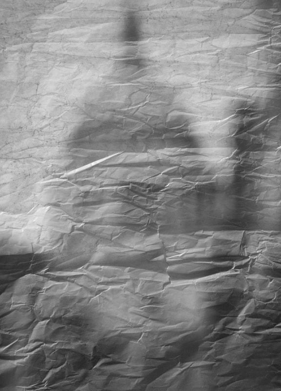
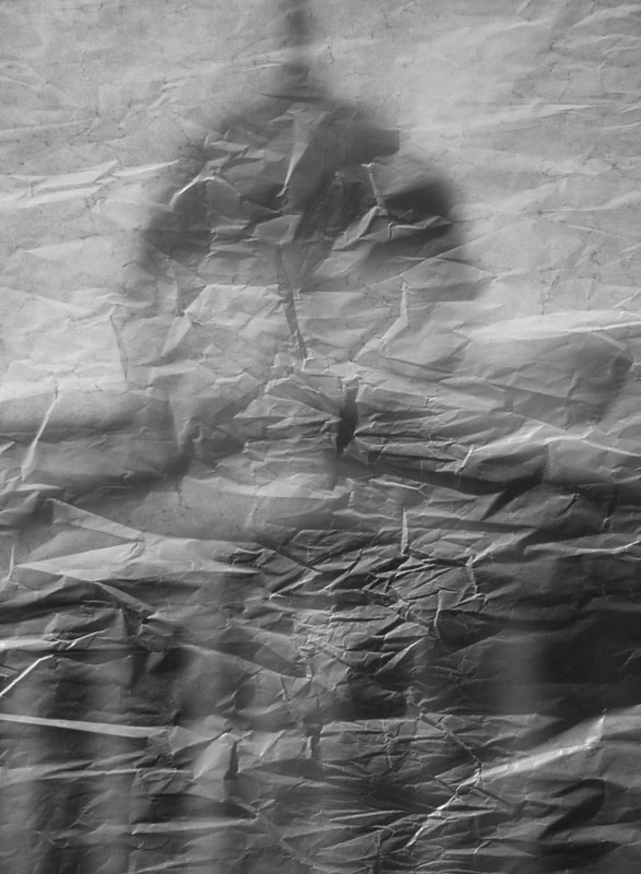
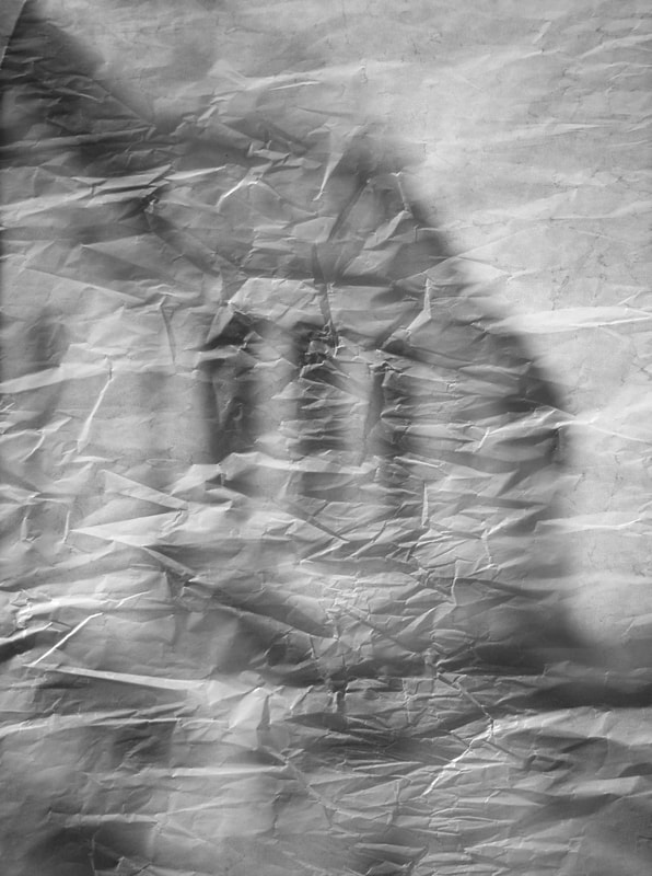
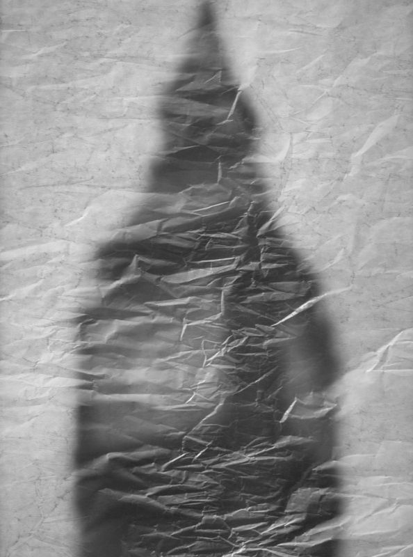
After seeing the results of the first few photos using tracing paper, i found that the most effective part of this was the texture created by the paper so I leaned into this and screwed up the paper to make much more defined wrinkles. I then straightened out the paper and didi the same thing by placing it in the laptop screen and photographing it. This worked very well and the contrast created by the stronger wrinkles is very effective. I love how the paper in front is in focus and sharper than the photos behind it. I also tried taking some with no other light source which are above. This did not work the same, as you couldn't see the texture of the paper and the result is too dingy for the style i was trying to achieve. The photos below are a good final piece though because they suit my theme of breaking structure of photos since I shot out of focus and also used physical means to enhance it. However, they are still recognisable because we see these structures so often.
Final Piece
|
|
|
|
|
